-
Most new users don't bother reading our rules. Here's the one that is ignored almost immediately upon signup: DO NOT ASK FOR FANEDIT LINKS PUBLICLY. First, read the FAQ. Seriously. What you want is there. You can also send a message to the editor. If that doesn't work THEN post in the Trade & Request forum. Anywhere else and it will be deleted and an infraction will be issued.
-
Please read our Rules & Guidelines
Vote now in wave 1 of the FEOTM Reboot!
You are using an out of date browser. It may not display this or other websites correctly.
You should upgrade or use an alternative browser.
You should upgrade or use an alternative browser.
Steel of Man. Restructured, Regraded, Rekindled!
- Thread starter tremault
- Start date
- Messages
- 1,230
- Reaction score
- 1,400
- Trophy Points
- 123
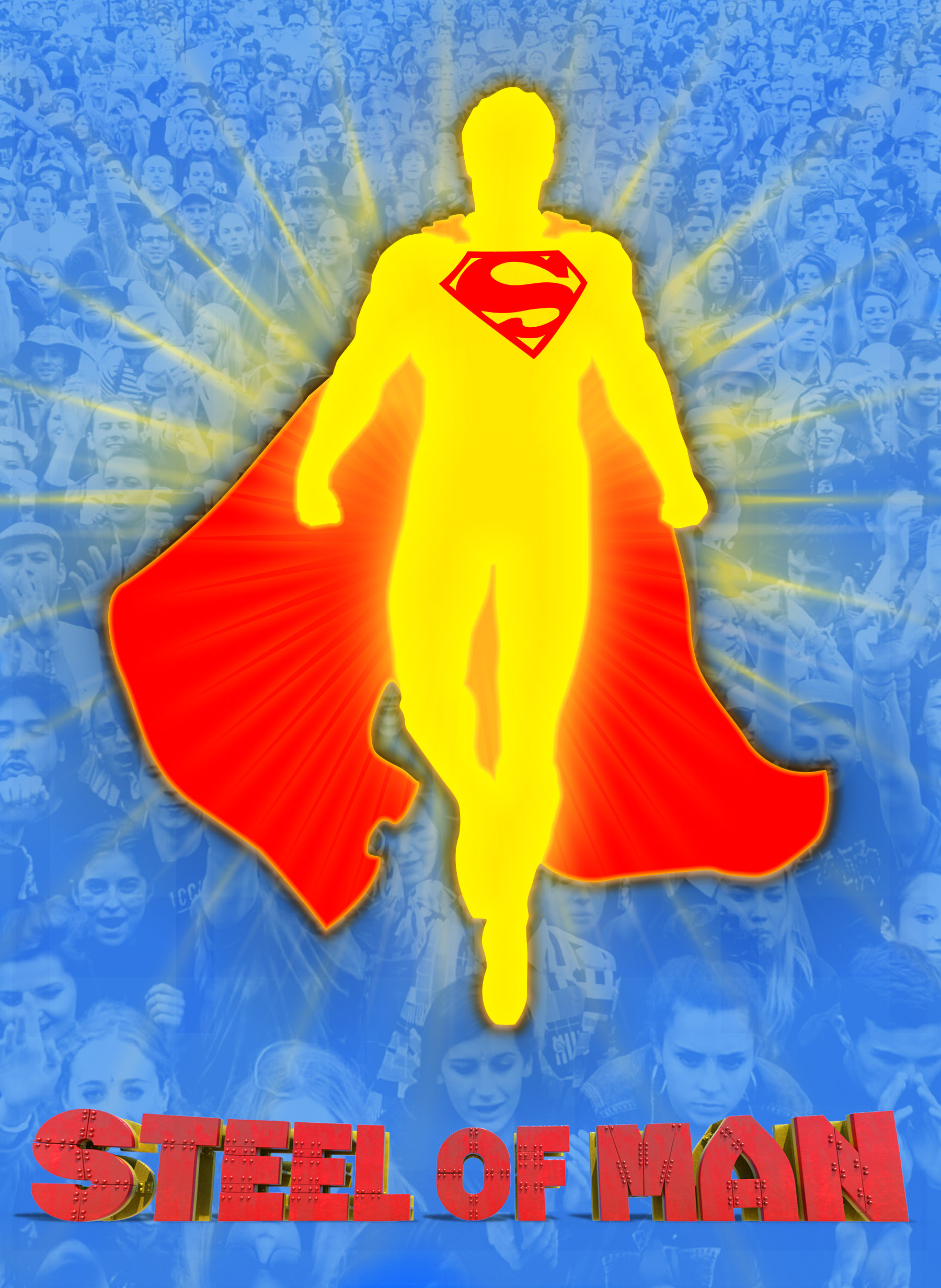
A little adjustment. I think it's looking nice. How do ya'll feel?

Last edited:
- Messages
- 1,230
- Reaction score
- 1,400
- Trophy Points
- 123
you mean like this?Eh, feels a little bit too cartoonish. Definitely get what you were going for though.
Maybe use a promotional cutout of Cavil instead of just using a comic artwork for the outline of Sups?

Shouldn't be too hard to replace the path on my colour layers. I was mainly concerned with how recognisable the silhouette would be. I picked one that seemed most dynamic and familiar, but if it's coming across wrong then I can change it.
- Messages
- 4,245
- Reaction score
- 1,568
- Trophy Points
- 123
Not crazy about the font, it makes me think of something along the lines of the Lego Movie. I like the comic booky Supes, though. Not having it be specifically Cavill but faceless enhances its status as a "symbol" for all the people in the back.
- Messages
- 1,230
- Reaction score
- 1,400
- Trophy Points
- 123
ok well I did some different things. I'm a bit bummed to be honest because I really liked my initial design and I seem to have completely missed the mark :/
I assume it felt like lego though because of the 3 colours. I was actually unsure of the different coloured words to be honest. so here I'm reflecting the comic titles. maybe this silhouette is also better as a more lifelike figure. I mean it's meant to be for a live action film.

I assume it felt like lego though because of the 3 colours. I was actually unsure of the different coloured words to be honest. so here I'm reflecting the comic titles. maybe this silhouette is also better as a more lifelike figure. I mean it's meant to be for a live action film.
Last edited:
- Messages
- 1,230
- Reaction score
- 1,400
- Trophy Points
- 123
Ok well I got a ton of feedback from a topic here and on facebook and here is what I think is the final poster design.
After doing so much work on it, I'm now thinking this may have to be the box art as well.
After doing so much work on it, I'm now thinking this may have to be the box art as well.
Last edited:
- Messages
- 1,230
- Reaction score
- 1,400
- Trophy Points
- 123
Okay, I got this cutaway for the bit that I previously used a transition. I wanted to have less of the mystery man, but I think this may actually work better.
This part, I added in a little cut-in to slow the pacing a little.
Here, I added in Lois' reaction shot. Had to remove music so used an AI tool, (thanks Lantern51 ^^) and I hope it still sounds good.
this part, I'm not sure about. I tried with no music but it sounded too empty. I think this music fits ok, but...
Last edited:
Wow great work! Can,t wait to see your hopeful version of this movie.
Your edit is really needed.")
About "debbiesue.mp4" the transition : Lois has just finished talking then we have this boat and wave sound appearing right away.
It's feel too abrupt/quick. Maybe wait 1 sec more after the end of Loîs voice, before showing the boat or making the wave sound appearing. or even better start the wave sound very low and increase it exponentially (like a transition). Sorry I'm not an editor so no idea what term to use.
Your edit is really needed.
About "debbiesue.mp4" the transition : Lois has just finished talking then we have this boat and wave sound appearing right away.
It's feel too abrupt/quick. Maybe wait 1 sec more after the end of Loîs voice, before showing the boat or making the wave sound appearing. or even better start the wave sound very low and increase it exponentially (like a transition). Sorry I'm not an editor so no idea what term to use.
- Messages
- 1,230
- Reaction score
- 1,400
- Trophy Points
- 123
thanks
actually this is the less abrupt version! okay, it still feels abrupt. good idea about bringing the wave in quieter. I'll try that.
I also noticed the the music is too loud in PeteRossNewAudio. It's a little frustrating, resolve has this weird thing where it keeps the audio abnormally quiet, so I don't always notice things until the render. :/
- Messages
- 640
- Reaction score
- 606
- Trophy Points
- 108
These all look really good and I like the lettering you are using when you are establishing a place. The one I kinda helped with before the voices seem a little mis-snyced though. I can hear the lady Lois is talking to in the shot of the guy after the cut away. Otherwise like I said these are really good and I want to see this movie!Okay, I got this cutaway for the bit that I previously used a transition. I wanted to have less of the mystery man, but I think this may actually work better.
This part, I added in a little cut-in to slow the pacing a little.
Here, I added in Lois' reaction shot. Had to remove music so used an AI tool, (thanks Lantern51 ^^) and I hope it still sounds good.
this part, I'm not sure about. I tried with no music but it sounded too empty. I think this music fits ok, but...
- Messages
- 640
- Reaction score
- 606
- Trophy Points
- 108
I do the same thing all the time with audio being too low or too high until after the renderingthanks
actually this is the less abrupt version! okay, it still feels abrupt. good idea about bringing the wave in quieter. I'll try that.
I also noticed the the music is too loud in PeteRossNewAudio. It's a little frustrating, resolve has this weird thing where it keeps the audio abnormally quiet, so I don't always notice things until the render. :/
- Messages
- 1,230
- Reaction score
- 1,400
- Trophy Points
- 123
well blow me down!! How on earth did I manage that! that's really weird, some things have got shifted round somehow. ^^;These all look really good and I like the lettering you are using when you are establishing a place. The one I kinda helped with before the voices seem a little mis-snyced though. I can hear the lady Lois is talking to in the shot of the guy after the cut away. Otherwise like I said these are really good and I want to see this movie!
edit: nope, actually I had it like that from dot. one of my first edits misaligned it and it was a bleedover. or something.
edit2 : yes, I removed the shot of the logs to remove the reference to an event that doesn't happen in this edit. I'll need to try and resolve that.
edit 3 : hopefully this should fix it ( I need to find a different music for this bit too i think) ;
Last edited:
- Messages
- 1,230
- Reaction score
- 1,400
- Trophy Points
- 123
I'd like some feedback on this clip please.
I like the idea of having this scene here, the cut to it is tricky though. direct cut to this scene felt very abrupt so I found some stock footage for an insert. I'm just wondering if it is enough.
I like the idea of having this scene here, the cut to it is tricky though. direct cut to this scene felt very abrupt so I found some stock footage for an insert. I'm just wondering if it is enough.
- Messages
- 890
- Reaction score
- 1,249
- Trophy Points
- 118
Not bad! I think used a random shot intended to be of the destroyed Metropolis in my transition of those two scenes on my MoS edit, but your mountain shot here works great too.I'd like some feedback on this clip please.
I like the idea of having this scene here, the cut to it is tricky though. direct cut to this scene felt very abrupt so I found some stock footage for an insert. I'm just wondering if it is enough.
Last edited:
- Messages
- 1,230
- Reaction score
- 1,400
- Trophy Points
- 123
oh that's good, thanks ^^
There are other issues of course. The filming is different in both shots. it appears that the cameras may be different. also, the shake of the camera appears natural in MoS but possibly digitally added in BvS.... Reason I say this is that there is no real motion blur in the BvS footage and it looks over sharp. So I'm trying an unsharp technique and some motion blur effects. Hopefully should unify it all much better. I'm trying to figure out if there are other differences too. I think there are differences in costume/makeup that I'm absolutely unable to solve, but thankfully this scene is themed such that the differences might work in my favour.
There are other issues of course. The filming is different in both shots. it appears that the cameras may be different. also, the shake of the camera appears natural in MoS but possibly digitally added in BvS.... Reason I say this is that there is no real motion blur in the BvS footage and it looks over sharp. So I'm trying an unsharp technique and some motion blur effects. Hopefully should unify it all much better. I'm trying to figure out if there are other differences too. I think there are differences in costume/makeup that I'm absolutely unable to solve, but thankfully this scene is themed such that the differences might work in my favour.
Nic
Well-known member
- Messages
- 1,705
- Reaction score
- 116
- Trophy Points
- 68
One idea I had to help transition would be to open with the scene from BvS of Clark starting at the foot of the mountain only for one of the locals saying "he's come here to die," with the rest of the movie being a flashback. Then again, with all the other flashbacks, that might not be the best idea.
- Messages
- 1,230
- Reaction score
- 1,400
- Trophy Points
- 123
It's a really nice idea, I agree about the flashbacks thing though, it does add that extra layer of complexity that I like to avoid.
I did try a fade to black at one point but that felt wrong. A fade to white might be interesting though with the snow and all that, also I have added bloom effects to make the scene all ethereal like a vision or like heaven.
I did try a fade to black at one point but that felt wrong. A fade to white might be interesting though with the snow and all that, also I have added bloom effects to make the scene all ethereal like a vision or like heaven.
- Messages
- 890
- Reaction score
- 1,249
- Trophy Points
- 118
My mistake, I have just been updating my edit to 5.1 with subtitles, and my transition is fade out to black metropolis, fade in from black on the mountaintop. (I used the city shot earlier.)
But again, yours looks great as is.
But again, yours looks great as is.