- Messages
- 15,090
- Reaction score
- 36
- Trophy Points
- 133
lol, it's all good ")
Read BEFORE posting Trades & Request
revel911 said:I do agree that the pics do look a tad too pink.
Hey Kal I thought I replied to your post weeks ago but it doesn't seem to be here.Kal-El said:Ollie you do realize that video is fake right? The colour correction is way off, and that company also tampered with the original footage to make their 'correction' come out better.
Ollie W said:Hey A9 just watched the latest clip. Simply awesome! Really digging your use of the Williams score.


 .
.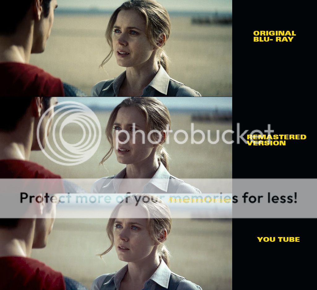 .
.This is interesting, where did you hear this from or is it speculation? Snyder is certainly a fan of heightened colors so the desaturated look of MOS did feel off and I wonder if it was a studio imposed thing. But he's also a pretty big fan of high contrast. One look at 300 will tell you that.Agent9 said:The Contract ratio you speak of used in this picture is a bit too much in my opinion. Its like a 6:1 when it should of been a 3:1 for a Superman film. This film has a very dark look, that Nolan wanted to try to match to the Dark Knight Films. This was a chose handed to Snyder by Nolan and Amir, as was the Post coloring of green overtones (Post Coloring is usually never up to the Director, its usually left up to the DP, the producer and the Studio.) So by saying this was Snyder's chose is inacurite. I can agree that Snyder usually shoots with a good contrast, but he also usually works with Long and its usually never this dramatic. But this time for MOS he had to work with the producers and the studios DP, not his usual, which in turn changed the look of the film - Hence now, if you look at Batman vs Superman, Snyder went back to shooting with Long. That overly green look didn't quite return in the BvS, and you'll also notice the contrast ratio in BvS isn't as dark.
Once Snyder made the movie for the Studio and it was successful, he was then handed a bit more control of the this film (BvS) - Which in return allowed him to grab Long as his DP again and go for a more 4:1 contrast instead of the 6:1 Man of steel looks like it was shot in. Even though MOS wasn't shot at a 6:1 - the Green's added so much darkness to the film when you lift them out, you lose some of your contrast, which I don't necessarily see as a bad thing, I like the look I've created - it's opinion based and that's what I was going for - more of the BvS Style.
DominicCobb said:This is interesting, where did you hear this from or is it speculation? Snyder is certainly a fan of heightened colors so the desaturated look of MOS did feel off and I wonder if it was a studio imposed thing. But he's also a pretty big fan of high contrast. One look at 300 will tell you that.
TM2YC said:^ All those opinions are fine but what about the comparison I posted...
...where the shadows are light-blue, instead of black? (They are barely different in your new uncompressed screengrab). That's not a matter of opinion or taste, it's just wrong. I'm just trying to help this project be the best it can be
As for the "flat" shadows I mentioned... they do look much better in your new uncompressed screengrabs. I think you've brightened them to the very brink where it still looks great but the further YouTube compression just tipped it over in dull flatness. e.g. In your 2nd screenshot from YouTube....

TM2YC said:^ Much better