• Most new users don't bother reading our rules. Here's the one that is ignored almost immediately upon signup: DO NOT ASK FOR FANEDIT LINKS PUBLICLY. First, read the FAQ. Seriously. What you want is there. You can also send a message to the editor. If that doesn't work THEN post in the Trade & Request forum. Anywhere else and it will be deleted and an infraction will be issued.
  • If this is your first time here please read our FAQ and Rules pages. They have some useful information that will get us all off on the right foot, especially our Own the Source rule. If you do not understand any of these rules send a private message to one of our staff for further details.
  • Please read our Rules & Guidelines

    Read BEFORE posting Trades & Request

Buffy - The Prophecy

Status
Not open for further replies.
instead of 'less squished', can you just unsquish it all the way? Also stretching one picture in order to make another less stretched doesn't seem like the best possible solution. Instead of stretching either, just don't shrink them as much. Instead of shrinking the frames to the proper height and stretching them horizontally, shrink them to the proper width, and crop the top and bottom. This way their aspect ratio isn't affected and you get the extra width you need.

on a more nitpickery level - have you tried other colors behind 'edit' besides white? Subjective choice, not a big deal, but there is probably a color, not sure which trial and error maybe, but a color that may do better there.
 
RollWave said:
instead of 'less squished', can you just unsquish it all the way? Also stretching one picture in order to make another less stretched doesn't seem like the best possible solution. Instead of stretching either, just don't shrink them as much. Instead of shrinking the frames to the proper height and stretching them horizontally, shrink them to the proper width, and crop the top and bottom. This way their aspect ratio isn't affected and you get the extra width you need.

on a more nitpickery level - have you tried other colors behind 'edit' besides white? Subjective choice, not a big deal, but there is probably a color, not sure which trial and error maybe, but a color that may do better there.

Thanks for the feedback. I know that stretching is not the ideal solution, but sometimes it's not possible to do different. I redid it and used the image to the left with the school-building to its native width, but the picture to the right needed a stretching, cause cropping from the top or bottom would have eliminated vital information. It's unfortunately a picture with very little native width.

Neglify also told me that a dvd-cover is needed, ie. with front and back-image. I don't intend to issue a dvd-release, it will be only mkv, but still a dvd-cover is needed, so I made one:

bljtuiyy6rsdn1itqrvlyd-large.jpg


Since the original cover I made, the image to the right, goes for a book-feeling, I continued on that path with this dvd-cover.
What do you think of this?
 
NewSpock said:
I know that stretching is not the ideal solution, but sometimes it's not possible to do different. I redid it and used the image to the left with the school-building to its native width, but the picture to the right needed a stretching, cause cropping from the top or bottom would have eliminated vital information. It's unfortunately a picture with very little native width.

it's definitely possible. If you watch the banners at the top of the page, you will never see one that is stretched, they are all cropped. I'm not the person who approves banners, but they do all need to be approved, and seeing as movies with bad aspect ratios never get approved, it stands to reason that your banner will probably be subject to the same standard.

In your case, if you can't make it work with those 2 frames, you probably need to use better images. Instead of using low resolution pictures with vital information in their entire vertical height, find higher resolution pictures, with the most important information only covering a small vertical section. For example, rather than using a closeup of buffy's face, use a normal zoomed out full body shot. That type of shot will actually act as a closeup of her face after you crop.
 
RollWave said:
it's definitely possible. If you watch the banners at the top of the page, you will never see one that is stretched, they are all cropped.

Of course it's possible by searching for another picture to the right, one with more width and more resolution, but that picture I have found captures so perfectly what I want to tell with the banner so I'll work with that one. The stretching by the way is very minimal as to only be perceived when comparing directly with the source. I'm quite content with the result.

What do you think of the dvd-cover?

bljtuiyy6rsdn1itqrvlyd-large.jpg
 
After searching the net for an hour I've finally found a better looking picture of the same/similar image used in the banner. It has more width, a bit more resolution and most importantly a different colour temperature which makes the image imho clearer.

So here's the latest version for the banner:

xgcbtamrlyko6leyp5qkgy-large.jpg


What do you think?
 
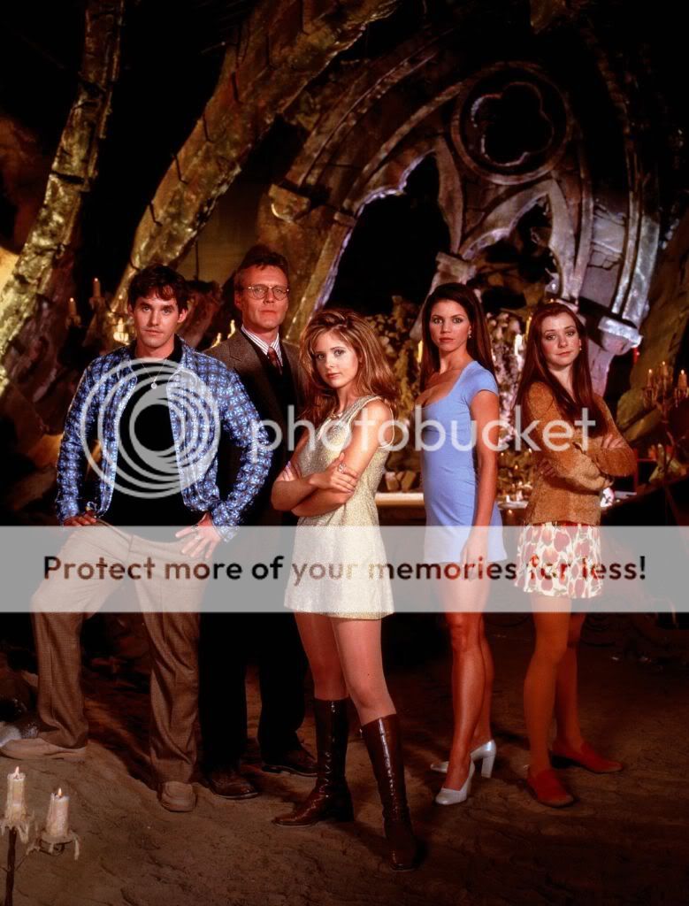
Have you considered maybe putting a cast photo on the back cover? There is plenty of promotional images still on the net that you could grab.
 
I like the revised banner, for sure! And the disc art looks great, too.
 
bionicbob said:
Have you considered maybe putting a cast photo on the back cover? There is plenty of promotional images still on the net that you could grab.

What do you think of this version?

zbjatypzrhmowtb7mic6fh-large.jpg
 
back cover is clearly stretched horizontally to make buffy look fat.

for 'cast photo' he was thinking something like:


BuffyCast-S1_1_zps62b10c88.jpg

and you could crop a lot of the top and bottom to make it fit better if need be. Don't stretch it though.

The photo you are currently using is fine though, you just need to correct the aspect ratio.
 
I agree, it definitely looks stretched. Also, the basic picture has sort of off center feel to me that I don't think works for a main (only) back cover pic.... though if you cropped out some of the left hand shadow it might work better imo.
 
I had the pleasure of watching the evolution of the fan edit over several months, and watching NewSpock grow as a storyteller and Fan Editor. The following is my review:

VIDEO/AUDIO QUALITY 8 out of 10
This is a MKV-Only Release, so I watched it on my computer and the video is good, especially when one considers how poor season one of the original source material is.... There was one or two video glitches and the picture quality takes a dip where you have zoomed in and cropped to remove title cards, but it is acceptable as it all serves the story. The audio is terms of sound seemed fine for a MKV release.

VISUAL EDITING 8 out of 10
Did not notice any flash frames but some of the cuts could have used slight more padding and some of created commercial breaks could have been smoother and more polished.

AUDIO EDITING 7 out of 10
There is fading in or out of audio during mid-dialogue during some transition scenes and a scene where you can hear the Master just starting to laugh on a transition into a new scene. Audio fan editing is the hardest to master (I am still learning) but I think you have made remarkable improvement.

NARRATIVE 8 out of 10
Editing episodic television into a cohesive 2 hour story is the hardest type of fan edit to create and you have done a very good job. The story has a clear beginning, middle and end. The two Flashback solutions are clever, though still a bit choppy but they accomplish their tasks. The Dream Subplot is a refreshing twist, though not always clear. But all the characters are well developed and the plot is solid and swift.

ENJOYMENT 8 out of 10
This is a fun movie and should appeal to Buffy fans. Thanks for the entertainment. Thumbs Up! :thumb:
 
RollWave said:
back cover is clearly stretched horizontally to make buffy look fat

And that's how our little girls get a distorted body image.

;)
 
bionicbob said:
I had the pleasure of watching the evolution of the fan edit over several months, and watching NewSpock grow as a storyteller and Fan Editor. The following is my review:

VIDEO/AUDIO QUALITY 8 out of 10
This is a MKV-Only Release, so I watched it on my computer and the video is good, especially when one considers how poor season one of the original source material is.... There was one or two video glitches and the picture quality takes a dip where you have zoomed in and cropped to remove title cards, but it is acceptable as it all serves the story. The audio is terms of sound seemed fine for a MKV release.

VISUAL EDITING 8 out of 10
Did not notice any flash frames but some of the cuts could have used slight more padding and some of created commercial breaks could have been smoother and more polished.

AUDIO EDITING 7 out of 10
There is fading in or out of audio during mid-dialogue during some transition scenes and a scene where you can hear the Master just starting to laugh on a transition into a new scene. Audio fan editing is the hardest to master (I am still learning) but I think you have made remarkable improvement.

NARRATIVE 8 out of 10
Editing episodic television into a cohesive 2 hour story is the hardest type of fan edit to create and you have done a very good job. The story has a clear beginning, middle and end. The two Flashback solutions are clever, though still a bit choppy but they accomplish their tasks. The Dream Subplot is a refreshing twist, though not always clear. But all the characters are well developed and the plot is solid and swift.

ENJOYMENT 8 out of 10
This is a fun movie and should appeal to Buffy fans. Thanks for the entertainment. Thumbs Up! :thumb:

Thanks for the nice review, bionicbob:). It was a pleasure to work with you during the approval-process and it definitely helped to polish the movie's editing.

As to the movie itself, I've uploaded it on mega. I'm just figuring out how to make a dlc of it, so I can put it up on fanedit.info. If someone wants to watch the movie before that, he/she can pm me and I'll give you the links.
 
TV's Frink said:
And that's how our little girls get a distorted body image.

;)

Hehe, I'm not so versed in doing covers and banners, it's my first attempt at this, but I wanted to do it myself cause even if the results don't really compete with the best out there (by far;-)), it's more personal that way.

And who knows, maybe in the future I might get better at it, and some day I might actually create a worthwhile cover.

I loved every minute of making this edit (about 5 months=150 days=18,000 minutes:) (probably more because of the weekends)). The most difficult aspect was not so much the technical side, of achieving a good picture/soundquality, good and smooth transitions... although these things needed also their time to learn (and bionicbob hitting me with a stick;-)).
The difficult side was to create a cohesive story, to make the scenes flow well, to get the pacing right and to achieve a consistent style and tone throughout the movie.

And to keep it interesting and fascinating.

Sometimes I cursed and wished to be able to reshoot certain scenes, but at the end I found solutions even for these hard nuts. The most interesting aspect I learned from this is that it's possible to rewrite story-elements through creative editing.

I think that this is a good start for the Buffy-movie-series I plan. Soon I'll start with season 2. Of course it won't be possible to make one movie for all of season 2, there is just too much interesting things going on in season 2, but maybe it's possible to make three or four interesting movies out of season 2, one building upon the one before.:)
 
Good news: Buffy The prophecy can now be found as a dlc on fanedit.info

It's a 2,9 GB mkv-download through the hoster mega. Password is: fanedit.org

Enjoy!:)

Other news: I've started preliminary work on Buffy 2, continuing the saga with a movie based on season 2 (I think it will be four movies for season 2 alone).
 
No linking to download sites, including info.
 
Neglify said:
No linking to download sites, including info.

Sorry, didn't mean to create a link, my mistake.

As to potential watchers: Please make sure to watch beyond the credits, there is a worthwhile post credit scene.
 
NewSpock said:
there is a worthwhile post credit scene.

We'll be the judge of that.


;)
 
Status
Not open for further replies.
Back
Top Bottom