• Most new users don't bother reading our rules. Here's the one that is ignored almost immediately upon signup: DO NOT ASK FOR FANEDIT LINKS PUBLICLY. First, read the FAQ. Seriously. What you want is there. You can also send a message to the editor. If that doesn't work THEN post in the Trade & Request forum. Anywhere else and it will be deleted and an infraction will be issued.
  • If this is your first time here please read our FAQ and Rules pages. They have some useful information that will get us all off on the right foot, especially our Own the Source rule. If you do not understand any of these rules send a private message to one of our staff for further details.
  • Please read our Rules & Guidelines

    Read BEFORE posting Trades & Request

Blade Runner: The Penultimate Cut (TM2YC)

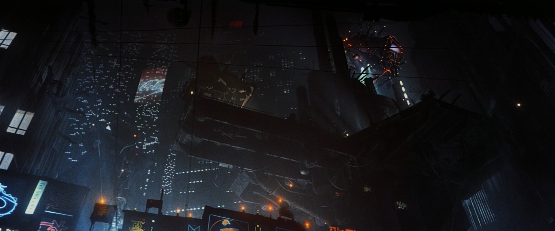
FYI: This is a screengrab of the shot (from the making of) before the teal grade was applied (and I'm nowhere near that):

48397914342_e47b6b20a6_c.jpg


In other news, I've finished blending in the final cut fixes (if I haven't missed any) and recutting the project to match the FC edit. I'm gonna render it off and see how much more work needs doing.

I'm at the point where I need to make fanedit credits but I still haven't decided on a title. One that occurred to me today:

Blade Runner: The Penultimate Cut

If Ridley's preferred Final Cut is the "Ultimate Cut", in the sense that it's the last and furthest, then mine is one back from that, one closer to the original.

I'm always open to title suggestions :) .

I received another copy of Blade Runner from eBay today because you can never have enough :D . The "30th Anniversary Collector's Edition" 3xblu-ray set because it has all the bonus features on a 50GB blu-ray disc, rather than spread over several DVDs like all(?) the other releases.

49102179621_358ef64eb6_c.jpg
 
I honestly think your grade looks better than the one you showed in the making of. May just be because yours is a higher quality image but I don’t think so.

Nonetheless, excellent work.
 
TM2YC said:
I'm always open to title suggestions :) .

Well... if you finish it this year, Blade Runner 2019 would fit with your release year, the year the movie takes place, and with 2049... :p
 
Gaith said:
TM2YC said:
I'm always open to title suggestions :) .

Well... if you finish it this year, Blade Runner 2019 would fit with your release year, the year the movie takes place, and with 2049... :p

I actually quite like this idea.
 
Gaith said:
TM2YC said:
I'm always open to title suggestions :) .

Well... if you finish it this year, Blade Runner 2019 would fit with your release year, the year the movie takes place, and with 2049... :p

Damn, I like that idea a lot. If only you'd suggested it last November, then I would have worked harder on trying to get it finished within 2019 :D . I might still be able to get it finished in the next 4-weeks, I'll see. It'd make it the 2nd TM2YC edit with a Gaith title.
 
Maybe I'm over thinking the dove shot, maybe just creating a new matte-painting "set extension" (to match all the other mattes in the finale) for the original shot of the dove would be the best way. It's the blue sky that is the big problem, not the building in the foreground.

Another rough b&w mockup:

49107676831_4beb2f5a07_c.jpg


Same principle as shots like this:

7a9cca0ce835420501636eb1473e777c.jpg


but with this kind of stuff going on:

img02.jpg


D5ArogIW0AEAvSd.jpg
 
TM2YC said:
Damn, I like that idea a lot. If only you'd suggested it last November, then I would have worked harder on trying to get it finished within 2019 :D .

Well, even if you don't complete it in the next weeks, it'll still be the in-universe story year and fit with 2049... And hey, did I mention you could call your TFF edit Star Trek: Paradise - The 2020 Hindsight edition? :p

 
TM2YC said:
Another rough b&w mockup:

49107676831_4beb2f5a07_c.jpg

And now I'm wondering if the whole movie should be grayscale?!

 
Gaith said:
And now I'm wondering if the whole movie should be grayscale?!

Have you seen Ranger’s Tears in the Rain? It’s really beautiful in B/W. Though I’d still prefer to have this color corrected version; the B/W is a nice companion.
 
Gaith said:
And now I'm wondering if the whole movie should be grayscale?!


I meant to post that. It's lovely bit of editing.
Moe_Syzlak said:
Gaith said:
And now I'm wondering if the whole movie should be grayscale?!

Have you seen Ranger’s Tears in the Rain? It’s really beautiful in B/W. Though I’d still prefer to have this color corrected version; the B/W is a nice companion.

Yeah I did the Academy review: https://forums.fanedit.org/showthread.php?tid=10005&pid=213063#pid213063

A highly recommended edit, not just because it looks fab in b&w but for the radically reworked story.

I had a go at doing a "storyboard" type mockup for the dove shot. I'm no Syd Mead :D but you get the gist:

49109603961_0c5b8f4cd7_h.jpg


49109770876_4d98d124b4_k.jpg
 
I like Tears in the Rain, but personally I don't like how Blade Runner looks in Black and white.
 
the dove shot doesn't work without a sky. it's roy's "soul", set free. somehow, the dove flying away into claustrophobic surrounding doesn't have the same effect.
regarding color, have you tried drdre's color matching tool on that shot?
 
Plissken1138 said:
the dove shot doesn't work without a sky. it's roy's "soul", set free. somehow, the dove flying away into claustrophobic surrounding doesn't have the same effect.

I'm going for a shaft of heavenly light, which is a similar symbolic ball park but yeah, you make a good point. The problem with achieving that and matching it into the surrounding footage is that all we see whenever the camera looks up (on set and in the matte paintings) is blackness and buildings (big image):

49111772562_7268ebb23a_o.jpg

Plissken1138 said:
regarding color, have you tried drdre's color matching tool on that shot?

Wouldn't that need footage that looked correct to match it to?
 
Yeah, I didn't mean blue sky per se, I'm still most in favor of just color corrected FC shot, but if you're going for extended buildings than ray of light is great idea.
And you're right about color match... Don't know why I imagined there are earlier FC editions.
 
Plissken1138 said:
I'm still most in favor of just color corrected FC shot

I'm still exploring that option too. I've more or less started again with the grade on the dove shot and this attempt is much more successful than the last (the ungraded FC shot is included at the end for comparison). youtube and vimeo uploads:


(Password: fanedit.org)


Grading the little neon signs to an appropriate level or rich saturation is proving tricky because it also boosts the strong teal tint surrounding them but I'll keep working on that. I'm also need to look into grading the dove so it has the blue tint of the preceding shot, or tone down the blue in the other shot.

btw I was using this shot from the start of the film as inspiration:

49112348346_b47af6b256_k.jpg
 
Stunning result! I'd say tone down blue dove in preceding shot, it's far less frames to deal with.
 
Plissken1138 said:
Stunning result! I'd say tone down blue dove in preceding shot, it's far less frames to deal with.

I'll do both probably. I'd already isolated the dove in the first shot (months back) to actually increase the blue, in line with my reference transfer colours. So I can just delete that layer. Isolating out the dove in the 2nd FC shot will be fiddly but not difficult.

For the bonus/alternate cut (still needs a title), I've finally finished going through the 3.5-hr 'Dangerous Days' doc and extracting all the film shots (50-mins worth). It's not all alternate takes and angles but most of it is. It needs putting into story order and then I can begin integrating into my alternate cut.

This shot from the doc can be used to fix the sun that they re-composited (and ruined) for the digital restoration:

49129351548_daed26a68c_c.jpg


It's a sharper and (more) stabilized source than my old DC DVD, which I was forced to use. So hopefully I can swap in this new source seamlessly. You can see the difference in these screengrabs I did:

48509849086_f8ab9fb763_h.jpg


It's featured in the doc because one of the FX guys responsible is saying this one shot is the thing he's most proud of in his career because of how technically difficult it was to achieve (not least because Sean walks right across the frame). It'll be nice to put it back the way he did it originally :) .
 
The first part of the bonus cut I'm working on is done, up to the end of the noodle bar scene. I think every deleted/non-FC shot is in there:


(Password: fanedit.org)

2-mins of video in this opening 9-mins is Workprint material (that is also in the Final Cut), the other 7-mins is all deleted material, alternate takes and different angles.

I was considering doing some light grading to match in the sources but I kinda like seeing it all in it's unfinished/damaged state. I'm undecided.
 
I started watching out of curiosity and ended up glued to my seat. It's fascinating seeing alternate versions of scenes I'm so familiar with.

Oh, I also watched the UHD transfer of The Final Cut a week or two back. The resolution looks absolutely stunning, and the colors mostly match the FC. However, some of the teal seems more balanced, and I noticed the unicorn shots are now tinted a slight blue-green-teal color. So now there are 3 historical unicorn colors: sepia, white/desaturated, and teal!
 
Siliconmaster said:
I started watching out of curiosity and ended up glued to my seat. It's fascinating seeing alternate versions of scenes I'm so familiar with.

Thanks. What did you think of the mis-matched colour grading? Interesting, or distracting?

By the way, I found another 30-mins of outtakes combing through all the bonus featurettes. There are a few more shots to go into the Holden and noodle bar scenes. I'm pretty sure I've got it all now.

Siliconmaster said:
now there are 3 historical unicorn colors: sepia, white/desaturated, and teal!

I think I'm going to go with slightly sepia, a mid point between the natural grey colour and the DC tint.
 
Back
Top Bottom