• Most new users don't bother reading our rules. Here's the one that is ignored almost immediately upon signup: DO NOT ASK FOR FANEDIT LINKS PUBLICLY. First, read the FAQ. Seriously. What you want is there. You can also send a message to the editor. If that doesn't work THEN post in the Trade & Request forum. Anywhere else and it will be deleted and an infraction will be issued.
  • If this is your first time here please read our FAQ and Rules pages. They have some useful information that will get us all off on the right foot, especially our Own the Source rule. If you do not understand any of these rules send a private message to one of our staff for further details.
  • Please read our Rules & Guidelines

    Read BEFORE posting Trades & Request

The Font Help Spot

thunderclap said:
Damn. How did I miss that?

lol. not looking? the same way everyone else does... :p so hows about merging this thread there?

thunderclap said:
I think it's Eurostile Extended #2 but not 100% sure.

Definitely not Eurostile Extended #2. Zep is really close with Karat Medium Regular. There are some subtle differences. For instance, the legs on the A have flat bottoms, while they are angled on Karat. However, more importantly the angle of the L and the points on the N match really nicely. You could get away with using this one. You would want to modify the verticle stretching to match perfectly (its less than 100%, i.e., slightly squished in the ALIEN title).

Since this is a free font, there is probably a pay font that Karat is based off of that matches even better what they used for Alien. But this would be a good substitute. I wouldn't use the Karat "3" though. It's different than the one used in the ALIEN title.
 
ThrowgnCpr said:
There are some subtle differences. For instance, the legs on the A have flat bottoms, while they are angled on Karat. However, more importantly the angle of the L and the points on the N match really nicely. You could get away with using this one. You would want to modify the verticle stretching to match perfectly (its less than 100%, i.e., slightly squished in the ALIEN title).
Actually, the legs are indeed angled in the Alien title.
It's easier to see if you drag the picture in the first post into the address bar or if you just click here
I was going to say that the Alien title is a bit wider, since the vertical legs on the N are wider than the slant, but what you said about the vertical stretching makes sense too.
The title is either stretched wider or squished downer :-D

Edit: If you download the font from whatfontis, in the zip file there is a vendinfo.diz file that states
High resolution ITC Kabel clone. Matching AFM font metrics, full char complement, kerning pairs. Digitised to accuracy of 2000x2000 grid. Professional quality for laser, inkjet printers or imagesetters from 300-3500 dpi. Truetype & Postscript (with AFM PFM INF CFG files).
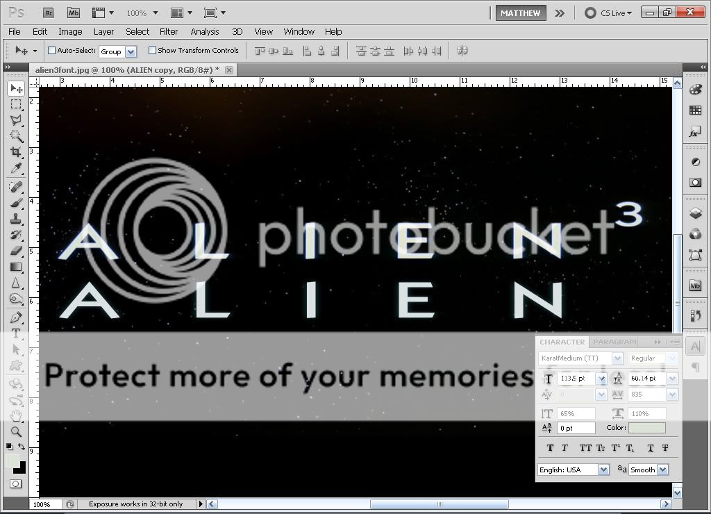
So ThrowgnCpr was also right about it being a clone of a commercial font.
 
yes, you are right. The change in angle seems to be an artifact of the stretching process. For shits and giggles, I tried to match it (using Karat Medium Regular) in Photoshop. I think its spot on (I also applied a blurred duplicate layer to match the title more closely. Original title on top, Karat recreation on bottom:

AlienKarat.jpg


http://i129.photobucket.com/albums/p203/ThrowgnCpr/faneditorg/AlienKarat.jpg
 
There is no "3" on the perfect re-creation of the title.
SLACKER!
:boxing:

But seriously - nice job :clap2:
 
I personally would like to thank you both, zep/throw, this font will definately come in handy :D
 
zeppelinrox said:
There is no "3" on the perfect re-creation of the title.
SLACKER!
:boxing:

But seriously - nice job :clap2:

lol, well I knew it wouldn't match at all, so I just left it off. I would have to search through my other fonts to find a 3 that fit better. Thanks for the kudos, but you deserve some applause too - identifying a font can be a pain in the arse. I left the character settings displayed on-screen for Thunderclap (click the link for full size image). Hopefully he finds it useful :)
 
I was wondering if anyone could help me out with figuring out what a few font styles are.

1)

KOCBMenuFeaturesFont2.jpg


2) Ok I also figured this one out myself from whatthefont
(Sutro Condensed Bold) and 1) is a bigger font size

(anyone know where i can get a free version of this or a similar font?)

KOCBMenuFeaturesFont.jpg


3) I figured this one out from whatthefont:
Nimbus Sans Novus Cond Black

(Anyone have any idea where I could get a free version of this font, or something similar?)

TheKillingFont.jpg


-----------------------

Well I came up with a possible solution. I'll have to test it out to see if it works, but if you go to www.fonts.com you can search a font style, and they will let you preview/try typing out the font. You can pick background color and font color and size. You enter the text in. Then it shows up as a PNG (which you can then save). If I can get a better handle on photoshop hopefully I can get this to work.
 
Ok I actually do need to find out if there is a way i can get "Sutro Condensed Bold" for free or if someone can recommend a font that is similar to it.
 
I was just wondering if anyone knows which font was used for the places/times in "Highlander: Endgame".
 
Mark Moore said:
I was just wondering if anyone knows which font was used for the places/times in "Highlander: Endgame".

please post a screenshot
 
hmm, didnt find an exact match, but the following are relatively close:

Calisto MT
Minion Pro
Adobe Hebrew
 
ThrowgnCpr said:
hmm, didnt find an exact match, but the following are relatively close:

Calisto MT
Minion Pro
Adobe Hebrew

Thanks. :)
 
Does anyone know what font was used for the title "dogma" on this dvd?
Dogma--Cd-Cover-33749.jpg


Im not sure if this is the right place to post this or not. If it isn't im sorry and please move it.


Thanks
juice
 
juice4z0 said:
Im not sure if this is the right place to post this or not. If it isn't im sorry and please move it.

It's not a problem, but in future always check the stickies. :)
 
Anyone know the Lost Highway titles/poster font or at least a reasonable lookalike? I don't need the letters to be split like the ones in the movie, which was probably custom made. I'm okay with a font that looks reasonably like it. Thanks!

lost-highway.jpg
 
Back
Top Bottom