• Most new users don't bother reading our rules. Here's the one that is ignored almost immediately upon signup: DO NOT ASK FOR FANEDIT LINKS PUBLICLY. First, read the FAQ. Seriously. What you want is there. You can also send a message to the editor. If that doesn't work THEN post in the Trade & Request forum. Anywhere else and it will be deleted and an infraction will be issued.
  • If this is your first time here please read our FAQ and Rules pages. They have some useful information that will get us all off on the right foot, especially our Own the Source rule. If you do not understand any of these rules send a private message to one of our staff for further details.
  • Please read our Rules & Guidelines

    Read BEFORE posting Trades & Request

L O S T - The Abridged Film Series

RollWave said:
Regarding needing to recognize the actors in credits - its pretty trivial to create custom scrolling credits to play at the end. The IMDB page will list all the actors names next to their character names, and I'm pretty sure all video editing software have media generators for scrolling credits. I'd be surprised if it took you more than 10 minutes to type in the 30 or 50 names or whatever it is you want to use. And you can recognize some writers, directors, etc similarly if you want. Might take a little bit of time to format it exactly how you want and find a song or sound clip to play while they scroll, but this really is not a major undertaking.

Since the new format is as a movie, it will help it feel more like an actual movie if it has scrolling closing credits like every other movie.

I hear you. But considering that the major acting, writing, directing and producing credits already appear during the film (and IMO there is absolutely no way to take them out), I think adding an end credits sequence would be redundant.
 
Just an update on this edit.

I've rendered a 1080p version of the first movie that should be done uploading in the next few hours. After it has been approved, I'll be happy to provide links to anyone who wants them. There is also a DVD5 version already uploaded for those who want it.

The 1080p version clocks in at around 5 GB for a 3.5 hour film. This amounts to about 1.5 GB per hour. I am pretty satisfied with the picture quality of this version, though those looking for a completely perfect copy will have to wait until I release a 10 - 20 GB version some time in the far-flung future.

Just a quick point of interest. Periodically throughout the film, there do appear some in-show credits over the image. Anyone who is familiar with LOST would surely agree that as TV show credits go, they are extremely non-intrusive.

My first priority when making this edit was to create a version of LOST that I enjoy. I have therefore decided that short of manually painting over every instance of the credits that appear in the show, no other method of removing this text would be a better solution for me than leaving them in. LOST is an inherently cinematic show, and I don't feel that cropping the image to remove the credits is worth the picture that would be lost in doing so. Please understand that I have not left them in for any reason other than my desire to present the show in its best possible light.

Laziness or a desire to "get the edit over with" has not played a part in my decision to leave them in - unless you count an unwillingness to manually paint over thousands of frames of credits as "laziness."

Again, these credits are unobtrusive and very rare (probably taking up little more than a minute or so of screen time across a 3.5 hour film)., and so I don't view them as an issue at all. However, I thought that I should let you all know about it before you download the film - just in case it is an issue for you.
 
Neglify has just approved the 1080p version of my film, so anyone who wants to download it (or the DVD5 version) can PM me for the links.

I'm just in the process of creating a poster and trailer for the film now, and so if all goes well the edit should be listed on IFDB by next week.
 
Wow, this sounds spectacular.

Even though I loved every minute of the original show including the final season and the ending, I'm more than interested to see what the show would look like without the aspects that don't go anywhere.
 
just got done watching this. beautifully executed and to my ears and eyes i saw nothing at all wrong with it.
Job well done, looking foward to future editions.
 
jswert123456 said:
just got done watching this. beautifully executed and to my ears and eyes i saw nothing at all wrong with it.
Job well done, looking foward to future editions.

I'm glad to hear you liked it.

Just by the way this is the preliminary poster for the first film, entitled Genesis. If anyone has any suggestions on it, let me know. Otherwise, this will be the poster I submit to IFDB.

zuc3.jpg


Hm, a bit pixelated and imo the font should be a bit brighter.

Really excited for this fanedit - maybe this will finally end my post-lost therapy sessions! I was already toying with making a "plothole" free version of lost so thank you for doing the job for me so i can be a lazy guy who just watches :D
 
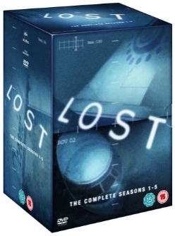
Not bad! Personally, I hate pretty much all Lost marketing, both the cover and poster concepts and the horrid and un-Lost-y font they used (Impact, the LOLcat-font). I prefer the few covers that uses the more series-appropriate Futura font, like the now obsolete seasons 1-5 box cover:

Seasons_1-5_box_dvd.jpg


So if I would suggest a change, it's trying the title in Futura instead.
 
jswert123456 said:
i would focus more on dvd artwork rather than a poster.

Correct. Like I said in my PM, cover art is require. This is more than just a poster.

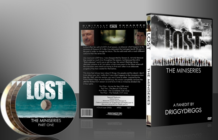
Example:

LOSTset_3Dview.jpg
 
That's a pretty badass cover there, Neg.
 
Neglify said:
Correct. Like I said in my PM, cover art is require. This is more than just a poster.

Example:

LOSTset_3Dview.jpg

Wow. Okay, thanks. It looks like I've got a bit of work to do.
 
Let's not completely overwhelm him here ;-)- the cool "3d" effect is something you DON'T need to worry about. That is done by some sort of software when you submit your artwork.

Basically you just need two things:
(1) DVD Cover Art (which includes a front and back, the connecting "spline")
(2) DVD Disc Art (though I'm not 100% sure this is required)

Both of the above have templates that you can load into photoshop or a program that supports photoshop files.

There's a resources section in this site that might have download links; otherwise, I know they are available somewhere in some thread. Hopefully someone can dig up a link for you.

So try not to stress out! And also, your cover art does not have to look as good as what Neglify posted. Essentially it just needs to exist, that's all. (I mean, do try to make it look nice, but don't stress if you aren't a skilled artist! -- I'm certainly not!)

Hint - use google to pull down a high res version of the DVD cover art and use that as a starting point. I think that's what a lot of people do. The important thing is to get the dimensions right, which is what the aforementioned templates can provide you.

Finally, there's a cover art forum (or two) in the tech area which you can ask more questions regarding how to actually get this done if you feel overwhelmed or run into trouble.

Hope some of this helps!
 
Thanks for the help. Neglify provided me the templates you're talking about, and I've made up something I'm reasonably satisfied with. It's certainly not as good as the example he provided, but I think it'll do just fine if its only criterion is "to exist." I think I can nail that one okay.
 
Here's the official trailer for the first film, entitled LOST I - Genesis:


So here's what I've come up with for my DVD cover and disc art. I changed the font to Futura, which is used in the LOST logo, and I've added some info on the back of the DVD.

915f.jpg


2m7t.jpg
 
Looks fine to me. My only suggestion would to maybe use white instead of red for the majority of the text, especially on the "front cover" which is what will be displayed the vast majority of time with your edit. The red makes it hard to read and also it doesn't stand out very well. You want to catch people's eye just a bit, and I think changing either all the text to white, or all of it except perhaps the number (or the word GENESIS) would improve readability and noticeability.

OR...use a white background instead of black?

Just some ideas that are easy to implement.

Either way, congrats on getting your final requirement done! :)
 
seciors said:
Looks fine to me. My only suggestion would to maybe use white instead of red for the majority of the text, especially on the "front cover" which is what will be displayed the vast majority of time with your edit. The red makes it hard to read and also it doesn't stand out very well. You want to catch people's eye just a bit, and I think changing either all the text to white, or all of it except perhaps the number (or the word GENESIS) would improve readability and noticeability.

OR...use a white background instead of black?

Just some ideas that are easy to implement.

Either way, congrats on getting your final requirement done! :)

Thanks for the advice, but I think that the colours stand out well enough at full size - though perhaps people won't be seeing it at full size very often.

As to your suggestion about using white, that colour has a special significance in LOST, so I'll be saving it for use at a later date. I want each of these DVD covers to be visually distinct but thematically linked, so that when they're all put together, they'll contrast each other but seem to be part of the same set.

Thanks for the advice all the same.
 
does anyone know what Lost 1-genesis is.i tried a search and nothing.it was released on .info
 
Back
Top Bottom