• Most new users don't bother reading our rules. Here's the one that is ignored almost immediately upon signup: DO NOT ASK FOR FANEDIT LINKS PUBLICLY. First, read the FAQ. Seriously. What you want is there. You can also send a message to the editor. If that doesn't work THEN post in the Trade & Request forum. Anywhere else and it will be deleted and an infraction will be issued.
  • If this is your first time here please read our FAQ and Rules pages. They have some useful information that will get us all off on the right foot, especially our Own the Source rule. If you do not understand any of these rules send a private message to one of our staff for further details.
  • Please read our Rules & Guidelines

    Read BEFORE posting Trades & Request

Kill Bill Roaring Rampage Edition

Sinbad said:
Tweaked opening, had some feedback on this thats its quite jarring when the kill bill titles kick in, I kinda wanted it to startle the viewer a bit, more feedback appreciated or alternate approach. I dont wanna change the silohouette thing though..


[video]

The following is feedback from me, is my opinion, and is not intended to hurt feelings or praise or troll, but to provide critique for what I think doesn't work. 

  • The audio edit (from the "my baby shot me down" song to whatever the new song is) works, IMO. 
  • The cartoon filter effect doesn't look very good. Even in thumbnail form it's visibly pixellated. I get what you're going for but it doesn't work. Just looks like a stock cartoon filter that comes with any editing program. If I were watching something and I saw it use a filter like that, I wouldn't finish watching, fan edit or otherwise. I think you can achieve an acceptable effect without using such an extreme filter.
  • The scrolling text looks low resolution, you might want to create a very high resolution PNG image file and scroll that instead of what I assume is text generated in your editing program. Also, I'd keep it one solid color, the red border doesn't look very professional and the yellow doesn't need it. 
  • I don't think the timing is quite right with your stamp graphic, I'd place it at the end of the music and let it sit over the fade to black. 
  • The voiceover sounds too compressed, like you're laying a low bitrate mp3 onto the movie's sound. Not sure if you tried to use Noise Reduction to remove music or if you had to use a compressed source for some other reason. 
  • There's a weird audio glitch at 1:00 after the voiceover that can be fixed with a fade-in. 
  • The reversed shot works fine. As Throw said, the smoke doesn't cause problems.
 
Dont mind negative feedback at all I'm first to admit the graphic/title  side of things is not my strong suit antything that makes the edit better
Any suggestions on a suitable filter, I've altered the speed of the clips so I need something that will hide frame blending thats why i used a filter to hide it.

The Kill Bill logo I can sort

The audio glitch at 1:00 is actually the sound of the crowd in the church i'll see if I can rip the music element only its more apparent because the scene is playing backwards and the shot that matches it is at the end of the scene now. I left it in because the fade in of the music sounded forced bringing it in later.
Yeah I've noticed a raspiness on the voice over too , i may need to rerip the entire audio from both movies again to solve that for approval

I put the stamp at the end originally and left it on 1or 2 secs after fading the video, should be in a earlier post, neither look quite right to me tbh

The reason I'm not working with raw files is I wanted to hardcode all the subs.

Thanks for the feedback!!
 

@"addiesin" I've managed to address the audio issues you highlighted, and done a higher quality sample render, I would be curious to know if the fact I'm using silohouettes masks any frameblending where I've tweaked the speed. It doesn't look too bad to my eyes in natural motion withought screenshotting frames
 
maybe a transition or fade out  before the kill bill color sequence begins at the first of this edit.
 
maybe I'll see how the feedback goes on the latest titles
 
Whoa. That's quite impressive. I remember asking way back if anybody here knew how to take the detail from the blu-ray and layer it over the colour of the DVD. I thought it must be possible. Great work, that guy.
 
Sinbad said:

It's lookin' good so far but here is some feedback if you don't mind...

- The quick switch from Sinatra to the new music just about works. Do you need the brief Sinatra intro though?
- Love the idea of the new Kill Bill title moving slowly across the screen. Very Tarantino style. The yellow could be a little more orange if I'm picky. Also is the title supposed to be partially transparent?
- The new titles overlaid on the Twin Pines scene do not look like something Tarantino would use and I don't like the font, or the black outline. This website: http://annyas.com/screenshots/directors/quentin-tarantino/ is very good for getting ideas on how titles should look and I've linked it straight to the Tarantino section for you. Have a look at the Hateful Eight titles. It uses Tarantino's trademark shade of warm yellow, over the pale snow. e.g.

he-qt-13.jpg


That might work for the Twin Pines scene. Not sure what the exact font for that is though.
 
Great feedback I'll check that site out! Yes i' ve been considering leaving those first two credits silent. How's the silohouette thing as it stands in the fixed titles is there any problem with it as I have played with the speed in a couple of clips to match the music. Also the stamp thing im a little unsure on how I can improve it..

I did take the opacity down a little on the kill bill logo just so the action was completely blocked behind, thoughta on that appreciated..
 
The solid yellow title looks better, though I would personally make it opaque. It's still a dynamic sequence even if some of the action is obscured or covered.

The footage behind it looks much better, I'm watching on mobile and it looks good in motion to me now. No more cartoon filter but the colors are still bold, it's been a while since I've seen the original fight sequence, so what you changed its no longer obvious there, good job.

The audio quality of the voiceover sounds better I think too. Didn't use the same headphones to check though.

..

Just try playing around with the stamp timing. That last music hit should feel like it matches the graphic halting its motion. Like the stamp's size adjustment and the song both end at the same time. With it synched right, the music becomes like a sound effect. This is all just personal preference, what you have right now is fine I think if you like it.

TM2YC has good thoughts on other things. You're almost there with it though.
 

Another play with the opening credits to hope make them a little more Tino-esque
 
Sinbad said:

Another play with the opening credits to hope make them a little more Tino-esque

Much better but still not quite right IMO.

- Music fades up too suddenly after the fe.org intro. Take some time to fade it up slowly against black if need be. The new music choice is excellent.
- The yellow on black titles look perfect.
- Opaque Kill Bill title looks better.
- Forgot to mention that I don't think the red stamp rampage thing looks right. Any other ideas?
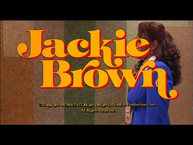
- Yellow text on the Twin Pines looks much better but the glowing red outline doesn't look Tarantino style to me. He tends to favour a sharp offset drop shadow like this...

640full-jackie-brown-screenshot.jpg


A black drop shadow would also work.
 
yeah i noticed the music comes in too  quick, ill try and get that offset right with the red too. The font was the closest i could get without paying £30. yeah im gonna redo the stamp i think its not working how I hoped. i was gonna use a thump sound effect but wouldnt work with the music being as bombastic as it is. Think its getting there now though personally apart from the stamp and the font outline (i need to get the hang of the offset thing) Those were the things I was expecting to be picked up on this time. Next time will be the charm I think
 
Sinbad said:
5x4o54.png

30d9ggo.png

4h2hqe.png

25qc2ns.png

2gwsx82.png

Its certainly has more detail and is more vibrant than my dvd version, obviously close up scenes tend to look better.


Added spoiler tags to giant wall of images.
 
I've got rid of the chapter cards and instead I show a title card for each member as the story moves to their confrontation with The Bride.  I've moved the writing of the Death List Five from the end of KB1 to the sword ceremony early on in my version. 

Some feeback on these title cards would be good too guys, thanks in advance


Think Ive sorted the font issue too

Oren

Vernita Green

Elle Driver

Drop Shadow
zsn4tg.png
 
Pretty much finished with this edit now. took out the sofie fatale deleted scene where she loses her other arm as it creates a reverse continuity error whatever you might call that and extended Bill and the Brides metting at Two Pines. Runtime now 192 Mins
 
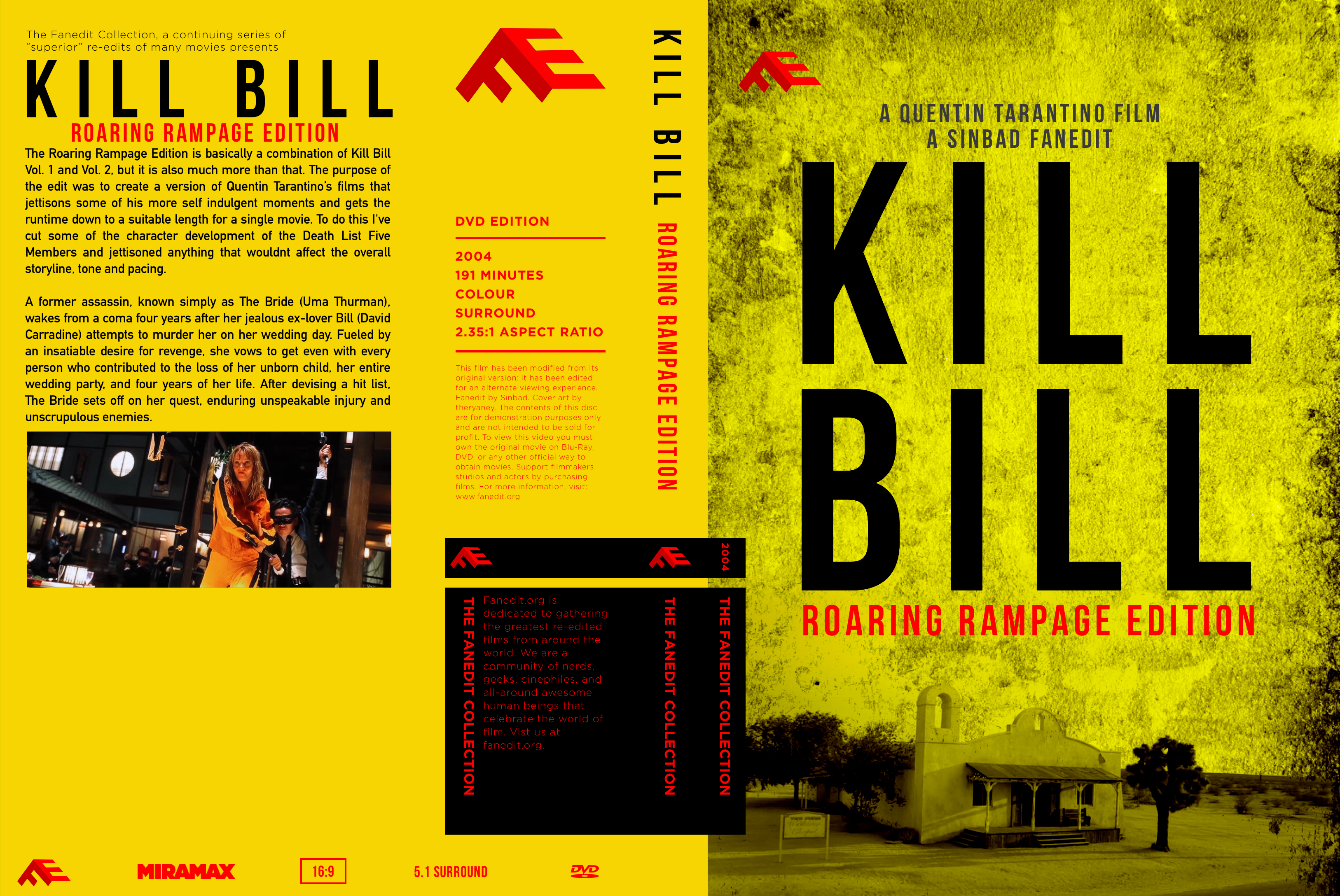
This took some time, but here is my cover art, @Sinbad! :)

artboard-copy-791.png


Hope you like it! ;)
 
i changed my  covers an d used your description.
it felt like it summarized the purpose of the edit better for the cover.
 
jswert123456 said:
i changed my  covers an d used your description.
it felt like it summarized the purpose of the edit better for the cover.

Here is my description:
The Roaring Rampage Edition is basically a combination of Kill Bill Vol. 1 and Vol. 2, but it is also much more than that. The purpose of the edit was to create a version of Quentin Tarantino’s films that jettisons some of his more self-indulgent moments and gets the runtime down to a suitable length for a single movie. To do this, faneditor Sinbad has cut some of the character development of the Death List Five Members and jettisoned anything that wouldn’t affect the overall storyline, tone and pacing. 

A former assassin, known simply as The Bride (Uma Thurman), wakes from a coma four years after her jealous ex-lover Bill (David Carradine) attempts to murder her on her wedding day. Fueled by an insatiable desire for revenge, she vows to get even with every person who contributed to the loss of her unborn child, her entire wedding party, and four years of her life. After devising a hit list, The Bride sets off on her quest, enduring unspeakable injury and unscrupulous enemies.

It's updated for a third person view and some grammar points. :)

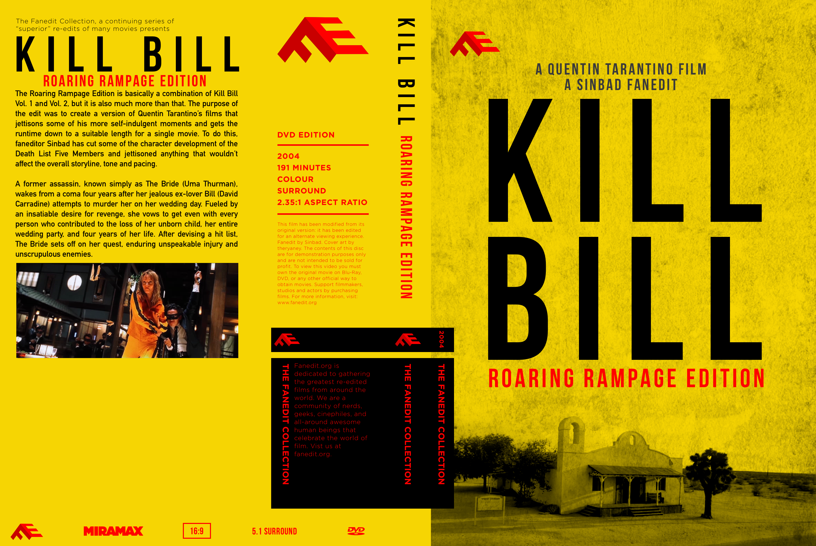
Here is an update on my cover:
artboard-copy-794.png


I changed the picture for the grunge, and polished it slightly.
 
Back
Top Bottom