- Messages
- 4,724
- Reaction score
- 2,544
- Trophy Points
- 148
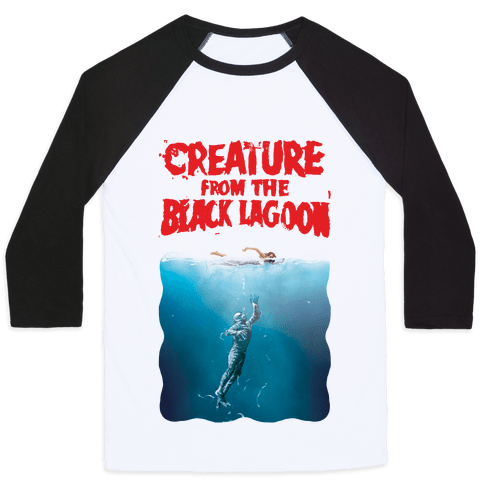
This is an alternate, "silent" version of my Gill-man edit, mixed with John Williams "Jaws" score.
After finishing the Gillman edit, I wanted to experiment a bit and do something more liberal with the film. I love the style of silent movies and after seeing TMBTM's silent edit of The Force Awakens, I felt inspired to go down that same route. Due to the similarities between the two films (CFTBL & Jaws) and the music, I thought that the Jaws soundtrack would be an appropriate choice.
This was originally intended as an extra for the Gill-man DVD, which I'm still working on... But due to the amount of work I've put in so far, I feel like it deserves to be a fan edit in its own right. When the DVD is eventually put together, it will house both versions of the film, but I'd also like both edits to be available separately and have their own spot on IFDB (I assume this is ok?).
As much as I love silent films, I've never made one before... So I'm not entirely sure if I'm doing it "right" or not... I've decided to put up everything I've done so far on Vimeo so as to gather feedback sooner rather than later.
It's been a while since I've worked on it, but I was just reviewing it today. It's only now that I've uploaded it that I can see some things that will need tweaking (Eg. Title cards being cut off at the sides).
Main changes:
Any feedback or thoughts are greatly appreciated!
After finishing the Gillman edit, I wanted to experiment a bit and do something more liberal with the film. I love the style of silent movies and after seeing TMBTM's silent edit of The Force Awakens, I felt inspired to go down that same route. Due to the similarities between the two films (CFTBL & Jaws) and the music, I thought that the Jaws soundtrack would be an appropriate choice.
This was originally intended as an extra for the Gill-man DVD, which I'm still working on... But due to the amount of work I've put in so far, I feel like it deserves to be a fan edit in its own right. When the DVD is eventually put together, it will house both versions of the film, but I'd also like both edits to be available separately and have their own spot on IFDB (I assume this is ok?).
As much as I love silent films, I've never made one before... So I'm not entirely sure if I'm doing it "right" or not... I've decided to put up everything I've done so far on Vimeo so as to gather feedback sooner rather than later.
It's been a while since I've worked on it, but I was just reviewing it today. It's only now that I've uploaded it that I can see some things that will need tweaking (Eg. Title cards being cut off at the sides).
Main changes:
- Prologue is in sepia, rest of the edit is in black and white
- Jaws soundtrack
- Much more streamlined than the B+ edit
- Heavily trimmed and lightly altered dialogue
- Some changes to shots (eg. added extra shot of fossil photo at 3:31 and had it fade into the fossil in the following scene)
- Change in feel. I've drawn some inspiration from Fritz Lang's "Metropolis", using the same font for the title cards and Biblical imagery in the prologue.
") I really like the opening sequence and the font used for dialogue is a very good fit imo. Looking forward to the finished edit. What are we looking at runtime wise about 25-30 mins? Its actually gave me an idea for another edit, *toddles off to Sinbad Ideas thread
I really like the opening sequence and the font used for dialogue is a very good fit imo. Looking forward to the finished edit. What are we looking at runtime wise about 25-30 mins? Its actually gave me an idea for another edit, *toddles off to Sinbad Ideas thread