-
Most new users don't bother reading our rules. Here's the one that is ignored almost immediately upon signup: DO NOT ASK FOR FANEDIT LINKS PUBLICLY. First, read the FAQ. Seriously. What you want is there. You can also send a message to the editor. If that doesn't work THEN post in the Trade & Request forum. Anywhere else and it will be deleted and an infraction will be issued.
-
Please read our Rules & Guidelines
Read BEFORE posting Trades & Request
You are using an out of date browser. It may not display this or other websites correctly.
You should upgrade or use an alternative browser.
You should upgrade or use an alternative browser.
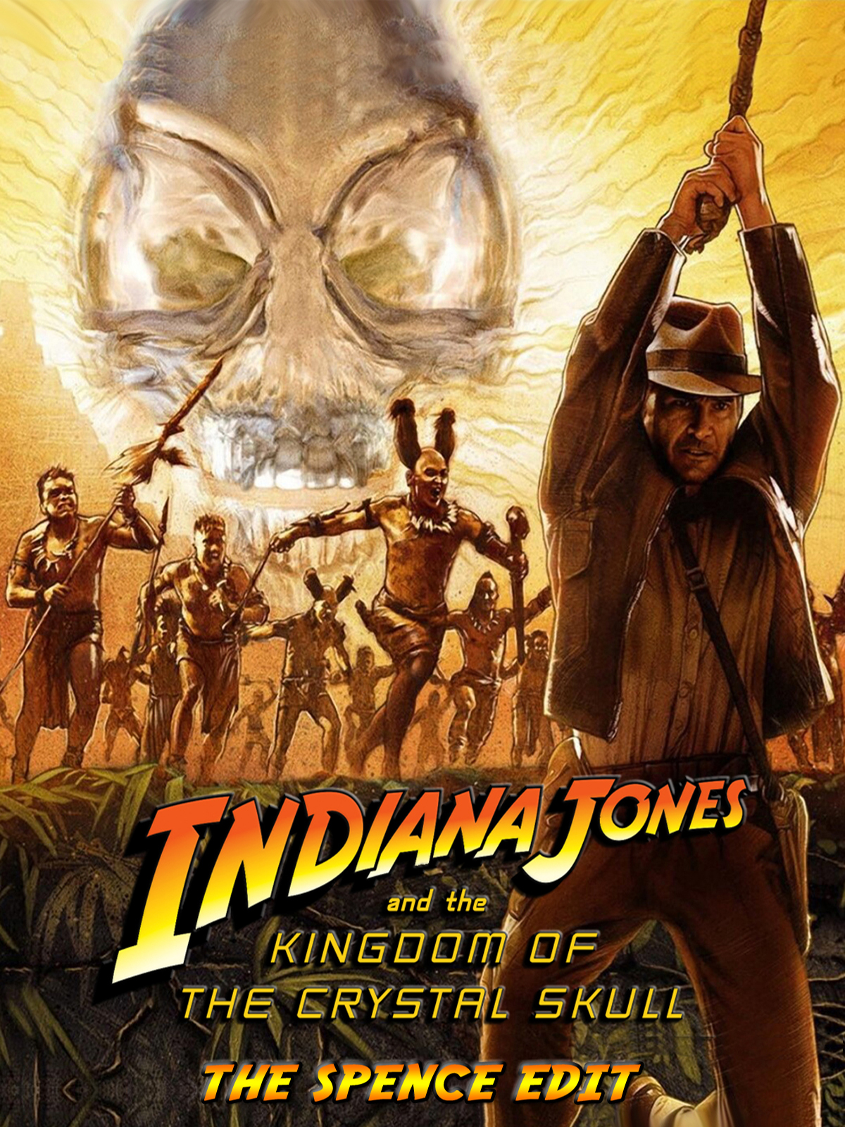
Indiana Jones and The Kingdom of the Crystal Skull - The Spence Edit
- Thread starter spence
- Start date
- Messages
- 2,218
- Reaction score
- 1,193
- Trophy Points
- 138
Anybody interested in taking the workprint of this for a spin?
When I say "workprint" It's 99.9% done, just may need some tweaking based on feedback.
If you volunteer, please be prepared to offer feedback in the next few days. If you can't do that, please just wait for the officially finished one. Thanks!
When I say "workprint" It's 99.9% done, just may need some tweaking based on feedback.
If you volunteer, please be prepared to offer feedback in the next few days. If you can't do that, please just wait for the officially finished one. Thanks!
Bored at 3:00AM
Well-known member
- Messages
- 85
- Reaction score
- 106
- Trophy Points
- 38
I could take a look if you're still lookingAnybody interested in taking the workprint of this for a spin?
When I say "workprint" It's 99.9% done, just may need some tweaking based on feedback.
If you volunteer, please be prepared to offer feedback in the next few days. If you can't do that, please just wait for the officially finished one. Thanks!
ArtisDead
Banned
- Messages
- 3,570
- Reaction score
- 3,477
- Trophy Points
- 143
So you are looking to take a look?I could take a look if you're still looking
Editzilla
Well-known member
- Messages
- 573
- Reaction score
- 342
- Trophy Points
- 78
What kind of feedback are you looking for?Anybody interested in taking the workprint of this for a spin?
When I say "workprint" It's 99.9% done, just may need some tweaking based on feedback.
If you volunteer, please be prepared to offer feedback in the next few days. If you can't do that, please just wait for the officially finished one. Thanks!
- Messages
- 2,218
- Reaction score
- 1,193
- Trophy Points
- 138
Mostly the "does it work?" kind. I've got it pretty much where I want it to be and there shouldn't be any technical issues. If there are they'll be small. I just want to know how it plays, if the changes work. If you enjoyed the film.What kind of feedback are you looking for?
Teacupdragon
Member
- Messages
- 11
- Reaction score
- 15
- Trophy Points
- 8
I just watched your first 20 minutes. Huge well done on this! I couldn’t notice many of the cuts you made until comparing it to the change list! Definitely a believable sequence.
This film is begging for an edit so I’ll definitely watch this one when it’s done.
This film is begging for an edit so I’ll definitely watch this one when it’s done.
ArtisDead
Banned
- Messages
- 3,570
- Reaction score
- 3,477
- Trophy Points
- 143
As I informed you, I have watched a plethora of edits of this movie lately. I had high hopes for your edit, my friend. I was not dissapointed. It runs like a Ferrari. Fast and engaging. I watched it straight through twice. Excellent work. I loved the opening.
Bored at 3:00AM
Well-known member
- Messages
- 85
- Reaction score
- 106
- Trophy Points
- 38
You may call me...The Looker!So you are looking to take a look?
Editzilla
Well-known member
- Messages
- 573
- Reaction score
- 342
- Trophy Points
- 78
Haven't finished it yet (only about half an hour in) but in terms of notes, I did have some.
Still image of the mountain at the beginning just doesn't work for me. I'd say just keep the prairie dog burrow since it's honestly not as bad as USSR troops accepting a drag race challenge...
Maybe have Indy say "Drop dead, comrade" instead of just "drop dead". I dunno, I like the delivery for the former better.
Not against removing Spalko's "telekinesis" but you might want to remove the whole "I know things...." lines as well since it's it sounds too much like it's setting up something and then nothing.
Thought the removal of "You don't know him" was very nicely done, if I didn't know it was removed beforehand, probably wouldn't have noted.
You could honestly remove the Bomb testing scene too and just have it go from Indy getting off the platform to being interrogated. Especially since you got rid of the disinfection scene.
Maybe also remove "Shake, Rattle, and Roll", feels like they're pushing the 50's setting a bit too hard compared to how the previous Indy films treated the time setting. (perhaps move it to the beginning though to replace Hound Dog since it is honestly the better song LOL)
Also remove the Brody statue scene, just seems a bit disrespectful. Or at least remove the part with the head coming off.
Editzilla
Well-known member
- Messages
- 573
- Reaction score
- 342
- Trophy Points
- 78
Well, just finished it today. Overall, I liked it and didn't really notice a lot of the cuts made. If it wasn't for me looking at the cutlist, 90% of the time I wouldn't have noticed. The way you removed half the dry sand scene was quite clever. I will say there are times where the new color just doesn't work and makes it look fake and vasoline-like a la Scream 4 (especially around the waterfall). Also wasn't a big fan of the whole blue-ish tint and did not think it made it feel like the original films at all.Mostly the "does it work?" kind. I've got it pretty much where I want it to be and there shouldn't be any technical issues. If there are they'll be small. I just want to know how it plays, if the changes work. If you enjoyed the film.
Other than the notes made above, I would also add these.
Remove the "This is very dangerous" on the cliff, feels too stupid.
Maybe also remove Indy's "Woah" before his big "WHOA!" crashing the car. As well as Spalko's "TURN!"
Also remove the "I DON'T LIKE THIS I DON'T LIKE THIS" when they're running down the stairs, just seems oddly added.
And remove Mac's "triple agent" thing. I've always disliked it and thought it stupid and unnesesary. You can just have Spalko come to the conclusion that she also figured out Oxley's ramblings at that time. Maybe just show the gun being lifted and then cut to Spalko entering?
I'd say also reinsert "Jonesy, I'm gonna be alright". I dunno, just always liked that line.
And remove Harrison's weird "haha" after Mutt says "Why didn't you dad?". It really comes off like a fake ADR.
Ender
Well-known member
- Messages
- 389
- Reaction score
- 190
- Trophy Points
- 58
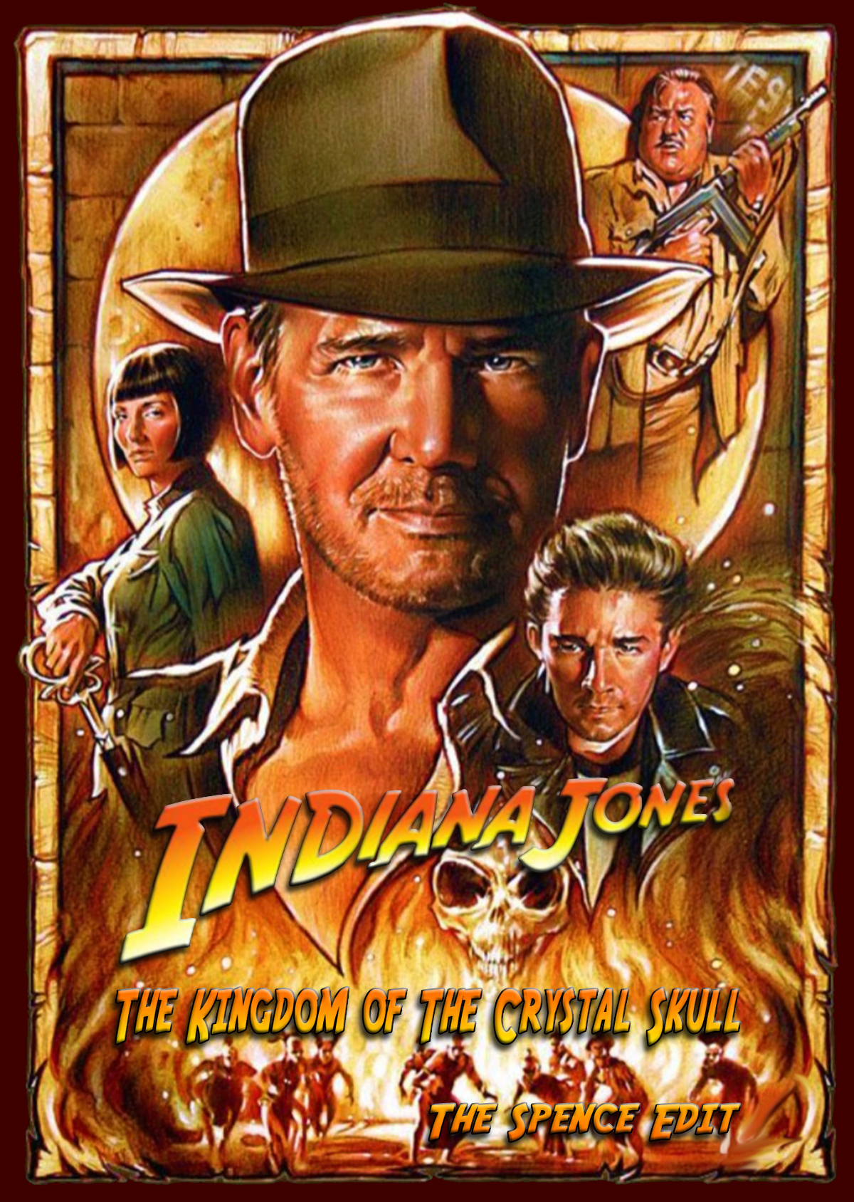
This one is the best. Feels most in line with what you'd expect from an Indy cover. The text needs work though. It looks...off. Like cheap 00s 3D. Make like a corporate logo in 2013 and flatten it. I would leave only "Indiana Jones" in the iconic orange to yellow gradient and font with the rest in a simpler font. The text placement also needs tweaking. If that gets taken care of this should be a perfect cover.
Bored at 3:00AM
Well-known member
- Messages
- 85
- Reaction score
- 106
- Trophy Points
- 38
Pretty sure it was finished. The version I saw was virtually done. I think a few tweaks were made afterwards, but it is quite a good version of the film.Did this edit ever get finished? I recently discovered the community and this edit sounds fantastic. I love all the effort on the posters so far, I think the corrected version of number 3 is my current favorite.
- Messages
- 8,747
- Reaction score
- 3,648
- Trophy Points
- 168
Edits in the Fixes, Mixes and TV area are completed. Also, if you are ever wondering if an edit is completed, you can always search for it on ifdb.
")
Just watched the smal version of the edit, Absolutly excellent, the tone of the film has shifted & the color pallet is beautiful. the final ten minutes however of the .mkv file are missing the dialogue, the score is present but the voices are silent atop the mountain. otherwise . really enjoyed the cut.
- Messages
- 2,218
- Reaction score
- 1,193
- Trophy Points
- 138
I'm on vacation but I'll look into that. I haven't heard thay from anyone else so far.Just watched the smal version of the edit, Absolutly excellent, the tone of the film has shifted & the color pallet is beautiful. the final ten minutes however of the .mkv file are missing the dialogue, the score is present but the voices are silent atop the mountain. otherwise . really enjoyed the cut.