- Messages
- 1,214
- Reaction score
- 1,383
- Trophy Points
- 123
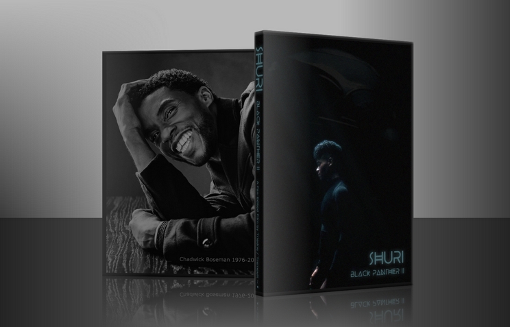
Wonderful. I love your process. Starting with type is very interesting. I generally come up with an esoteric concept first, a visual cypher if you like, but I might experiment with your approach some time. You're right, simple can be fantastic, I took that approach with Shuri and Steel of Man, making it all about layout and simple placement.And same sentiments to you! I super dig your posters as well!
For me, I almost always start with typeface for some reason. It gets my juices going. I do a bit of digging of the type of font and styles I like. To me, I found 99.99% of makes coverart appealing for me is proper font and quality textures. I really don't get too complicated, especially when I'm starting out.
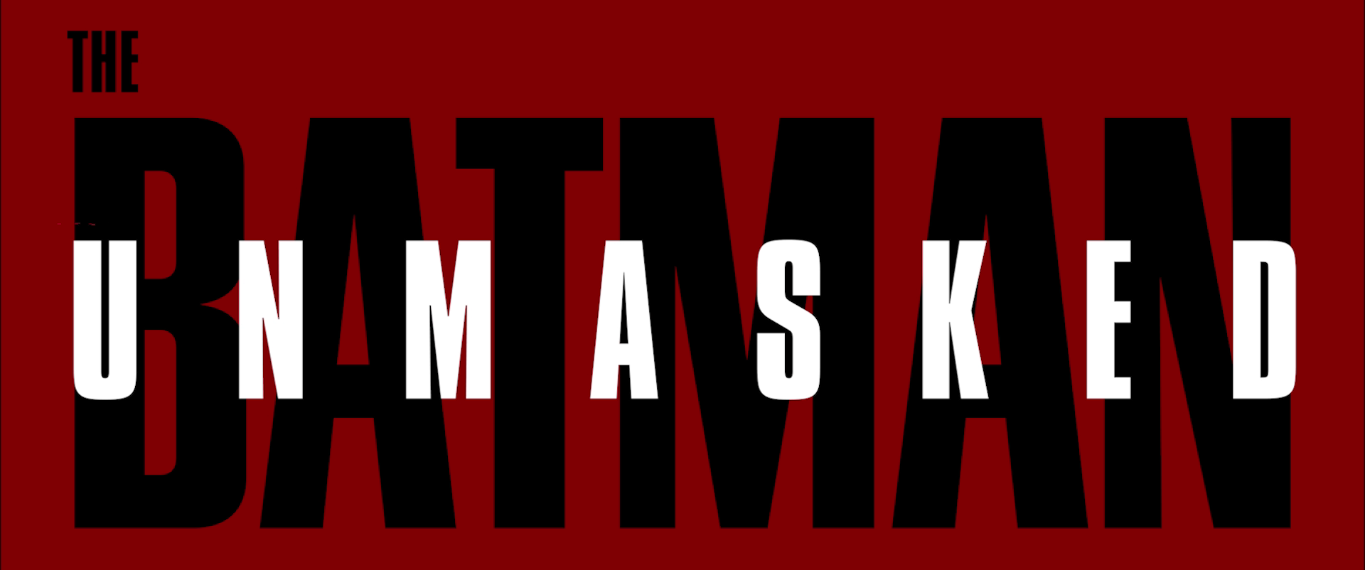
I guess I'll start with a quick walkthrough of my simplest poster yet, The Batman Unmasked.
Started with Riddler's cypher symbols (Rata Alada), then Riddler's writing font, but I settled for more readability and focus:
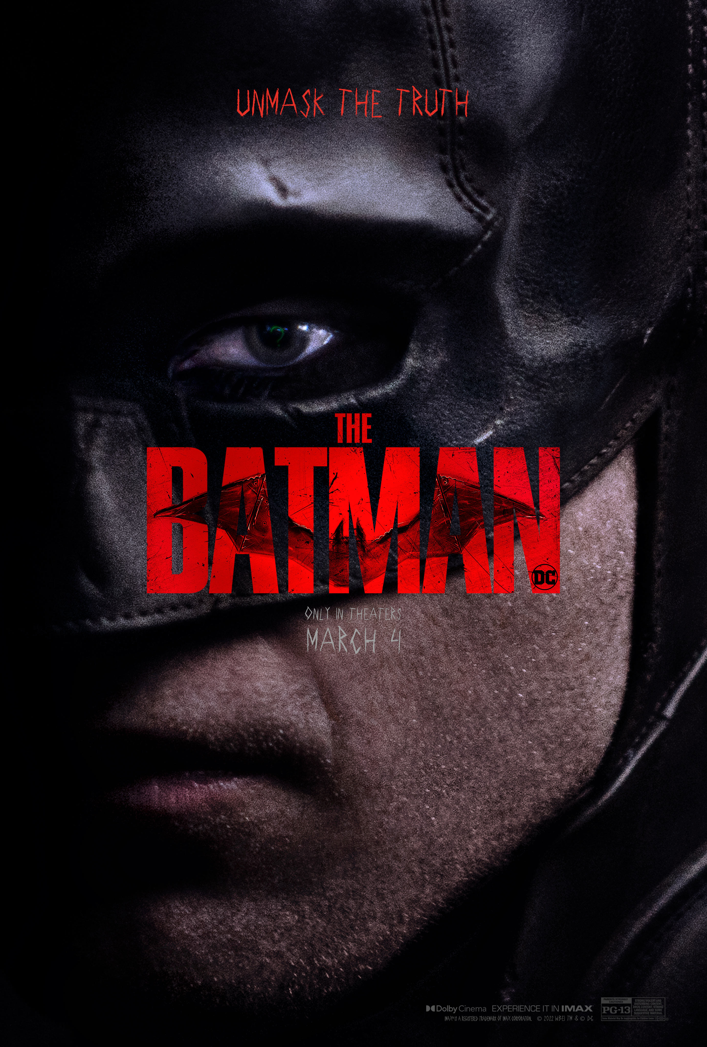
Poster (referencing to an officially released poster)
70's variant logo, DC logo, and now the same typeface layer goes into the fan-edit movie itself:

Easy peasy.
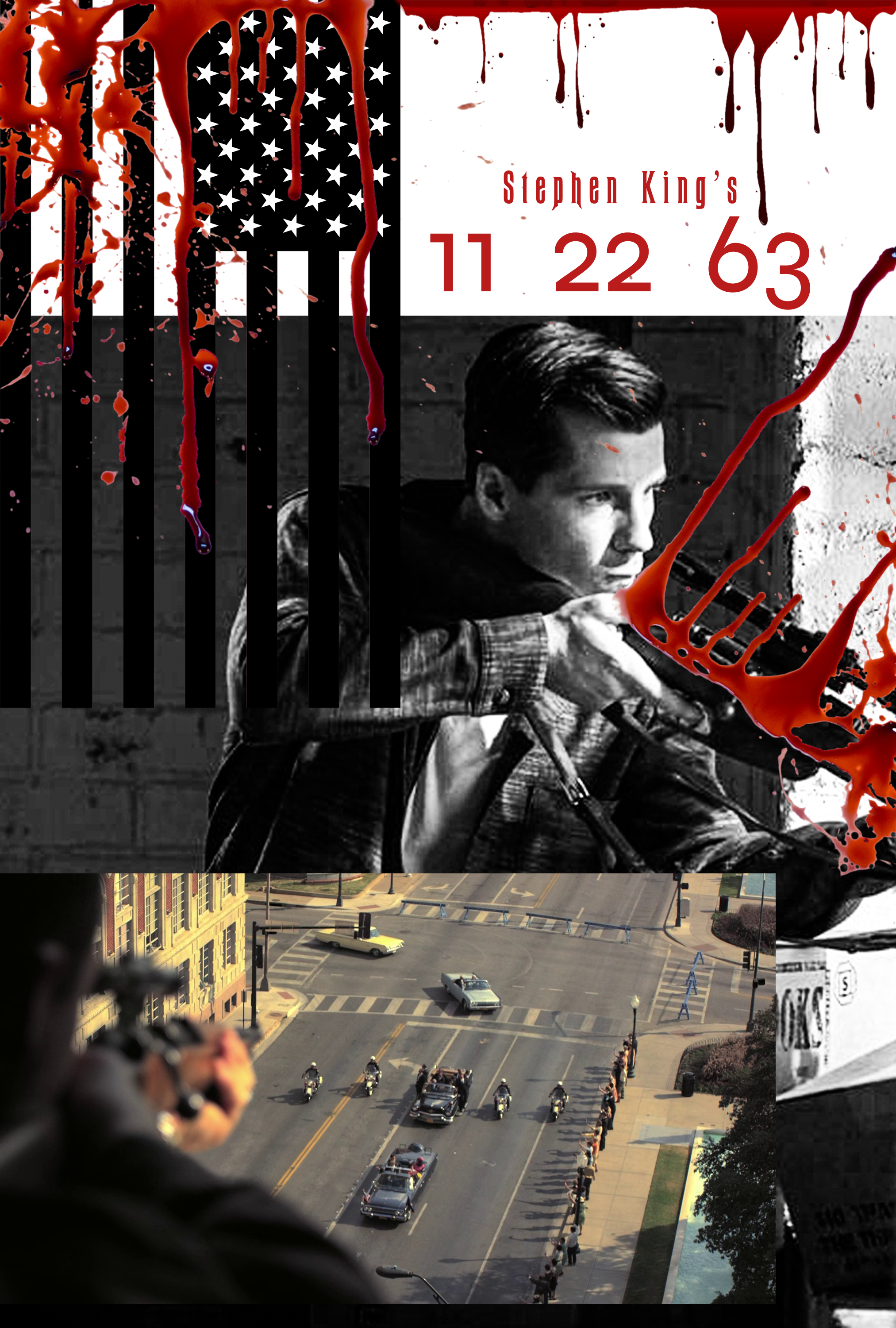
Again, to me it's just putting your taste to test. Simple, quality layers makes up for a lot. Sometimes, I think about theme, and the fan-edit itself and how that can drive the poster. That led me to some really creative paths as well (which I hope to get to in later posts)
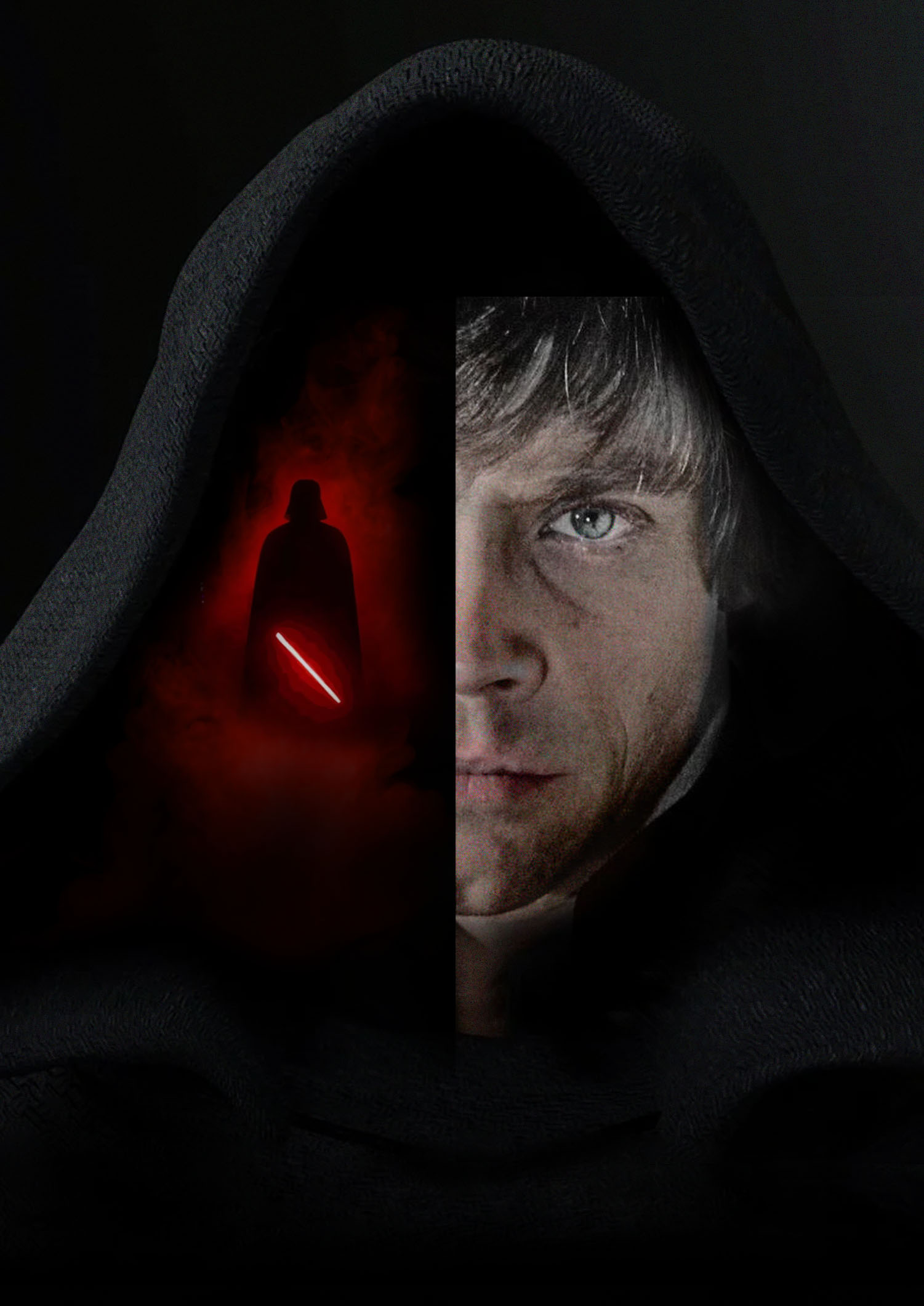
I really love how you connected the front and back cover right there, that is really striking.
")