• Most new users don't bother reading our rules. Here's the one that is ignored almost immediately upon signup: DO NOT ASK FOR FANEDIT LINKS PUBLICLY. First, read the FAQ. Seriously. What you want is there. You can also send a message to the editor. If that doesn't work THEN post in the Trade & Request forum. Anywhere else and it will be deleted and an infraction will be issued.
  • If this is your first time here please read our FAQ and Rules pages. They have some useful information that will get us all off on the right foot, especially our Own the Source rule. If you do not understand any of these rules send a private message to one of our staff for further details.
  • Please read our Rules & Guidelines

    Read BEFORE posting Trades & Request

How I make my covers

tremault

Well-known member
Faneditor
Messages
1,214
Reaction score
1,383
Trophy Points
123
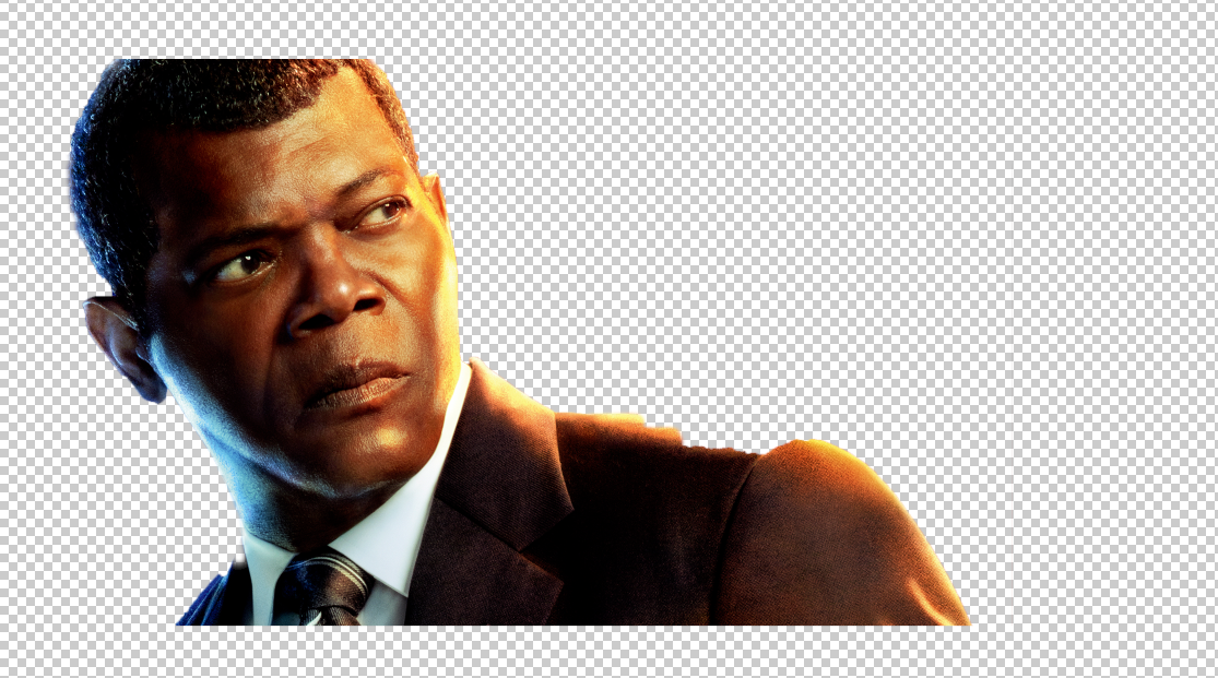
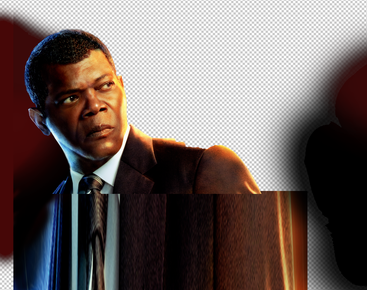
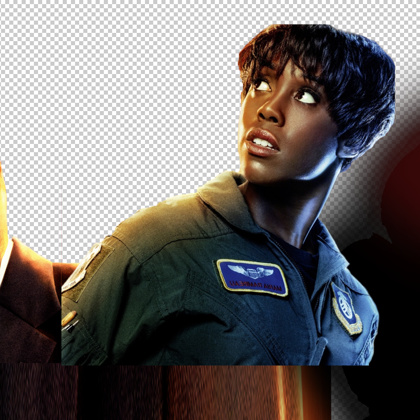
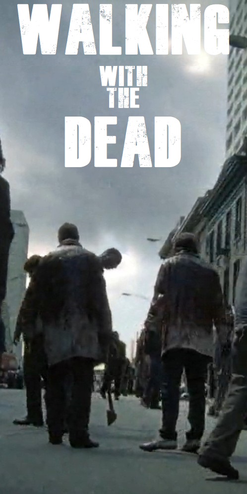
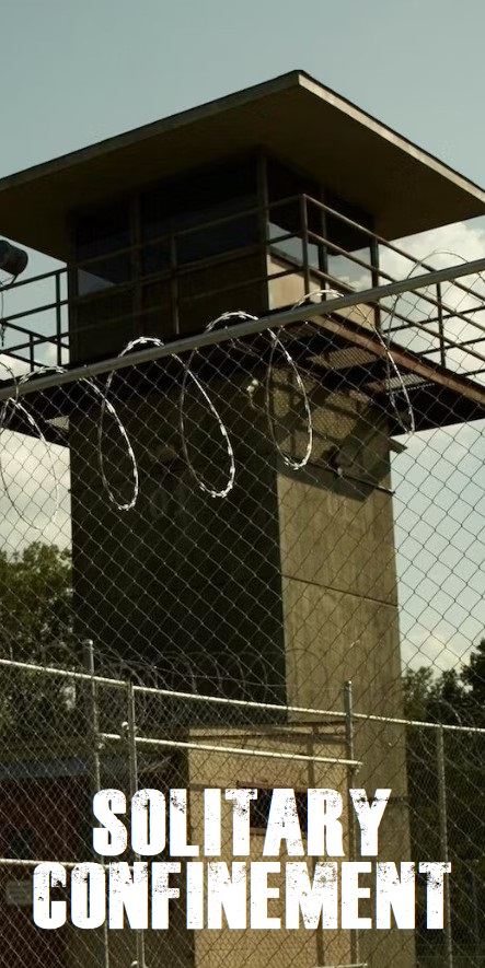
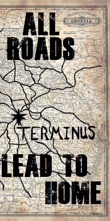
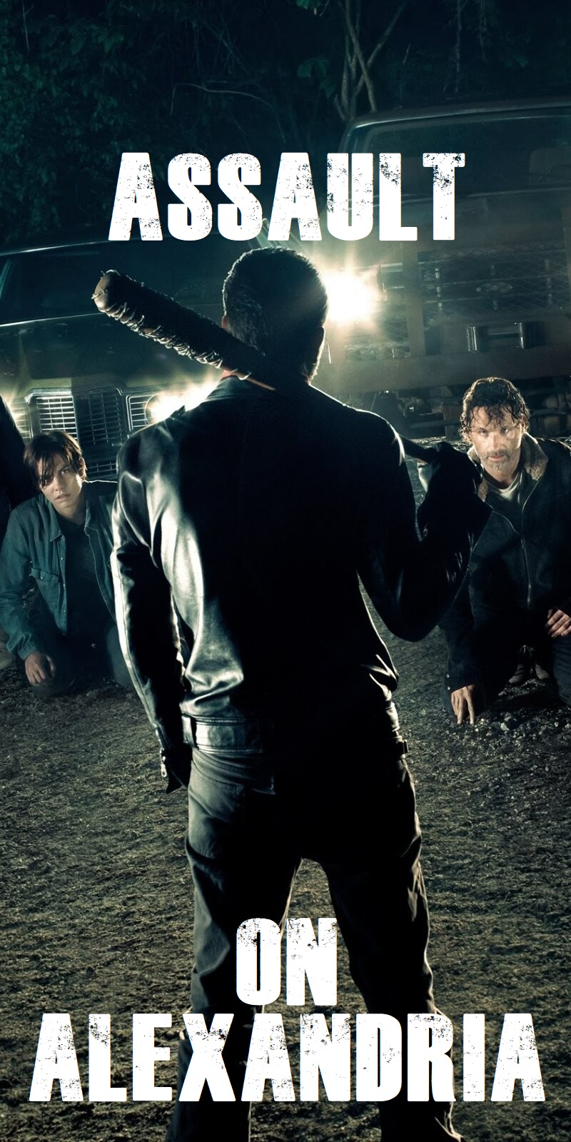
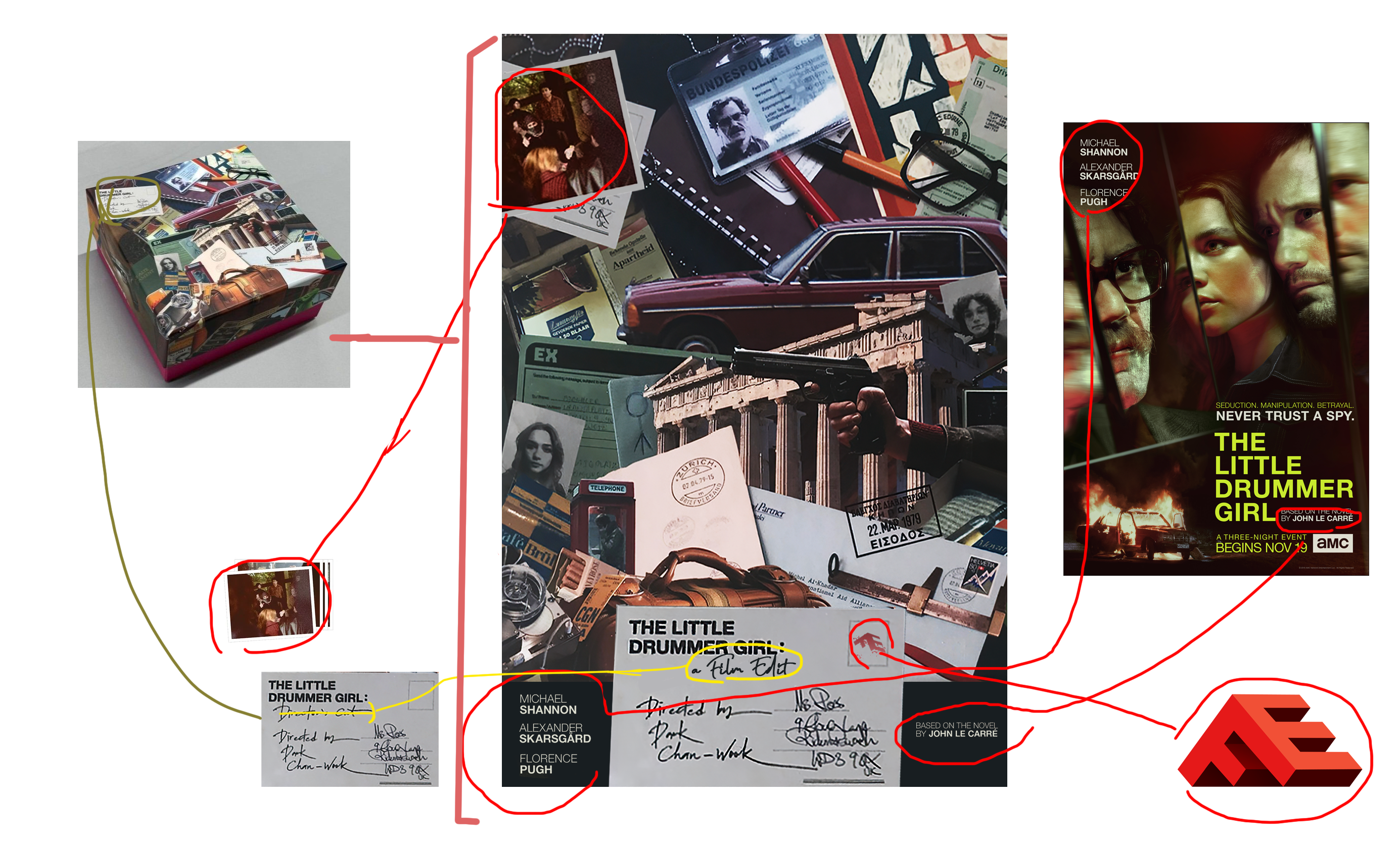
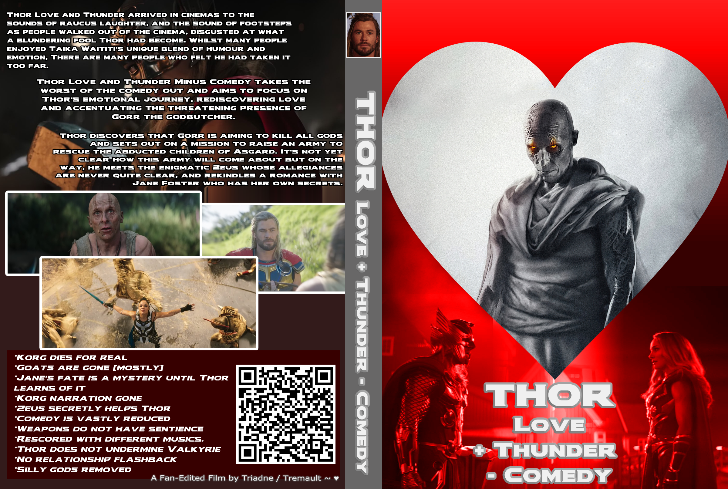
Cover art is kind of a necessity in order to give a first glimpse of what our edit is about. I feel it's becoming more important to demonstrate the sources for the imagery on our cover art so I decided to show a breakdown of how I produced my covers. I think in future, I may show this process in my ITW threads but for now I'm just trying this out.

Captain Marvel: Where's the Love

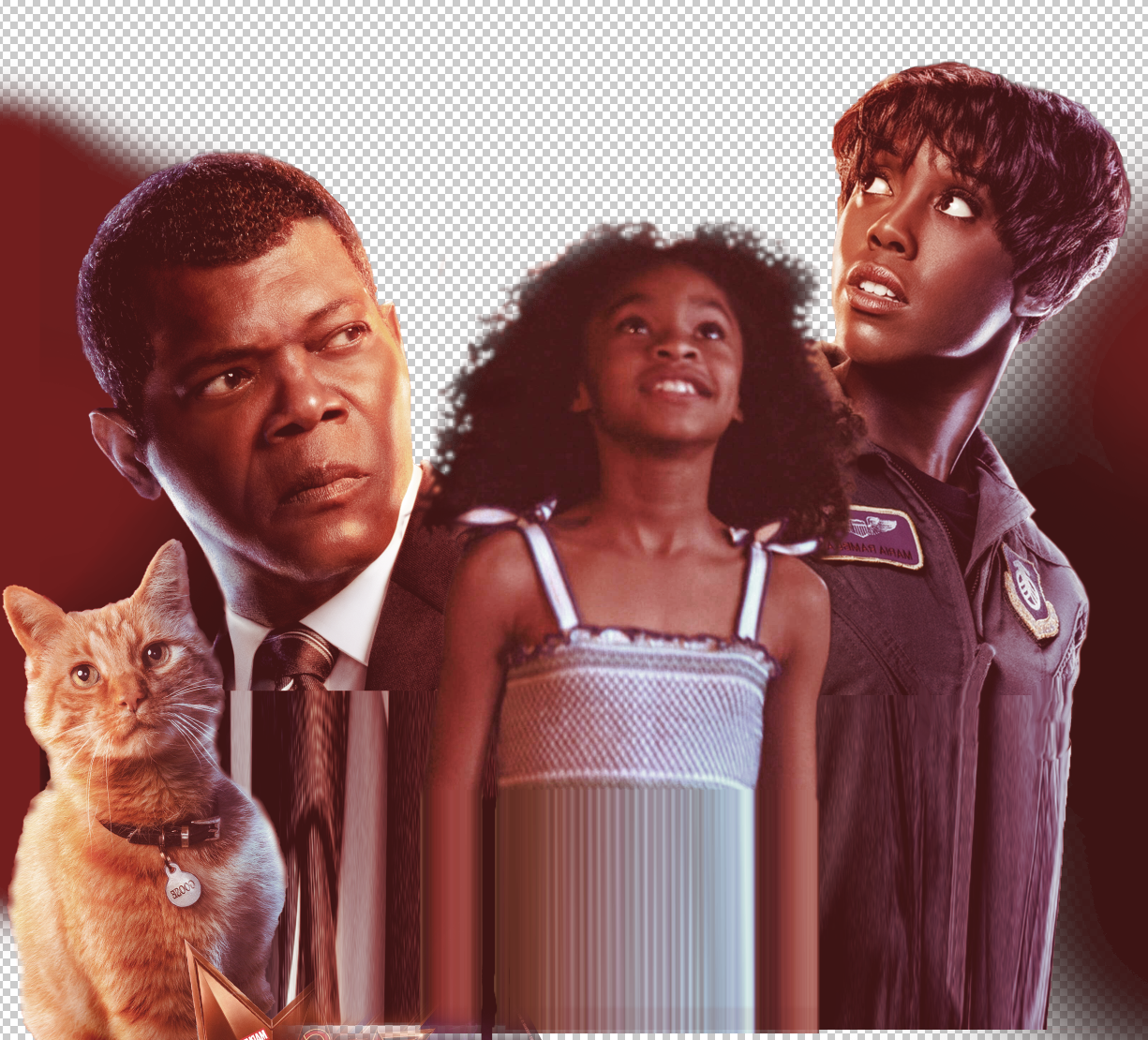
I used promo imagery for Nick Fury, reconstructed his head. Same process for Maria.
Monica was a screen capture and so was Yonn Rogg.
1.png
2.png
3.png
4.png

5.png

6.png
7.png

8.png
9.png


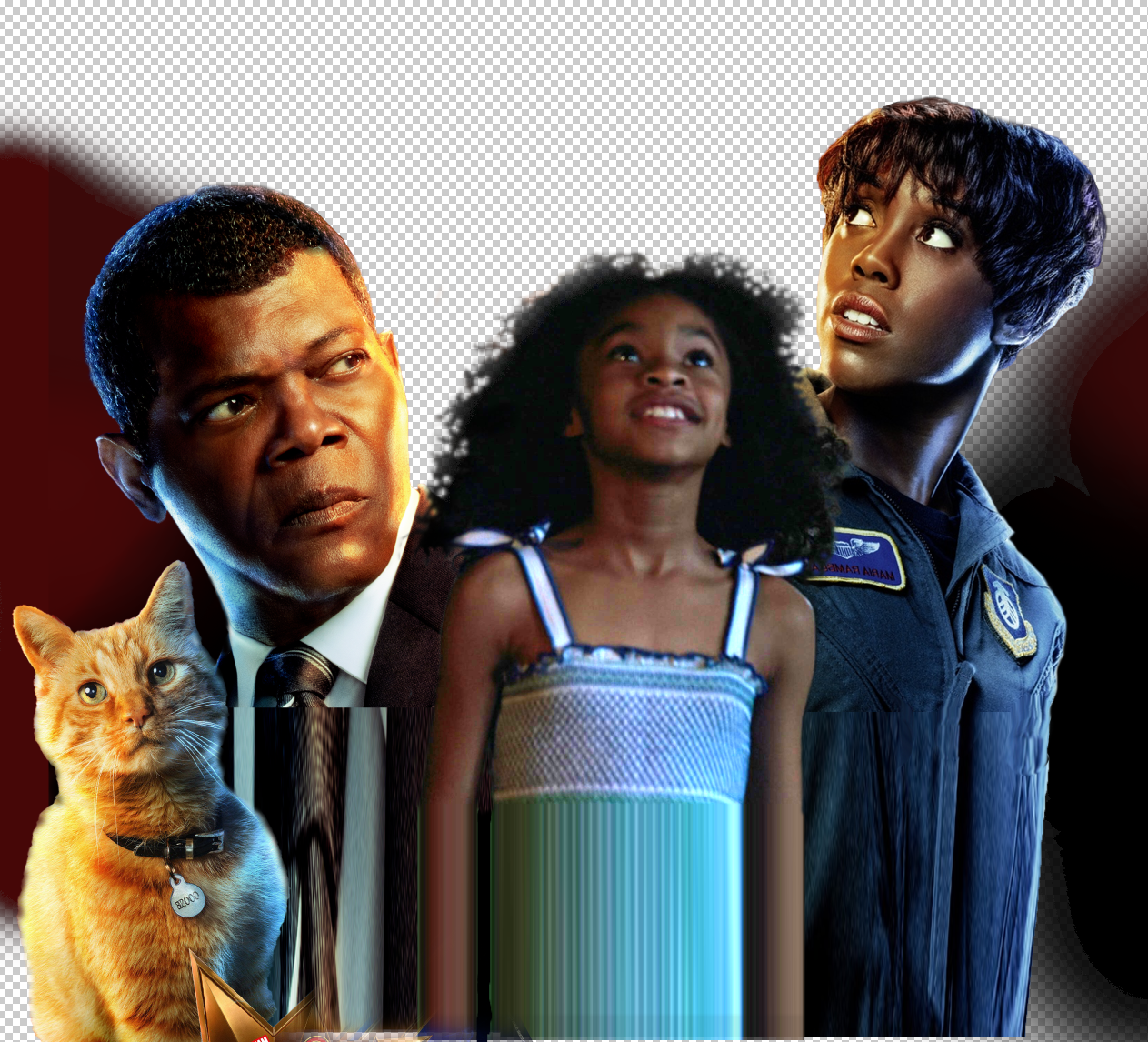
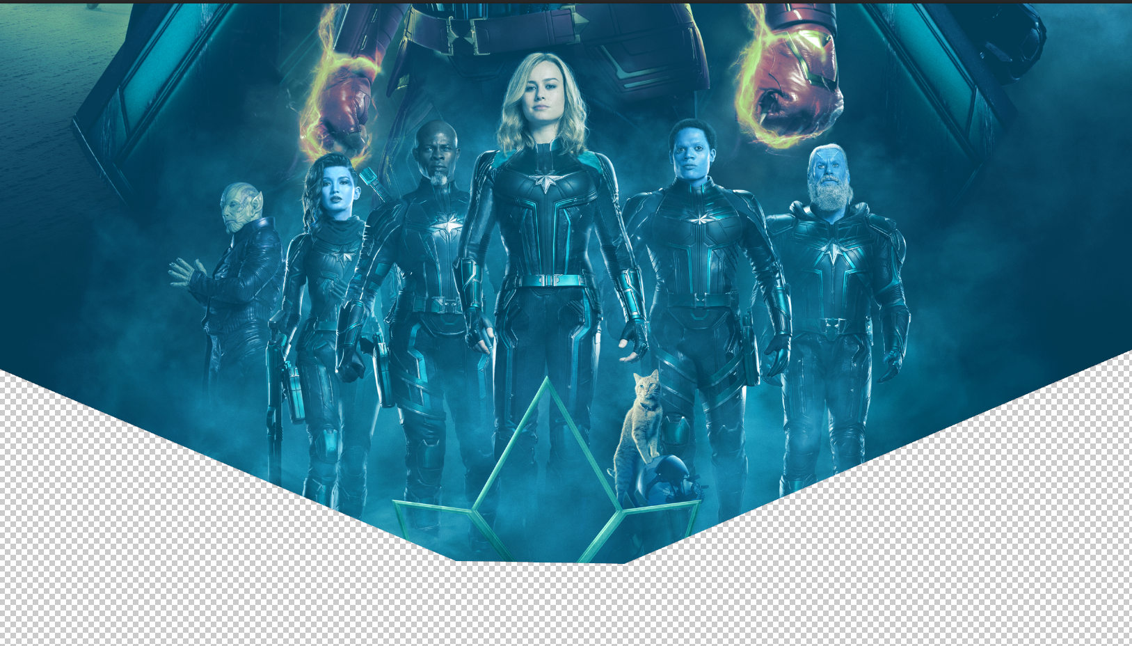
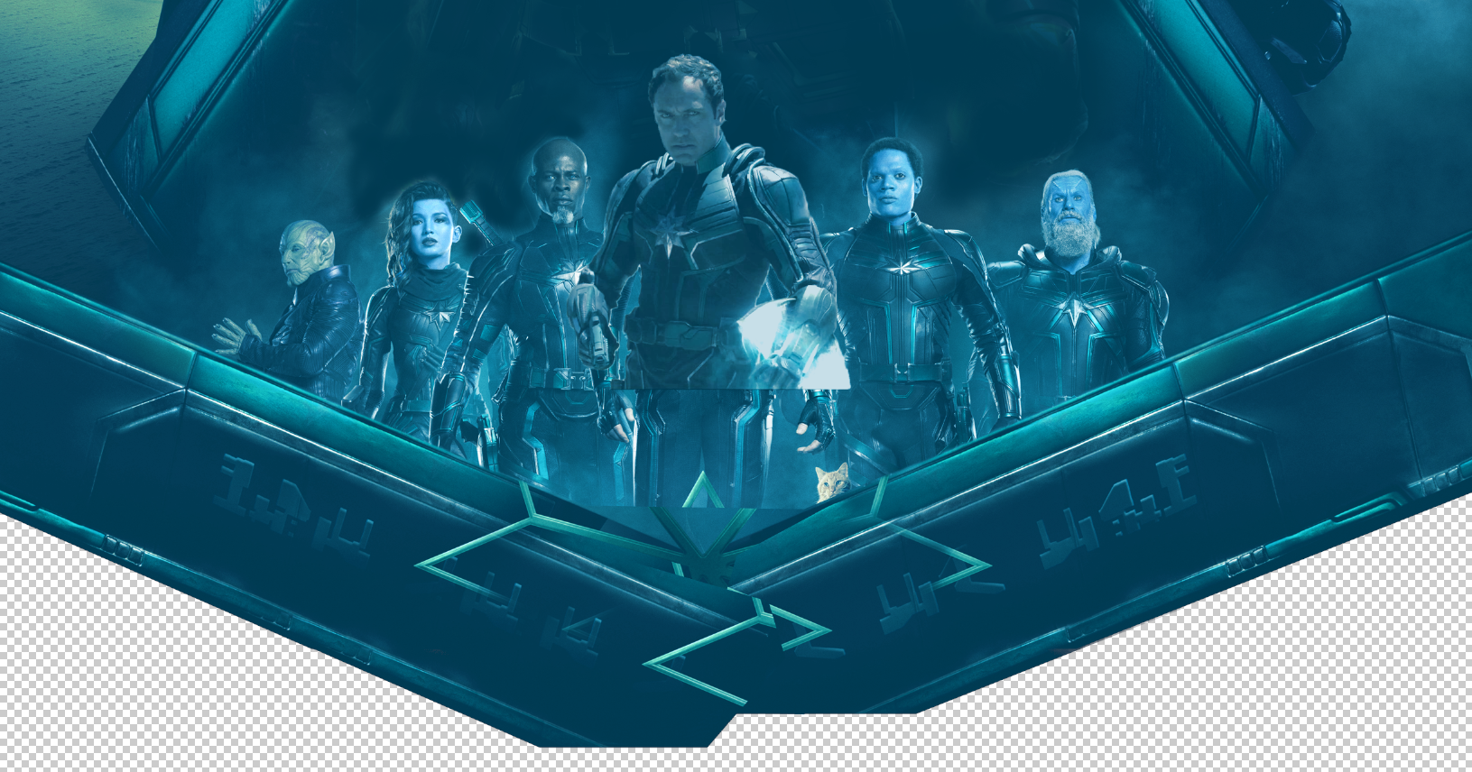
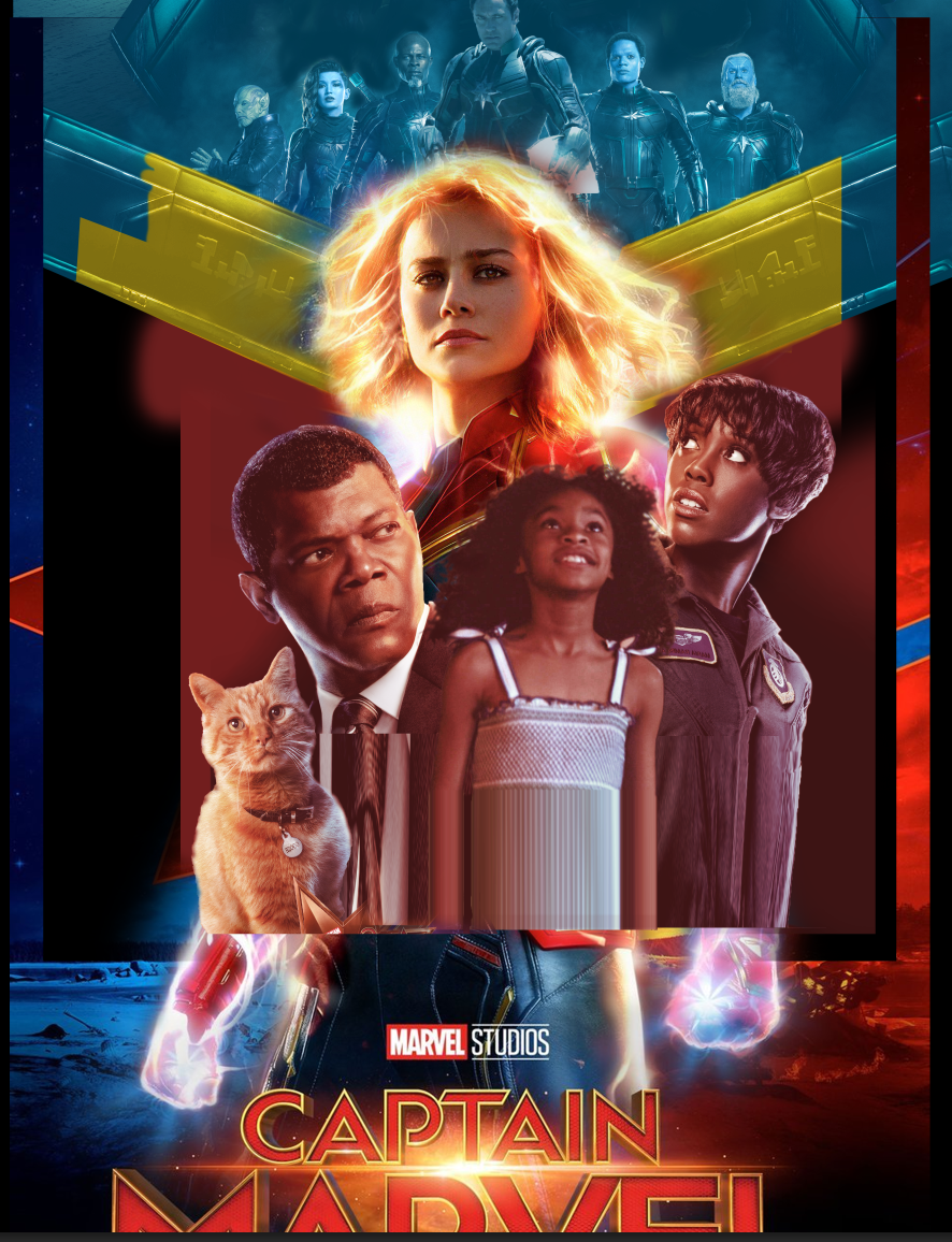
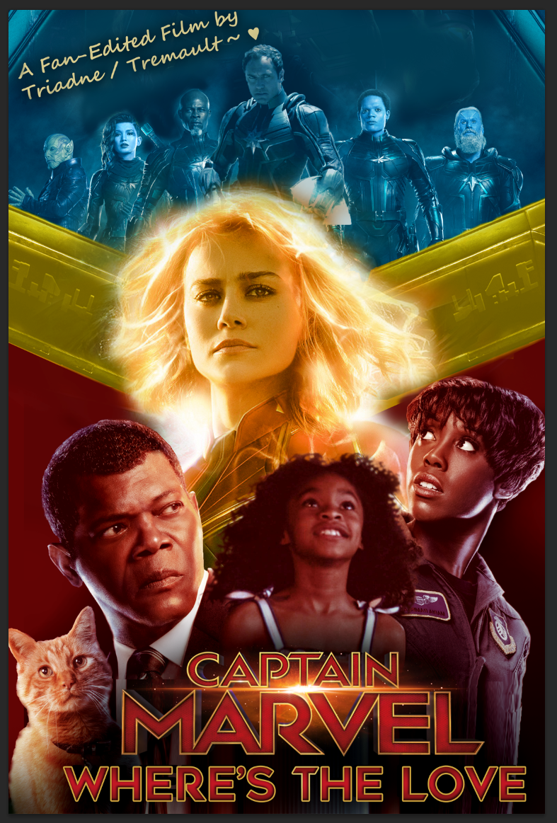
The full cover layout was designed by @Zarius
 
Last edited:

Shang-Chi: Legacy of the Rings


I took This promo art And applied some filters to it.
I took this screen grab and applied filters to that, and layered onto an official bluray cover.
I painted some layers and colour adjusted to get a balance and cleaned up cover with new screen capture and edited title.
Added all the text, titles info, etc.
1.webp
3.jpg

2.png
4.png
5.png

6.png
 
Last edited:
Samuel L Jackson's tie is proper wonky/jagged in your first edit of that poster. I would recommend nudging it to be more in line and then feathering it so that it blends a bit better.
 
I wrote some pointers for making custom covers for someone here... (NINE? omg) years ago. I think they are still helpful, though the original sample cover I made to go with it is lost to time and tinypic shutting down. It was somewhat directed at a specific cover, so I've edited out some parts of the quote to keep it relevant, but the original is still linked.

And to put my money where my mouth is, I have attached the dvd case/cover I did for Q2's Deathly Hallows edit. It was photoshopped using a similar process to tremault's workflow examples.

Tips

1 The front cover's image should make sense artistically. If you're not sure where else to begin, it may be a good idea to start with an image that would give the audience an idea of what movie they're looking at even if the title wasn't present.

2 The title should be able to stand on its own. Think about it as though there was no image at all, would the title/logo you've used look good on a plain-color cover? Don't think about it as "a font" and instead think about it as "a design".

3 (If you're making a cover you intend to print) The back cover is just as important as the front. The images should be small and uniform so you can fit some descriptive content. A good back cover will expand upon what exactly the viewer will be watching.

4 Think about color selection. One thing you could do is use the color picker in your image editor to choose colors to use for text and logos straight from the source photos. Another thing you can do is use Adobe Kuler to choose a color scheme ( https://color.adobe.com/ ).

5 Think about negative space. This is all the spots on the cover that have literally nothing to look at. Negative space is not your enemy if you can organize it in such a way that it directs the viewer's eye across the cover.

These are not all-encompassing tips that cover everything you need to know, but may help someone who doesn't already know.
And here's the Harry Potter cover I put together:
(Edit: posted the version for ants accidentally. replaced now with the bigger one.)
 
Last edited:
Samuel L Jackson's tie is proper wonky/jagged in your first edit of that poster. I would recommend nudging it to be more in line and then feathering it so that it blends a bit better.
Thanks for the feedback :)
The image element there is mostly obscured by the title though so I don't expect people to be noticing that in the final cover.

Thanks for the tips @addiesin very helpful!
 
Traditional cover art arrangements are hard. Too hard for me. If you're ever unsure what to do, just keep an eye out for a frame from your bluray that creates a natural tableaux with your characters or sets the emotional tone you're going for in your edit. These blurays are stuffed with incredible photography. Take advantage of it!

I'm happy with this one from my Hackers edit. It's a single frame from a 6(?) frame sequence. The frames on either side do not work, but this one has a tableaux that feels right. All I did was upscale, greyscale, curves, vignette, border, title.

poster1.png
 
I don't consider myself much of a poster artist. I don't even have photoshop - I make mine in Vegas. And I didn't make posters for my first few edits because graphic design is not something I consider my forte.

Like Futon, these were both made from screencaps of Annihilation, with text laid over the top. With the 2nd one, it was a panning shot, so I took two screencaps and merged them for a larger image, then created the symmetry effect.


This too was created from a screencap taken from the opening credits:
 
I've used screenshots for some posters for potential edits. The ratios are wrong though, so I'll have to do them again:


-We Could be Heroes
After re-watching Heroes Season 1, there's far too much content to cut it down to even an epic-length movie, so I'm going to try to cut it into three parts:

(Graphic poster warning)
We-can-be-Heroes-Poster-2.png

We Could be Heroes is the first part going from the pilot to 'Homecoming'

The-Man-who-Sold-the-World-Poster.png

The Man who Sold the World goes from 'Homecoming' to 'Company Man'

Ashes-to-Ashes-Poster.png

Ashes to Ashes leads from 'Company Man' to the finale.

I don't plan to start this one too soon, but it is one I'm eager to do. I'm surprised there's no Heroes edits on the IFDB yet considering how highly regarded it is.

These Heroes ones are my favourite. It's a pretty obvious idea to use the paintings as posters, but it represents the three parts I plan to split it into really well.
 
I love this thread. I can’t wait to get home from work and share what I’ve been doing for my artwork covers
 
@Gibichung I love your posters, from what I've seen around and specifically in your signature!

I feel like I swung too ambitious for what my skills actually are on this, but here's a little dissection of my first. I'd love to get better at this with time.

Poster-v4.png


Andor-Poster-Dissect.png

I basically just borrowed elements from those pieces and stuck them together, going for something similar to the Andor propaganda poster. Should be self explanatory how they were all implemented. The Aurebesh text reads "Rebellions are built on hope". It doesn't really look like a movie cover, but I was going for something else lol. When I revisit the edit around Andor season 2's release, I'll probably try to remake/fix this one or just start over, maybe with a new design philosophy or reference source.

My The Little Drummer Girl edit's poster was even more simple, I was lucky enough to buy a Korean-exclusive collector's steelbook set for the show, which came with a fancy box with a very cool design. Of which there are no clear pictures of on the internet, luckily for me - it's a unique poster for when you type "The Little Drummer Girl poster" on Google. I just stole from that and made some adjustments.

TLDG-FAN-EDIT-POSTER-v2.png

Little-Drummer-girl-Poster-dissect.png
 
Last edited:
Very nice! @NFBisms I like how you broke that down.

Thor: Love plus Thunder minus Comedy

I took a couple of screenshots of Thor and Jane and placed them together. I colourised it and created a heart cutout. I inserted an image of Gorr, that I believe this may be the original source. I added image of Jane for the back and then I stuck on my screenshots and text and all that.
rByUbaU.png
OFadqSe.png


eSvdpBg.png
oq3dtie.png
 
Last edited:
I'm happy with this one from my Hackers edit. It's a single frame from a 6(?) frame sequence. The frames on either side do not work, but this one has a tableaux that feels right. All I did was upscale, greyscale, curves, vignette, border, title.

poster1.png
This is genuinely one of my favourite covers ever posted on IFDb.
 

Doctor Strange and the Book of Dreams

I created this symbol in vectors, based on various found images and screenshots from the film.
1.png

These were found images.
2.png
3.png
4.png
5.png

6.png


The cover for this one is reversible and the other side was designed by @Wakeupkeo
 
Last edited:
I have a couple of posters I made from scratch, but they're not very interesting.

For this one I took some screenshot and promotional images from the movie and just put them together and tried to make it look like an old-timey movie poster (or at least what I think an old-timey movie poster looks like😅)


This one I just made from simple shapes, but I think it looks great. It was inspired a bit by that 10 Cloverfield Lane poster if your remember it.
Edit: Now that I look at it, it was very inspired, lol
IMG_7497_1024x1024@2x.jpg

Again, I got the ratio wrong so the Hole one ended up getting squashed and the Batman one was cut off when I published them.:facepalm:
 
I have a couple of posters I made from scratch, but they're not very interesting.

For this one I took some screenshot and promotional images from the movie and just put them together and tried to make it look like an old-timey movie poster (or at least what I think an old-timey movie poster looks like😅)

This one I just made from simple shapes, but I think it looks great. It was inspired a bit by that 10 Cloverfield Lane poster if your remember it.

Again, I got the ratio wrong so the Hole one ended up getting squashed and the Batman one was cut off when I published them.:facepalm:
I really like these. You should give yourself more credit. I think these are much better and show more passion than the ai ones you've been experimenting with.

Also, if you feel like you want to improve your skills, I would be happy to coach you or just give some tips.
 
I think these are much better and show more passion than the ai ones you've been experimenting with.
Fully generated posters definitely wouldn't suit most edits, but I like it for the more conceptual/thematic ideas. If I want a poster that represents the edit in a more dramatic way AI can give me images that don't exist in the movie itself.
For example, I have this poster for an edit of CW's Arrow Season 5:
I had this as a very clear image in my head as soon as I thought of the edit. It's representative of the story and I could have probably found stock images for the island and ship and maybe found an image of Green Arrow slumped over if I trauled through the series looking for it, but generating the images I need has the same effect. And it may not be perfect, but it looks good enough for what it is.

There might be other avenues for using generated images, like making backgrounds for the images of actors to stand against, or generating templates that can be copy the composition from (composition us one thing generated images are usually pretty good at)
But I understand that this isn't the AI thread, so I won't go into it past this comment.

Also, if you feel like you want to improve your skills, I would be happy to coach you or just give some tips.
Thanks for the offer! Next time I'm building a poster from scratch I'll remember to hold you to that. I usually struggle to make text on posters look good. It never really looks like it belongs there.
 
The ratios are wrong though, so I'll have to do them again
Im curious to know what is the good ratio. I never put any thoughts into it🙁
Traditional cover art arrangements are hard. Too hard for me. If you're ever unsure what to do, just keep an eye out for a frame from your bluray that creates a natural tableaux with your characters or sets the emotional tone you're going for in your edit. These blurays are stuffed with incredible photography. Take advantage of it!

I'm happy with this one from my Hackers edit. It's a single frame from a 6(?) frame sequence. The frames on either side do not work, but this one has a tableaux that feels right. All I did was upscale, greyscale, curves, vignette, border, title.

poster1.png
Though very simple, your posters are effective! Especially that one. A lot is being told in that single image.
 
@Gibichung I love your posters, from what I've seen around and specifically in your signature!

I feel like I swung too ambitious for what my skills actually are on this, but here's a little dissection of my first. I'd love to get better at this with time.

Poster-v4.png


Andor-Poster-Dissect.png

I basically just borrowed elements from those pieces and stuck them together, going for something similar to the Andor propaganda poster. Should be self explanatory how they were all implemented. The Aurebesh text reads "Rebellions are built on hope". It doesn't really look like a movie cover, but I was going for something else lol. When I revisit the edit around Andor season 2's release, I'll probably try to remake/fix this one or just start over, maybe with a new design philosophy or reference source.

My The Little Drummer Girl edit's poster was even more simple, I was lucky enough to buy a Korean-exclusive collector's steelbook set for the show, which came with a fancy box with a very cool design. Of which there are no clear pictures of on the internet, luckily for me - it's a unique poster for when you type "The Little Drummer Girl poster" on Google. I just stole from that and made some adjustments.

TLDG-FAN-EDIT-POSTER-v2.png

Little-Drummer-girl-Poster-dissect.png

And same sentiments to you! I super dig your posters as well!

For me, I almost always start with typeface for some reason. It gets my juices going. I do a bit of digging of the type of font and styles I like. To me, I found 99.99% of makes coverart appealing for me is proper font and quality textures. I really don't get too complicated, especially when I'm starting out.

I guess I'll start with a quick walkthrough of my simplest poster yet, The Batman Unmasked.

Started with Riddler's cypher symbols (Rata Alada), then Riddler's writing font, but I settled for more readability and focus:
the-batman-unmasked-v0-ugmidrbgrkpc1.png


Poster (referencing to an officially released poster)
the-batman-unmasked-v0-udrup8mfrkpc1.png
MV5BM2MyNTAwZGEtNTAxNC00ODVjLTgzZjUtYmU0YjAzNmQyZDEwXkEyXkFqcGdeQXVyNDc2NTg3NzA@._V1_.jpg


70's variant logo, DC logo, and now the same typeface layer goes into the fan-edit movie itself:
vlcsnap-2024-03-20-17h46m10s136.png
vlcsnap-2024-03-20-17h45m57s779.png
vlcsnap-2024-03-20-17h45m48s491.png


Easy peasy.
the-batman-unmasked-v0-ky17s73frkpc1.png
the-batman-unmasked-v0-rbv79j0hrkpc1.jpg


Again, to me it's just putting your taste to test. Simple, quality layers makes up for a lot. Sometimes, I think about theme, and the fan-edit itself and how that can drive the poster. That led me to some really creative paths as well (which I hope to get to in later posts)
 
Last edited:
Back
Top Bottom