• Most new users don't bother reading our rules. Here's the one that is ignored almost immediately upon signup: DO NOT ASK FOR FANEDIT LINKS PUBLICLY. First, read the FAQ. Seriously. What you want is there. You can also send a message to the editor. If that doesn't work THEN post in the Trade & Request forum. Anywhere else and it will be deleted and an infraction will be issued.
  • If this is your first time here please read our FAQ and Rules pages. They have some useful information that will get us all off on the right foot, especially our Own the Source rule. If you do not understand any of these rules send a private message to one of our staff for further details.
  • Please read our Rules & Guidelines

    Read BEFORE posting Trades & Request

WIP: Rocky Horror Picture Show DVD art *First post updated*

Aztek463

Well-known member
Faneditor
Cover Artist
Messages
1,627
Reaction score
2
Trophy Points
51
RHPS_IMAN.jpg


http://i21.photobucket.com/albums/b270/ ... or_003.jpg

No more grey! :grin:


--------------------------------------------
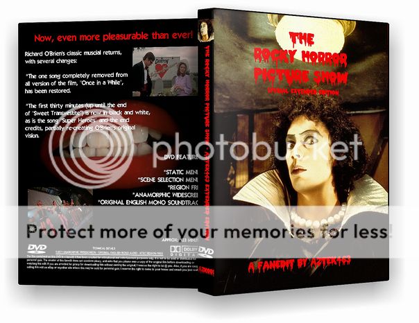
http://i21.photobucket.com/albums/b270/ ... Horror.jpg

Still a work in progress, feed back would pwn.
 
I think this requires some more work ;-)
 
make the cover solid black since the red to black to grey is a tad jaring...


just my opinion anyways
 
i agree with ilubu. i would scratch the grey. swith to solid back. allows thing to look a bit freed up and is easier on the eyes
 
BUT if switched to black it looks like an all common RHPS cover. I would think it to be best to aim for something unique and different.
 
good point, but as it stands (grey and red) it is a bit harsh on the eyes. maybe play with textures (nothing to extreme) or something. also if you do that maybe either remove the black from the mouth photo, so its just a mouth, or put a small border around the picture. if the black stays, also may want to keep the title text either seperate from it, or completely included. the runover looks a bit rough. just some ideas though, keep up posted aztek:)
 
Ah...now I see what you mean. It looked black last night...damn :p

Ah well, back to the GIMP - thanks for the feedback ;)

EDIT: Got rid of the grey, simple n00b error. Things tend to look different at midnight, y'know?

Does anyone know the font used in that little box that gives you the specifications, IE Langauge, Audio type, Region, etc?
 
your on your way, definately making progress. I would still do something about the mouth photo. the way the text runs over from the gray into the photo makes it a bit rougher. Keep up the good work
 
Yes, I know the grey is still there. Don't keep hasseling me about it :p
 
Back
Top Bottom