• Most new users don't bother reading our rules. Here's the one that is ignored almost immediately upon signup: DO NOT ASK FOR FANEDIT LINKS PUBLICLY. First, read the FAQ. Seriously. What you want is there. You can also send a message to the editor. If that doesn't work THEN post in the Trade & Request forum. Anywhere else and it will be deleted and an infraction will be issued.
  • If this is your first time here please read our FAQ and Rules pages. They have some useful information that will get us all off on the right foot, especially our Own the Source rule. If you do not understand any of these rules send a private message to one of our staff for further details.
  • Please read our Rules & Guidelines

    Read BEFORE posting Trades & Request

ThrowgnCpr's newest covers

i love it, she is a queen, but looks like a warrior. very cool. what site did you get that from?

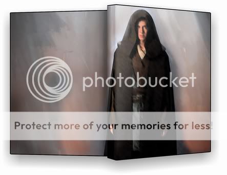
on another note... i think i found a solution to this cover maybe. I found an image of anakin. a promo shot for ep3 with a gray background. he is in a very similar pose as vader in the painting i used for this first cover attempt. i am attempting to run some filters over it and play with it a bit to make it look like a painting in the same style to morph over. we'll see how it turns out
 
thanks avp, i thought of trying that. i am going to attempt the method i mentioned above, if it doesnt work out i may try the anakin sand shot you posted
 
another one from that artist:
d.jpg
 
those are so cool. i really love that first one. ok, here is a really rough idea of what i am thinking...

demo_teaser2.jpg
 
oh yes!!! That is better!
 
i need to make it blend a bit better, but i'll go with this. and hey, if anyone ever is bold enough to cram the OT into one film, there will be a matching set :)
 
cool, i havent seen that one. is it fan created?
 
Dunno got it from a blaksvn torrent
 
OK, how about this. i tried to make it blend so it looks like a real painting. it didnt turn out that great, but i think it does the trick

falloftherepublic2_preview.jpg
 
It's quite nice. And does the trick.
 
i do like it overall.... but the image of anakin isn't quite menacing enough for me for something called "fall of the republic". maybe use the cover for the book.....

20050114_1_bg.jpg


just my thoughts. or a more menacing pic for the one you've got going.... or maybe you could find a way to make that pic more menacing.... darken around the eyes or something. dunno.
 
well, i think i am going to leave it as is for now. i can however make one much more menacing for your edit when it comes out ;)
 
download link?
 
i didn't bring the final high-res one with me to the office. I'll try to post it this evening.
 
a cover for the clerks II - budget cut edit

clerks2-thebudgetcutpreview.jpg


I designed the front using the idea dislexsick used to promote the edit. It is based on the cover of the screenplay script. I used better quality color images (that I converted to B&W) instead of the screenshots dislexsick posted. (frankly I thought the image quality was pretty not good in the edit)
 
yes!!! nice one.
 
Back
Top Bottom