• Most new users don't bother reading our rules. Here's the one that is ignored almost immediately upon signup: DO NOT ASK FOR FANEDIT LINKS PUBLICLY. First, read the FAQ. Seriously. What you want is there. You can also send a message to the editor. If that doesn't work THEN post in the Trade & Request forum. Anywhere else and it will be deleted and an infraction will be issued.
  • If this is your first time here please read our FAQ and Rules pages. They have some useful information that will get us all off on the right foot, especially our Own the Source rule. If you do not understand any of these rules send a private message to one of our staff for further details.
  • Please read our Rules & Guidelines

    Read BEFORE posting Trades & Request

Some Covers I have done.

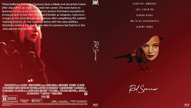
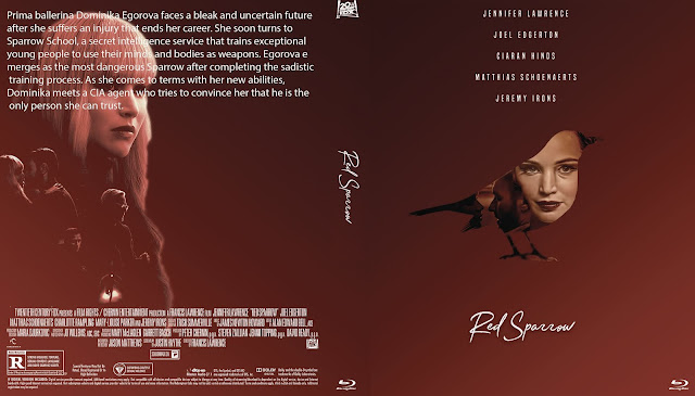
Red Sparrow- version 1
red%2Bsparrow-%2Bversion%2B1.jpg
 
^ You need to increase the contrast of the front picture. It needs to be more black. Increase your screen brightness if you can't see it.
 
David Gordon Green's Halloween- version 1
tweaked one of my Halloween covers so fans
can have a complete cover for Ryantology's fanedit.
The editor is very happy with this cover.
david%2Bgordon%2Bgreens%2Bhalloween-%2Bversion%2B1.jpg
 
Yeah, jswert123456 always kills it on the Blu-ray cover creation front!
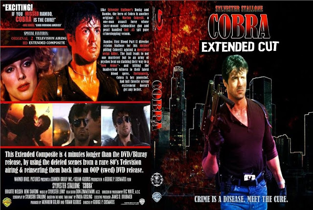
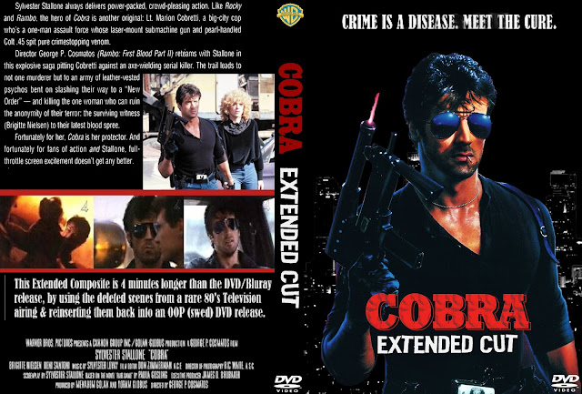
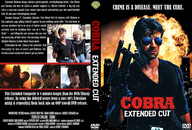
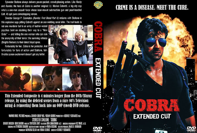
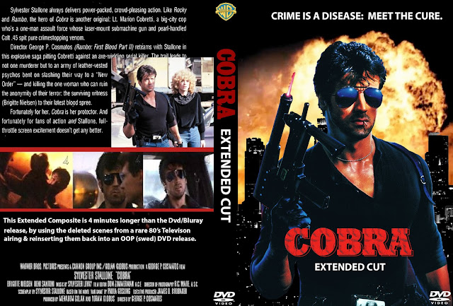
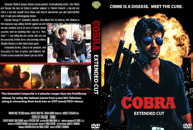
 
Cobra 1986 extended- original cover- done by someone else
QaNylJJ.jpg


My upgraded version
cobra%2Bext.jpg
 
jswert123456 said:
Cobra- extended cut- version 2
cobra%2Bext-%2Bversion%2B2.jpg

I really like this...

Though I think either COBRA should be bigger or EXTENDED CUT should be smaller....?
 
Much better imo.  

Looks more balanced.

The "EXTENDED CUT" is an unusual font.... it works, but since it does not appear anywhere else on the main cover it sort of looks out of place to me.  Out of curiosity did you try using the same font as "Crime is a disease..."? Might give it a more uniformed look.

But it's all in the eye of the beholder.   :p

Damn.  Now I want to go watch COBRA!!! lol
 
i dont have the fonts used, this was just a quick extract text from original cover
and the paste it on my new cover.
 
ok picked a font for "crime is a disease" and "extended cut" and on the back cover a little.
cobra%2Bext-%2Bfont%2Bchanged.jpg
 
I like newest version much better. :)

My only nitpick (lol) is the top tagline looks off centre.  I would move it over a few spaces closer to the spine.
 
Me like!  :D

But why do you have a : after DISEASE?  I think that is suppose to be a Period?
 
Back
Top Bottom