-
Most new users don't bother reading our rules. Here's the one that is ignored almost immediately upon signup: DO NOT ASK FOR FANEDIT LINKS PUBLICLY. First, read the FAQ. Seriously. What you want is there. You can also send a message to the editor. If that doesn't work THEN post in the Trade & Request forum. Anywhere else and it will be deleted and an infraction will be issued.
-
Please read our Rules & Guidelines
Read BEFORE posting Trades & Request
You are using an out of date browser. It may not display this or other websites correctly.
You should upgrade or use an alternative browser.
You should upgrade or use an alternative browser.
Some Covers I have done.
- Thread starter jswert123456
- Start date
jswert123456
Well-known member
- Messages
- 2,379
- Reaction score
- 24
- Trophy Points
- 48
it was scaled with h&w locked.
and the front pic, originally she was lying on a bed
and that wasnt my first choice for the front cover, but i couldnt find good hi-res pic of the images i wanted, so had to scrap my original plan.

and the front pic, originally she was lying on a bed
and that wasnt my first choice for the front cover, but i couldnt find good hi-res pic of the images i wanted, so had to scrap my original plan.
")
- Messages
- 1,843
- Reaction score
- 12
- Trophy Points
- 53
Good job; I prefer the cleaner second front cover.
I see that it says "fan enhanced," did somebody actually do a Cry-baby edit? I'm weird and from Baltimore so Waters has always been interesting to me.
I see that it says "fan enhanced," did somebody actually do a Cry-baby edit? I'm weird and from Baltimore so Waters has always been interesting to me.
jswert123456
Well-known member
- Messages
- 2,379
- Reaction score
- 24
- Trophy Points
- 48
new image

jswert123456
Well-known member
- Messages
- 2,379
- Reaction score
- 24
- Trophy Points
- 48
no its just a pic, all of these covers are for real and fake fanedits.thecuddlyninja said:Good job; I prefer the cleaner second front cover.
I see that it says "fan enhanced," did somebody actually do a Cry-baby edit? I'm weird and from Baltimore so Waters has always been interesting to me.
- Messages
- 23,679
- Reaction score
- 410
- Trophy Points
- 193
Kal-El said:^The back image looks stretched. Or is that me? And the arm and butt of the girl on the front need a little bit more work.
We can all use a little work on our butts.
Kal-El
Well-known member
- Messages
- 4,331
- Reaction score
- 17
- Trophy Points
- 43
TV's Frink said:We can all use a little work on our butts.
Hahahaha my God, Frink :focus: :lol:
jswert123456
Well-known member
- Messages
- 2,379
- Reaction score
- 24
- Trophy Points
- 48
version 2 of- The Shining cover.

jswert123456
Well-known member
- Messages
- 2,379
- Reaction score
- 24
- Trophy Points
- 48
well the back is exactly the same, the only thing changed is the front.
and it wasnt meant to "comic book".
I was just simply trying something different than just the same dvd cover that's out there
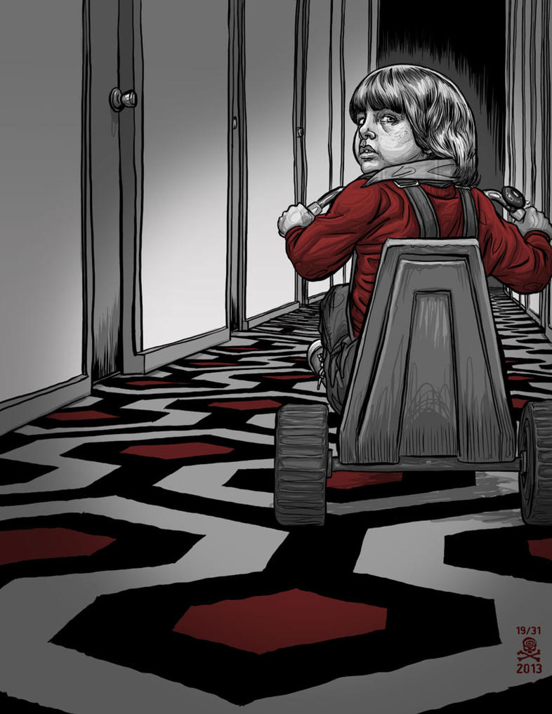
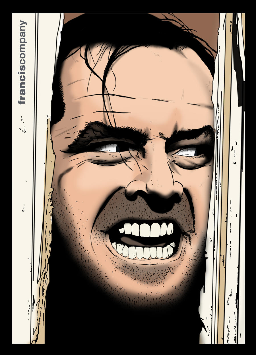
of his head sticking thru the door after he attacked it with the axe.
and it wasnt meant to "comic book".
I was just simply trying something different than just the same dvd cover that's out there
of his head sticking thru the door after he attacked it with the axe.
- Messages
- 1,843
- Reaction score
- 12
- Trophy Points
- 53
But isn't it a comic book illustration on the front cover? I think it looks rad but agree with Kal that if you had the same type of illustrated picture on the back it would tie together really well.
jswert123456
Well-known member
- Messages
- 2,379
- Reaction score
- 24
- Trophy Points
- 48
here is version 3.

- Messages
- 1,843
- Reaction score
- 12
- Trophy Points
- 53
That ties together (though you might tint the back slightly more green to match the blue colors). I personally loved the comic look. I would use the front cover you had on V2 which I love and something like this
or this:
would look great on the back (with maybe a vertical strip of stills next to it to fill the space) imo.
or this:
would look great on the back (with maybe a vertical strip of stills next to it to fill the space) imo.
jswert123456
Well-known member
- Messages
- 2,379
- Reaction score
- 24
- Trophy Points
- 48
thecuddlyninja said:That ties together (though you might tint the back slightly more green to match the blue colors). I personally loved the comic look. I would use the front cover you had on V2 which I love and something like this
or this:
would look great on the back (with maybe a vertical strip of stills next to it to fill the space) imo.
not doing a comic book look, so these pics make no sense.
- Messages
- 1,843
- Reaction score
- 12
- Trophy Points
- 53
jswert123456 said:not doing a comic book look, so these pics make no sense.
Okay. You had a comic book illustration on the front cover of v1 and v2, which I thought looked great. To each his own.
jswert123456
Well-known member
- Messages
- 2,379
- Reaction score
- 24
- Trophy Points
- 48
Kal-El said:That first cover would make a great front! Doesn't always have to be the main lead on the cover... Iconic scene or shot works just as well.
what are you talking bout- the first cover?
the last cover I put is the final one.
jswert123456
Well-known member
- Messages
- 2,379
- Reaction score
- 24
- Trophy Points
- 48
the back pic of him in the maze is just alot more blue and less faded as the front pic.
I guess I can see if I can match it up more.
I guess I can see if I can match it up more.
jswert123456
Well-known member
- Messages
- 2,379
- Reaction score
- 24
- Trophy Points
- 48
ok this is it- version 4-
