Canon Editor
Well-known member
- Messages
- 1,730
- Reaction score
- 80
- Trophy Points
- 53
Dig! I would love if you could keep fine tuning your cover art for the edit.
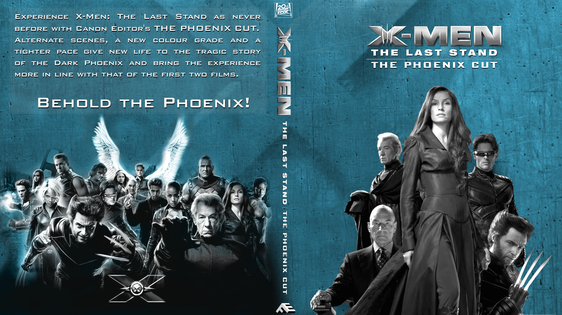
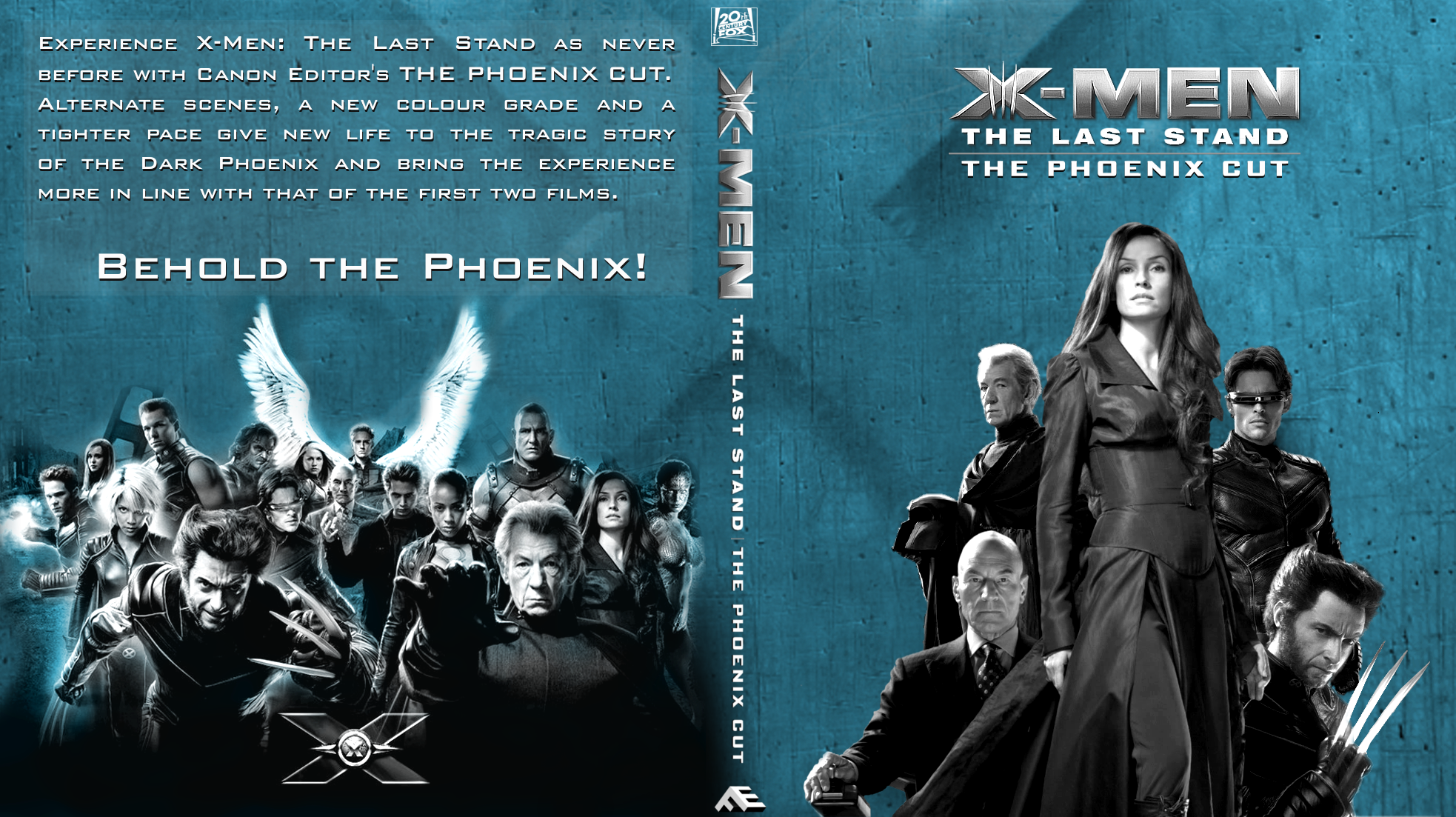
My suggestion is to let the space breathe a little more, add a small figure of Warren/Angel flying in the background, just below the title. Have Wolverine’s figure pushed back a bit, fading a bit under his back, push Magneto a bit more to the back as well and Xavier just next to him, instead of Scott. If you could bring the blue tint to the same saturation and tone as the one on the DofP cover reference you posted and oversaturate Jean’s dress, it would be wonderful. Maybe, to remove some unnecessary “weight”, the Phoenix image behind Jean could go too. Having Magneto higher up with Charles next to him would allow Jean to have her own little center space without being crowded, cleaning the cover even more. I have some ideas regarding the placement of other characters on the back too, when you get to it!
These are simply my suggestions, but go with your own too, obviously!

")