• Most new users don't bother reading our rules. Here's the one that is ignored almost immediately upon signup: DO NOT ASK FOR FANEDIT LINKS PUBLICLY. First, read the FAQ. Seriously. What you want is there. You can also send a message to the editor. If that doesn't work THEN post in the Trade & Request forum. Anywhere else and it will be deleted and an infraction will be issued.
  • If this is your first time here please read our FAQ and Rules pages. They have some useful information that will get us all off on the right foot, especially our Own the Source rule. If you do not understand any of these rules send a private message to one of our staff for further details.
  • Please read our Rules & Guidelines

    Read BEFORE posting Trades & Request

Requests

Hello all, 


As some of you know, I have completed my X-Men: The Last Stand fan edit (titled The Final Cut) and will be needing a cover for it.  

If someone is interested in designing one, please do!  I need your help. 

DETAILS: 
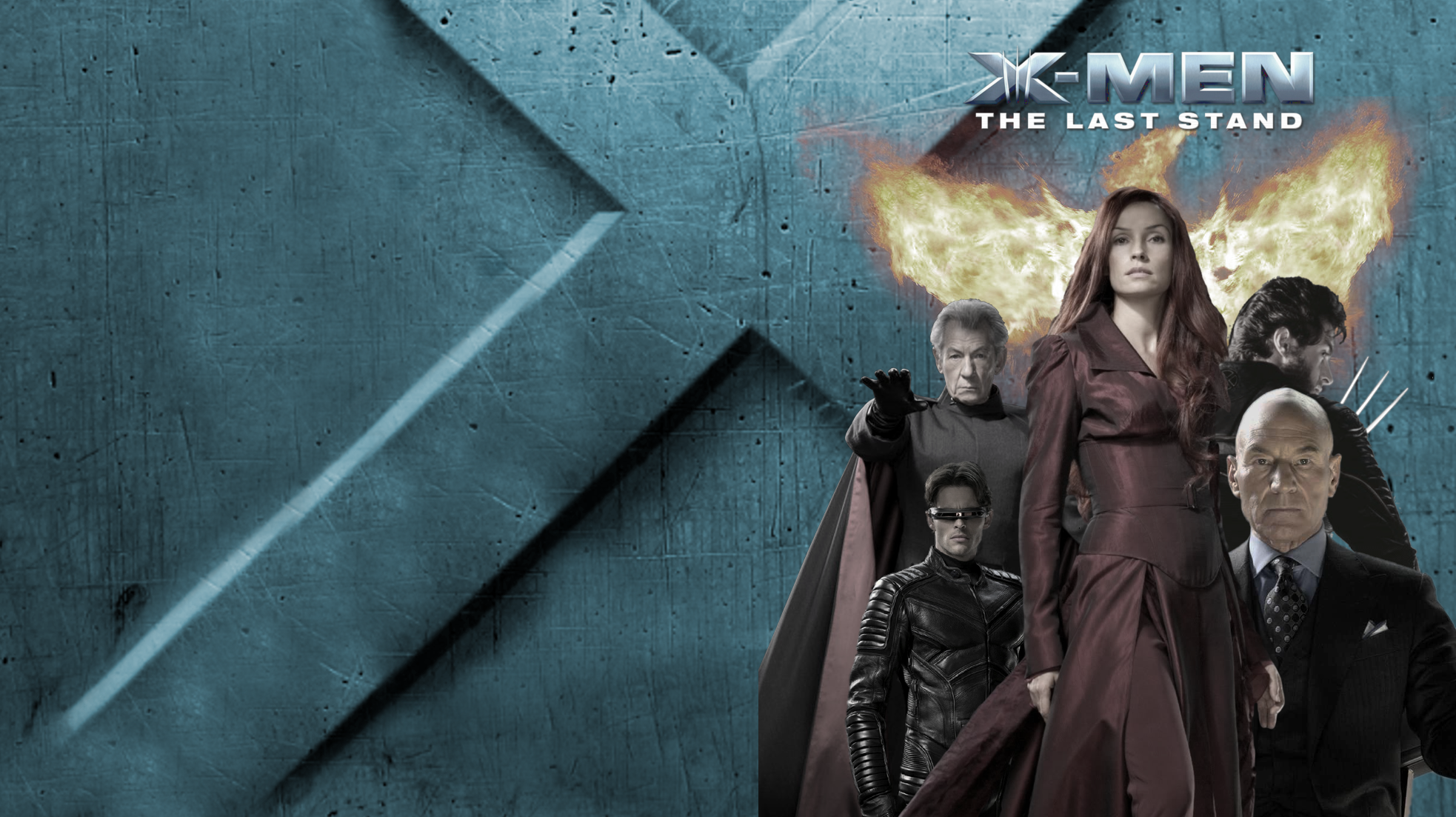
I wouldn’t mind a simple and effective cover.  What I always thought of was one aking to the red themed cover for Days of Future Past: The Rogue Cut, tainted blue instead.  

What would be fantastic would be a cover where we see Wolverine, Beast, Iceman, Professor X, Magneto stand and somewhere in the background, but visible nonetheless, Jean Grey in her red dress.  The red dress would be the only element not tainted in blue. 

This is only my two cents, but please advance other concepts, fellas!
 
That idea sounds real good. I'll see what I can do. :)
 
Are you wanting any specific text/fonts? Do you have a synopsis to put on the back?
 
The perfect text font would be the one from the original 2003 X2 poster, but I don’t know which one exactly it is and if it is possible.  As a second choice, definitely Bank Gothic.  I can provide a synopsis to put on the back.
 
Canon Editor said:
I can provide a synopsis to put on the back.

waitforit.gif

:p
 
:D


“Experience X-Men: The Last Stand as never before with this final cut of the film.  Alternate scenes, a new colour grade and a tighter pace give new life to the tragic story of the Dark Phoenix and bring the experience more in line with that of the first two films.  Behold the Phoenix!” 

Apply changes where you feel the need to ;)
 
Posts merged in the Requests thread of the cover art section.
 
Not sure if you'll like this idea, but here's my go. You wouldn't believe how hard it is to find a good poster focusing on Jean. 

Artboard.png


final.png


Increased Saturation on her dress, desaturated everything else.
 
Artboard_Copy_11.png


New cover based on the Japanese version. This works well if it's called the phoenix cut.
 
@"Canon Editor", here's a draft of a DOFP-esque X3 cover. I've made it blue-ish as requested. If you like the direction let me know and I'll pursue it more.
ce-x3-draft.png


DOFP references
freedvdcover_x-men_-_zukunft_ist_vergangenheit_rogue_cut_ohne_fsk.jpg


image.php
 
Wow, these are all amazing: THANK YOU GUYS.  Dig, I find the direction not too bad, but not too simple either.  If tweaked a little more, it could work. 
Wow, Ryaney!  Your covers are FANTASTIC.  I always loved the Japanese poster, even though it looks mirrored, somewhat…  :dodgy:
I love the poster with Jean Grey’s dress oversaturated.  That is exactly the feel I was looking for.  Thank you.
 
A suggestion: the X-Men subtitle font is bank gothic. In case y'all were trying to match it.
 
I just sourced a PNG from Google images for the logo and text. The rest are all cropped and overlapped. Looks like Canon prefers the Ryan posters so I'll let Mr. Ry run with it.
 
ThrowgnCpr said:
A suggestion: the X-Men subtitle font is bank gothic. In case y'all were trying to match it.

Thanks, but the font we're trying to match (for me) is the "ROGUE CUT" font.  :) 

DigModiFicaTion said:
I just sourced a PNG from Google images for the logo and text. The rest are all cropped and overlapped. Looks like Canon prefers the Ryan paoters so I'll let Mr. Ry run with it.

No, I really like your style, just saturate it as tad bit and oversaturate Jean. :)
 
Canon Editor said:
Dig, I find the direction not too bad, but not too simple either.  If tweaked a little more, it could work.

I'll await direction if you're interested.

@"theryaney" poster and case art should reflect the same image, so I'd not want to invest the extra time if Canon is liking yours, which look great btw. I just wanted to throw the option of his DOFP blue request out there.
 
Okay, @"DigModiFicaTion". It still looks really fantastic though.  :p
 
Back
Top Bottom