• Most new users don't bother reading our rules. Here's the one that is ignored almost immediately upon signup: DO NOT ASK FOR FANEDIT LINKS PUBLICLY. First, read the FAQ. Seriously. What you want is there. You can also send a message to the editor. If that doesn't work THEN post in the Trade & Request forum. Anywhere else and it will be deleted and an infraction will be issued.
  • If this is your first time here please read our FAQ and Rules pages. They have some useful information that will get us all off on the right foot, especially our Own the Source rule. If you do not understand any of these rules send a private message to one of our staff for further details.
  • Please read our Rules & Guidelines

    Read BEFORE posting Trades & Request

macmilln's Poster Emporium

Nice! Better than mine I think, though I suspect it to be TWS based on the hair. Doesn't really matter 'cause it's way cleaner.

And this also doesn't matter, for your use, but for my own OCD I replaced the font in yours to match with the rest of the set (font is Gilroy ExtraBold if you wanna know):
qvviPF6.jpg
 
Thanks, for the font suggestion! I just used Gotham Medium as it looked close enough, but Gilroy looks a little nicer.
 
@"Xerlientt"'s Doctor Sleep - The Shining Cut
hP1JtC7.jpg
 
Pardon my intrusion, but what is Captain Marvel: Higher, Faster, Farther?
 
macmilln said:
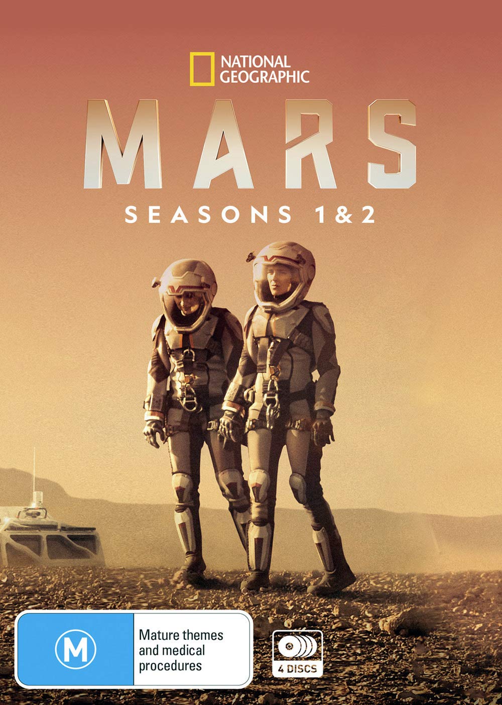
Hey @"Last Impressions" I stumbled across some new art for Mars. Can you confirm if either of these are season one?

mars-2016

(I can clean up the text in this one)
71JpbMlCsxL._SL1403_.jpg

If both, let me know which one you like better and I'll slap it on a poster for you!

Hey Macmilln's sorry i must have missed this post - i confirm that the first picture is of season 2 (which will be my Phase 3 )so will be of no use until i finally get around to editing phase 3. You can use the second picture though. Thanks and take care out there.
 
@"Motleys Fanedits" I don't even know if it was ever formally released. It's an edit made by someone from a Discord server I used to be apart of. Probably more-or-less inaccessible...
 
@"Last Impressions" finally got around to making that Mars: Phase Two poster, hope ya like it!
jydpDWF.jpg
 
macmilln said:
@"Last Impressions" finally got around to making that Mars: Phase Two poster, hope ya like it!

Thanks - that looks proper top notch . I still don't know when i will get around to phase three as its only available digitally. I have a few edits in the works but the the famn damily come first - due to lockdown i am now the head teacher of my own home school...flexing the cane - drinking coffee, smoking fags all while i'm wearing my corduroy blazer with elbow patches...dishing out detentions and grounding my kids...as punishment they have to leave the house for two weeks :)

keep safe
 
@"Last Impressions" whaddaya think?
gDSMDLB.jpg


I had to trace the logo in Illustrator 'cause I couldn't find one high-res enough. It's not perfect but I think it gets the job done!
 
macmilln said:
@"Last Impressions" whaddaya think?
gDSMDLB.jpg


I had to trace the logo in Illustrator 'cause I couldn't find one high-res enough. It's not perfect but I think it gets the job done!

That is sweet. Thank you so much. Can i play around with it and make a bluray cover? Is it possible for you to send me the PNG file of the logo's..once again thank you

would i need permission from the artist to use their images?
 
@"Malthus"' Thor: Odinson?
J1nGc9v.jpg


Sorry Malthus, this certainly isn't my best MCU-poster work. In my experience, there isn't a lot of minimalist art for Thor to be found...and I've already selfishly 'reserved' the best art I could find for my own potential edit... this is awkward, I know...
 
macmilln said:
Sorry Malthus, this certainly isn't my best MCU-poster work. In my experience, there isn't a lot of minimalist art for Thor to be found...and I've already selfishly 'reserved' the best art I could find for my own potential edit... this is awkward, I know...

Don't be daft, I love it! Thank you. It just occurred to me that my artwork didn't actually feature the film's title. 

JRsMAEx.gif
 
@"Last Impressions"' Ad Astra: Cor Tenebrae Edit
wkAM30r.jpg
 
The text on that Mandy poster is sublime but the text on the Ad Astra one looks off IMO. I think it's because the large gap between 'Ad' and 'Astra' is further exaggerated by the gap between 'Cor' and 'Tenebrae' being lined up with it (and the D and C being lined up too). To me it looks like "Ad Cor/Aster Tenebrae Edit". A tweak like this perhaps?:

50048474591_e175796753.jpg
 
@"TM2YC" Interesting that you point that out, as the Mandy poster text was traced by me, whereas the Ad Astra one was lifted from an official poster :D.

I see what you mean, whad'ya think of this?
37cTKYn.jpg
 
And an alt (more "conventional" art, but much less empty space):
y47d8hJ.jpg
 
This is great @"macmilln" and thanks for chipping in with your comments @"TM2YC" the font on the second poster is much improved - i love the spacing. I am currently working on a poster now and was just about to head off to bed and now i'm pumped again to carry on. Like with the Mandy poster can you send me the PNG files - I would love to use the titling in some of my artwork. I may even try to turn your yellow poster blue as the planet is meant to be Neptune. Once again , i thank you both.
 
Back
Top Bottom