jswert123456
Well-known member
- Messages
- 2,379
- Reaction score
- 24
- Trophy Points
- 48
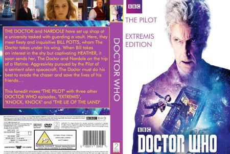
version 2- tweaked

Read BEFORE posting Trades & Request


Zarius said:Consensus is I'm just rubbish at this, but here we go again with another stab at a cover
")
Zarius said:Here's a new cover I made for my Knight Rider 2000 edit
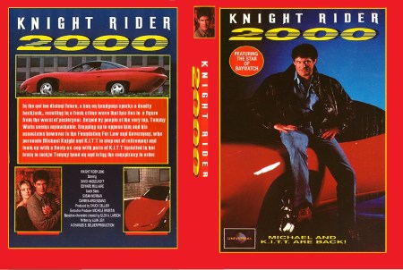
Zarius said:That KR one is definitely DVD sized when you see the full version.
Thanks for the comments
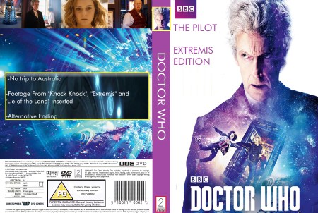
Zarius said:Wasn't satisfied with the last cover, here's another stab at it