-
Most new users don't bother reading our rules. Here's the one that is ignored almost immediately upon signup: DO NOT ASK FOR FANEDIT LINKS PUBLICLY. First, read the FAQ. Seriously. What you want is there. You can also send a message to the editor. If that doesn't work THEN post in the Trade & Request forum. Anywhere else and it will be deleted and an infraction will be issued.
-
Please read our Rules & Guidelines
Read BEFORE posting Trades & Request
You are using an out of date browser. It may not display this or other websites correctly.
You should upgrade or use an alternative browser.
You should upgrade or use an alternative browser.
Fanedit Covers By Zarius
- Thread starter Zarius
- Start date
jswert123456
Well-known member
- Messages
- 2,379
- Reaction score
- 24
- Trophy Points
- 48
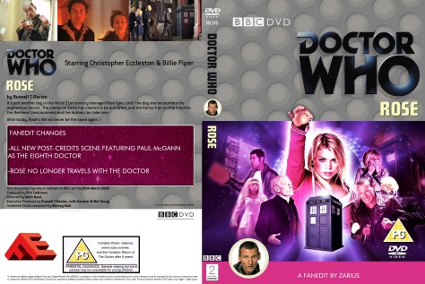
Zarius said: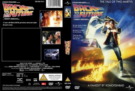
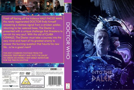
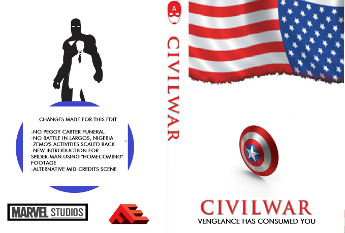
A cover request from @"SonofSinbad"
(I left some space on the back for him to write his changes in)
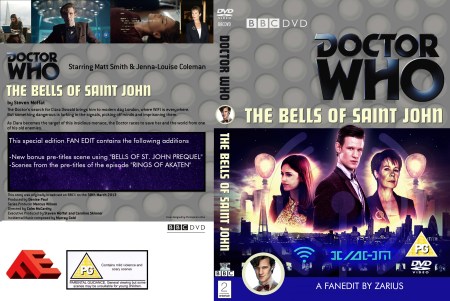
might look better if all the photos on the back are the same size
and all lined up.
- Messages
- 15,090
- Reaction score
- 36
- Trophy Points
- 133
Zarius said:I dunno, some DVDs have unalligned screencaps of varying sizes.
True, but there is usually some sort of design reasoning behind it. I agree with jswert that creating some uniformity would improve the cover.
And for Pete's sake, lose those giant UK ratings and the barcode. Neither are relevant to the edit anymore.

- Messages
- 15,090
- Reaction score
- 36
- Trophy Points
- 133
")

- Messages
- 15,090
- Reaction score
- 36
- Trophy Points
- 133
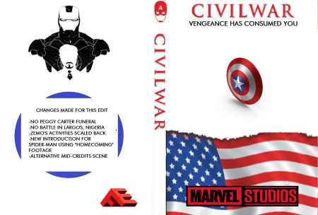
nice and clean, but Captain America's shield is oval...
MiniMetroid
Well-known member
- Messages
- 52
- Reaction score
- 0
- Trophy Points
- 11
The flag could be turned upside-down due to all the mayhem
- Messages
- 1,843
- Reaction score
- 12
- Trophy Points
- 53
I like the minimalist design, very nice. However I prefer the flag on the bottom, so it goes from bigger to little as you go up, personally. The back is dynamite. I would prefer the title centered on the spine and another FE logo at the bottom. I think it'd look more balanced plus I like FE logos visible on my shelf. ?
Also, I don't know if you know this but the reverse flag is a nice reference to the military. When a flag patch is worn on a uniform, the stars face forward no matter what, so patches worn on the right arm look like the one on your cover. It's a nice reference to CA's roots, even if you didn't intend it.
That being said, the flag is burnt up so I don't think proper flag protocol is really a priority in the midst of a Civil War!