• Most new users don't bother reading our rules. Here's the one that is ignored almost immediately upon signup: DO NOT ASK FOR FANEDIT LINKS PUBLICLY. First, read the FAQ. Seriously. What you want is there. You can also send a message to the editor. If that doesn't work THEN post in the Trade & Request forum. Anywhere else and it will be deleted and an infraction will be issued.
  • If this is your first time here please read our FAQ and Rules pages. They have some useful information that will get us all off on the right foot, especially our Own the Source rule. If you do not understand any of these rules send a private message to one of our staff for further details.
  • Please read our Rules & Guidelines

    Read BEFORE posting Trades & Request

Doctor Who

I felt underwhelmed by the special. The social commentary was over the top, and it felt like they were trying to force emotional moments instead of letting them occur naturally. I really wanted to like Capaldi's Doctor, but I guess it wasn't in the cards.

I'm excited to see Whittaker in the role, and even more excited to see what Chibnall can bring.
 
My wife and I managed to catch up on our viewing of classic Who so that we saw “Tenth Planet” just before “Twice Upon a Time”! The episode was terrific.


I’m thinking of an edit for “Twice.” I thought it was terrific just as it was, but I would make a few changes to try to make it feel like an actual Hartnell storyline:

1) Make the whole story black-and-white, and in two half-hour installments.

2) Replace the opening titles with Hartnell’s.

3) Cut out any double-entendres which, while not unusual for modern prime-time TV, wouldn’t have been part of a 1960s children’s television show.

4) Cut down on the controversial lines that made the First Doctor come off as more sexist than he actually was.

Mind you, it’s not a criticism to say that this felt like a Twelfth Doctor story; it was a Twelfth Doctor story and should feel like that. But it is fun to play a game of “What if…?” For that matter, I’d make the special effects dodgier if I knew how!

Anyway, it was a fun and entertaining story, and a great way to cap off Capaldi's era!
 
TomH1138 said:
I’m thinking of an edit for “Twice.” I thought it was terrific just as it was, but I would make a few changes to try to make it feel like an actual Hartnell storyline
That sounds like a fun way to rewatch.
 
@"TomH1138"  , if you go through with this, I can assist.  I've tinkered with a process for processing video to resemble the 405-line / 377i look of the Hartnell era for quite a while, and would be happy to give your edit that treatment once you've cut everything together.
 
With Crimbo over, I finally found time to watch the DW special and it really was one of the all-time greats IMO. The sometime Doctor team ups are always fun and the sparkling banter between One and Twelve was no exception. Some of Capaldi's dialogue at the end brought a tear to the eye. The episode was visually the best the show has ever looked.
 
You know, in retrospect, Moffat probably had more planned out than we might give him credit for.

 
Oh yeah ^ Joanna Lumley would have genuinely made a great Doctor. She's hosting the BAFTAs this year by the way.
 
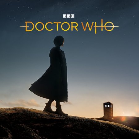
So what does everyone think of the new logo?

1519157071059.jpg
 
Zarius said:
So what does everyone think of the new logo?

1519157071059.jpg

Like everything else that has been reveled about the new series, not very good. The whole 'lines through letters' thing is just a stupid gimmick.
 
wilhelm scream said:
Zarius said:
So what does everyone think of the new logo?

1519157071059.jpg

Like everything else that has been reveled about the new series, not very good. The whole 'lines through letters' thing is just a stupid gimmick.

It's going to be on all the merchadise going forward, including new releases of retro Who material
 
It's a nice logo. I like the way the last O looks kinda like a ringed planet. I don't think you'll ever beat the chunky Pertwee logo though.

40652151252_96eaeff854_z.jpg


It's like the Star Wars logo but before Star Wars.
 
You don't prefer the Second Doctor's logo in good ol' Times New Roman?
 
asterixsmeagol said:
You don't prefer the Second Doctor's logo in good ol' Times New Roman?

Not really, one of my least favorite. This of course being the worst:

Logo-7.png


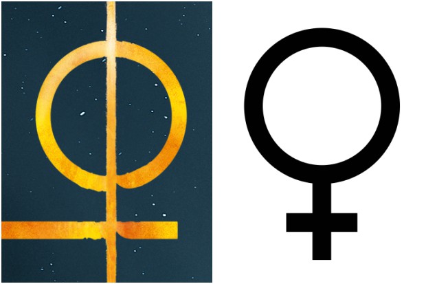
DW_Hero_Insignia_On_Background_RGB-924c0b4.png


I like this circle version.
 
matrixgrindhouse said:
Oh, neat - it's a key (to the TARDIS?) unlocking tumblers, right?  I dig it.

Oh yeah and also maybe this...?

1-WhoFunky-feb5464.jpg
 
TM2YC said:
asterixsmeagol said:
You don't prefer the Second Doctor's logo in good ol' Times New Roman?

Not really, one of my least favorite. This of course being the worst:

Logo-7.png

In case it's not clear, I was kidding about the Second Doctor logo. It's awful. It's my least favorite but the Seventh Doctor logo you showed is really bad too.
 
Tardis model at the end doesn't look convincingly pro level but I like the different take on the time-tunnel:

 
I need some advice....

Tom Baker's first series comes out on region 1 Blu-ray in June, but is it worth buying?
I already own it on dvd, and I was under the impression, and please correct me if I am wrong, that the reason the original DW episodes have not been released on BR before now was because they were not shot on film?

So would I be just buying DVD quality video (with slight up conversion?) on Blu Ray?  Would the only real difference be rather than all the bonus features being on a seperate disc they would all be on a single BR????

:huh:
 
Back
Top Bottom