- Messages
- 14,897
- Reaction score
- 2,422
- Trophy Points
- 228
Masirimso17 said:How DO you fix this weird letter spacing?
Hope I'm not going too off topic
Yeah, let's not drag this thread too much off topic but in short...
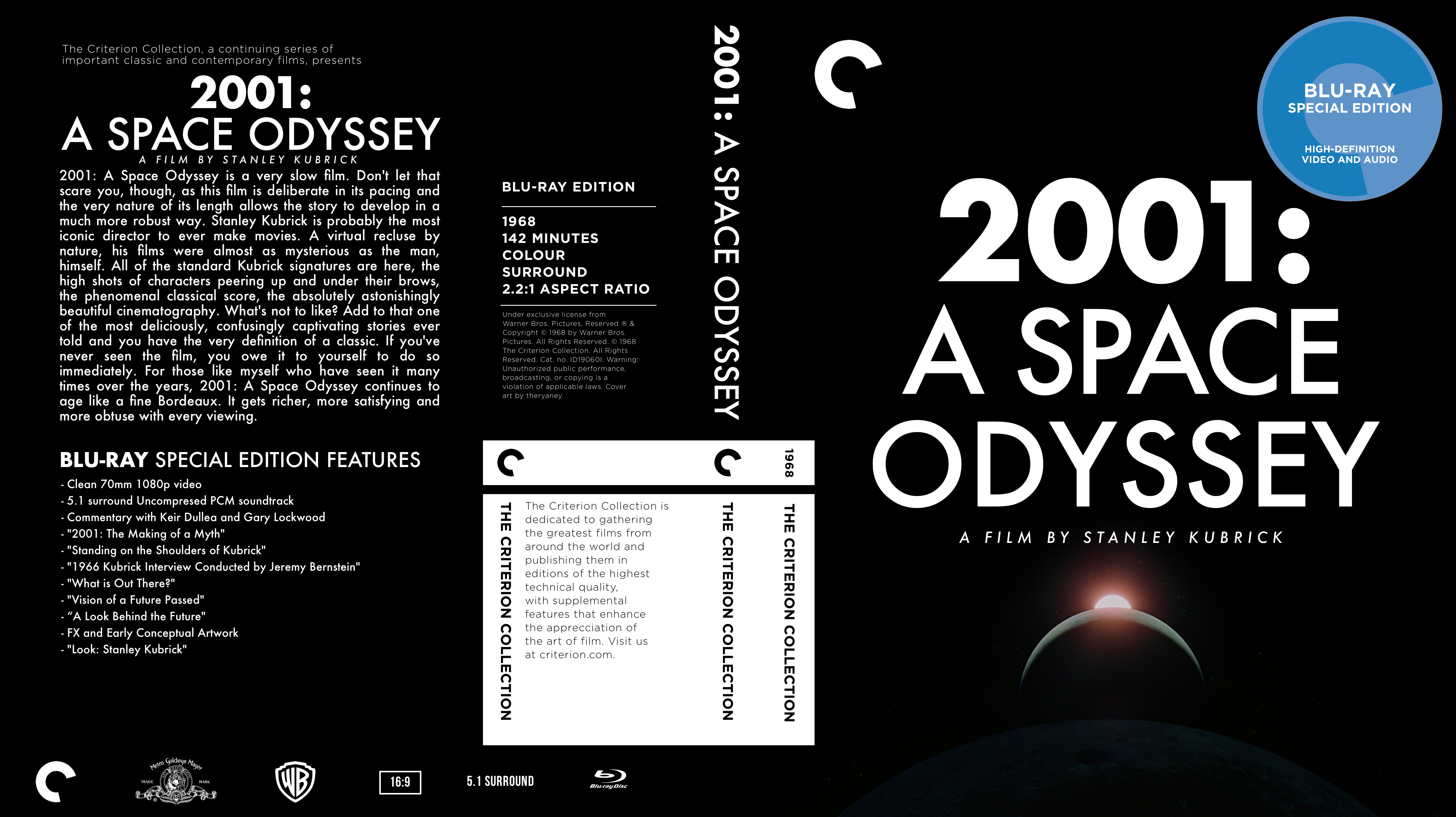
It's down to perception caused by the shape of certain letters and their relationship to other letters. In the cover above, the A is actually spaced closer to the P and the C, than they are to the S and E, but because of the shape of the A (and the letters next to it) the gap looks larger. The only way to fix this is to manually adjust the spacing until it looks right on your own judgement. Your PC is probably not going to do this for you, or get it right.
")