• Most new users don't bother reading our rules. Here's the one that is ignored almost immediately upon signup: DO NOT ASK FOR FANEDIT LINKS PUBLICLY. First, read the FAQ. Seriously. What you want is there. You can also send a message to the editor. If that doesn't work THEN post in the Trade & Request forum. Anywhere else and it will be deleted and an infraction will be issued.
  • If this is your first time here please read our FAQ and Rules pages. They have some useful information that will get us all off on the right foot, especially our Own the Source rule. If you do not understand any of these rules send a private message to one of our staff for further details.
  • Please read our Rules & Guidelines

    Read BEFORE posting Trades & Request

Discussion: The new Digital-Fanedit

Status
Not open for further replies.
I just want to say that I really like the new design. In terms of the forum, I prefered the vBulletin forum we just left, but this is just as easy to use and looks pretty slick. The new home looks fricking  great! I agree that we don't need a "latest reviews" widget or FEOTM on the front page. The thumbnail view for articles is totally tits. I'm not quite sure how I feel about IFDB yet, and I know there's still a lot to do on that front, so I'll refrain from commenting on it now.

I definitely like viewing threads in "classic mode" as that makes things easier for my eyes to follow. For anybody who hasn't messed around with their options, go to "User CP" --> "Edit Options" and you can find it under "Thread View Options". Changing it to Classic Mode goes from this to this.
 
ThrowgnCpr said:
NewSpock said:
I think some important functionality got lost:

1. In the old design, you could find everything important on the front page, what new fanedits are published for the week, and the latest review on the right side.

Now you need to click on IFdb to see the latest reviews, and what new fanedits are published is not visible at all.

2. And when you want to search for fanedits of a specific faneditor, you can't anymore.

Thanks NewSpock. RE: your concerns:

1) The old front page was a complete and utter mess. We (the staff) all hated it. Much of that info was redundant, most of the "articles" weren't really articles, and it was impossible to read it anywhere but a desktop. This is a big platform change for everyone, but hopefully you'll see it is a much better system. Articles will be posted regularly, covering new releases, movie news, tutorials, etc--not just a batch of cookie-cutter notifications for new edits. The entire suite of sites was redesigned to operate as one unit. For the latest reviews and edits, go to IFDb. We are still working on adding functionality to IFDb, so don't be alarmed.

2) See my last comment in #1. We still have to add some of the navigation functionality. The jReviews plugin couldn't handle importing several hundred menu items to the wordpress framework. The navigation won't be exactly the same as it was before, but we still have quite a few things to adjust there before it is done.

The next week or two is still going to be a busy one for the staff, stay tuned.

Fair enough, I can see now how much hard work it must be to create, manage and organise such a major redesign. Kudos and thanks for that to all involved.
 
TV said:
Vultural said:
Useless Opinion - If that FE logo is permanent, it is clunky and squeals corporate 80s.  If a gag, well done!
Filed under "Useless Opinions Best Kept To Youself."

My darling Frink, I should slap my wrist.
Here I thought this thread was for opinions, suggestions, bug reports, observations.
Replies from Throw and other honchos seem to address and clarify points others make.
Apparently, not everyone desires opinions.
I guess at least one member perceives that new FE logo is not FanEdit, but hisownself.
Silly me.

ThrowgnCpr said:
Vultural said:
Useless Opinion - If that FE logo is permanent, it is clunky and squeals corporate 80s.  If a gag, well done!
Not a gag; it's real, and something we had envisioned for a while. We're quite happy with it, even if it isn't your taste. Sorry, its staying.

I still contend that logo is clunky.  The top bar on the F is way too long.
I ain't emperor, though, so I'll stew quietly for a spell.
Might send it to my web designer friends so they can giggle.

Another point - How about those old banners?  They coming back?  I really liked them.
Thanks.
 
Vultural said:
Here I thought this thread was for opinions, suggestions, bug reports, observations.
Replies from Throw and other honchos seem to address and clarify points others make.
Apparently, not everyone desires opinions.
I guess at least one member perceives that new FE logo is not FanEdit, but hisownself.
Silly me.

I still contend that logo is clunky.  The top bar on the F is way too long.
I ain't emperor, though, so I'll stew quietly for a spell.
Might send it to my web designer friends so they can giggle.

Another point - How about those old banners?  They coming back?  I really liked them.
Thanks.

If you liked the design of the old banners, I can see why you don't like the new logo, and I don't mean that as a compliment  :)

Maybe you and your web designer friends can go make your own, really amazing fanedit site in your free time, and show us plebes how it's done. I look forward to seeing what you come up with.
 
bionicbob said:
reave said:
You're right, because you're Bob. But I'm not sorry.

Not certain how to interpret your comment (funny? sarcasm? angry?) but I am not asking for an apology.

Before this gets out of hand, I want to make clear I truly appreciate the commitment, all the hard work you (hundreds and hundreds of hours)and the others put into this site.  It is staggering and mind-blowing.  I don't know how you juggle it all and real life too!  It's amazing, inspiring and you all should be highly commended!

And I have no issue with changing or redesigning the site (which looks really cool!!!).  And I know fully well that a new design will have bugs and will take time to work out.

My issue was only combing the relaunch with an "in-joke" that only a very elite few would understand, and then expecting the general membership to "get it" and not question anything.

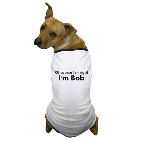
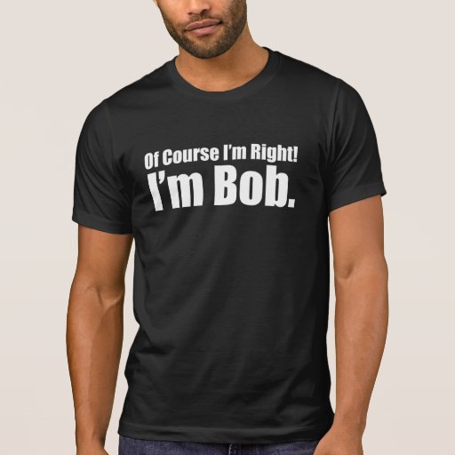
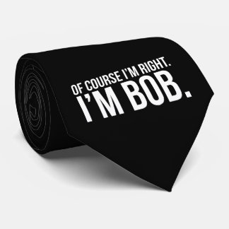
It's not getting out of hand. I L :heart: VE you, Bob. It's just that you're always right, because you're Bob. 

Another in-joke that apparently fell flat. I figured all Bob's knew about all Bob's being right.

of_course_im_right_im_bob_dog_tshirt.jpg

of_course_im_right_im_bob_trucker_hat-r8a664b1923e64d5ba5e4f7d36f4ee8f2_v9wfy_8byvr_324.jpg

of_course_im_right_im_bob_shirt-r97589dd3343f4dbe87a66188252650a1_8naxo_512.jpg

of_course_im_right_im_bob_incipio_feather_shine_iphone_6_case-r5a9491546fc84177b49d2b9f095793fc_zezap_324.jpg

i_am_bob_drinking_glass.jpg

of_course_im_right_im_bob_tie-r63cce662e1e74cad8f0927ee8cee25e6_z5nrg_324.jpg

6e566aa7a12a97022.jpg

because_im_bob_dog_tshirt.jpg
 
Vultural said:
I still contend that logo is clunky.  The top bar on the F is way too long.
I ain't emperor, though, so I'll stew quietly for a spell.
Might send it to my web designer friends so they can giggle.

Another point - How about those old banners?  They coming back?  I really liked them.
Thanks.

Opinions are one thing, and I was expecting some hesitation/disagreement with our design choices, but your 'opinions' are starting to come off snide and tasteless.  

Those old banners are not coming back. Among a variety of issues. they were a nightmare to manage. Edits will now be featured on the homepage via a simple slider (one of the many tasks we haven't gotten to yet).

I'll not get into a back and forth on design choices and opinion. It is impossible to please everyone in that regard. I hope we can engage in better conversation about functional ways to improve the site.

I know other staff members will also want to chime in with their perspectives. This was, after all, very much a team effort.
 
I'm fine with banners going away. They took up too much space on the page, and I know how annoying it is to update the rotation. I'm looking forward to seeing how that slider thing on the home page turns out.
 
Gonna be honest, I thought the redesign was a joke. Didn't help that it came out on April Fool's and was bundled with that "digital fanedits" nonsense! I do see some virtue in the redesign now - I like that it's mobile friendly and that all the outdated "help" pages on the main site seem to be gone.


Neglify said:
I definitely like viewing threads in "classic mode" as that makes things easier for my eyes to follow. For anybody who hasn't messed around with their options, go to "User CP" --> "Edit Options" and you can find it under "Thread View Options". Changing it to Classic Mode goes from this to this

Thanks, that was helpful.

jerick said:
Favorite part of the new site.....the beautiful simplicity of grey on gray text.

I also find all the grey hard to look at.

Question: Will every fanedit release be accompanied by a specially written article on the front page? I'm wondering 'cause that seems like a lot to ask of the staff.
 
Problem Eliminator said:
Question: Will every fanedit release be accompanied by a specially written article on the front page? I'm wondering 'cause that seems like a lot to ask of the staff.

Ideally, yes. In reality, probably not. The way we are handling articles is different now (not the sole responsibility of one person) so hopefully we'll see some more interesting articles released on a regular basis, with little burden on a single staff member.
 
Great timing and idea to use an April fool's joke for a redesign, which is very well done. Thank you for putting so much work into this and make it look truly professional and technically advanced. FE will greatly benefit from this.

and on a side note:

As for the DFE stuff... well, it reminded me on tough times with a truly weird person (not the weirdest or most psycho person in my FE times, because that spot will always be reserved). When you try to get a peaceful, friendly, positive, constructive and creative community, you strangely encounter those, who are offended by just that and who interestingly go miles to tell everyone, what a bad person you are with your rules and how they are suppressed by that.

I think the most genius idea of Zuckerberg was to NOT add the "hate" button.
 
boon23 said:
Great timing and idea to use an April fool's joke for a redesign, which is very well done. Thank you for putting so much work into this and make it look truly professional and technically advanced. FE will greatly benefit from this.

Thanks, Boon. For everything. 

Just you wait, it's going to be even better.
 
Thanks boon! FE wouldn't be where it is today without you. The community is forever indebted to you, and it makes the entire staff glow to know like the design/direction.
 
I'm not crazy about the new logo myself but until I design and submit one, I can only thank those who worked on it.

Love the new site! Very slick. When can we get our chat room back?
 
Regarding the automatic subscription concern, I've wiped everyone's subscriptions list and set everyone to not auto subscribe. Unfortunately this can only be done globally, so if you did subscribe recently you'll need to again.
 
Vultural said:
I still contend that logo is clunky.  The top bar on the F is way too long.
I ain't emperor, though, so I'll stew quietly for a spell.
Might send it to my web designer friends so they can giggle.

Filed under "Headed for an infraction."
 
blueyoda said:
When can we get our chat room back?

It's actually available now. Go to http://ifdb.fanedit.org and Login. Use your Forum sign-in information. Then click on Chat. We're going to be merging the two systems soon so that logging in on IFDB or the forums will result on you being logged in on the other.
 
Apologies if my opinions were perceived as snide or tasteless.
They were not meant that way.
They were meant as a light joke - and like other jokes they did not land well.
Again, apologies to anyone who was upset.

Note - I am not going to launch my own fanediting site.
Believe me, that suggestion and all it implies resonates.

I do not understand the hostility towards BionicBob.
He was surprised and confused by the new look and expressed his concerns.
BBob gets belittled and mocked.  At least that is how I perceive it.

I do like how quickly pages load.  That is a major improvement.
 
I am not sure, because I haven't tested it, but I think I have admin power over fanedit.org, or at least I can do posts and other stuff. You might want to correct that. :) Also: I am not allowed to enter the chat.
 
Vultural said:
I do not understand the hostility towards BionicBob.
He was surprised and confused by the new look and expressed his concerns.
BBob gets belittled and mocked.  At least that is how I perceive it.

I'd like to set the record straight--and I've been talking to reave all day so I feel comfortable speaking for him too--in that there is absolutely no hostility towards BionicBob. He is one of our most valued members, and we all love him. There is clearly a difference of opinion on how far we went with the joke, and some additional references missed their marks (like the "I'm right because Bob" reference), but I'm hoping that at the end of today, we can all still get along as before.

This community thrives because of its amazing members, and I want to see that continue in coming years.
 
Status
Not open for further replies.
Back
Top Bottom