• Most new users don't bother reading our rules. Here's the one that is ignored almost immediately upon signup: DO NOT ASK FOR FANEDIT LINKS PUBLICLY. First, read the FAQ. Seriously. What you want is there. You can also send a message to the editor. If that doesn't work THEN post in the Trade & Request forum. Anywhere else and it will be deleted and an infraction will be issued.
  • If this is your first time here please read our FAQ and Rules pages. They have some useful information that will get us all off on the right foot, especially our Own the Source rule. If you do not understand any of these rules send a private message to one of our staff for further details.
  • Please read our Rules & Guidelines

    Read BEFORE posting Trades & Request

Some Covers I have done.

jswert123456 said:
and as the pic says- it's a working copy, just a rough sketch.

It says that?
 
tweaked it a bit.
LbLIkml.jpg
 
jswert123456 said:
cover removed

Can you stop repeatedly removing covers you posted please. If you retroactively go back and delete the links to the images people are talking about, the thread doesn't make any sense anymore. Thanks.
 
jswert123456 said:
So can we just remove the thread please.

Nope.

We could maybe lock it if you wanted but I think you just need to count-to-five/take-a-deep-breath etc etc for a wee moment and you'll see people here are just trying to help. It's constructive criticism :).
 
TM2YC said:
Can you stop repeatedly removing covers you posted please. If you retroactively go back and delete the links to the images people are talking about, the thread doesn't make any sense anymore. Thanks.

I've restored all the posts as they were before.

jswert, don't do that again. As TM2YC said, it really makes it hard for people to read the thread. And it's especially bad form to do it in someone else's thread (like the Iron Man 3 thread). If you don't want constructive criticism, don't post.

This is a warning - next time will be an infraction.
 
OK first off the reason for me doing the covers is for me to get more practice with my skills.
Yes, I can take take criticism, that's why I go back and constantly tweak when someone suggest I change this or that.
I'm sorry if I over reacted and removed the pics.
 
Text is way too small with too much empty space on the back. Also, the image of Jason in the mask didn't come into play until Part 3 (not to mention Jason isn't even the villain in the first movie), and the image of his mom's head is from Part 2.
 
^All of that. Make sure the text is big enough so it fights right in between the picture of the lake and the picture on the bottom (whichever picture you're going to replace the head with). For the front, I suggest getting something generic in place, like a picture of the cabin, the lake, or something like that. We don't even get to see the killer at all until it's revealed to be Ms Voorhees. Up until that point all we get to see is a shadow, hand or arm at most. Not much to work with for a front cover.
 
jswert123456 said:
OK first off the reason for me doing the covers is for me to get more practice with my skills.
Yes, I can take take criticism, that's why I go back and constantly tweak when someone suggest I change this or that.
I'm sorry if I over reacted and removed the pics.
One more thing. When you post new versions, make a new post instead of replacing the old post. Otherwise it looks like people are pointing out things that aren't there.
 
Neglify said:
Text is way too small with too much empty space on the back. Also, the image of Jason in the mask didn't come into play until Part 3 (not to mention Jason isn't even the villain in the first movie), and the image of his mom's head is from Part 2.

look when I did a search for Friday the 13th 1980, these are some of the images that came up.
I'm sorry but it's been a long time since I've seen these movies and I forgot he wasn't the original killer.
The extra black space is there cause there is nothing to put there cept maybe some pics of other cast members.
was the back pic of her in the boat, at least part of the first movie, I want to be sure that's at least correct.
Things will be corrected.
 
Just a personal opinion but this cover strongly implies Ms Voorhees is front player and/or could be the actual killer. She doesn't appear that much in the film at all (including the climax).

For this picture for example, it would be cool if you could cast a shadow over Jason, so you can't see who it is (or make a silhouette of him), change it so it's night instead of day, and make it front cover size.

Get rid of a large portion of the trees/lake in the middle, move the sign to the right side of the girl's head, and cast a shadow over Jason. If you know how to do all this, it could turn out fantastic. Not that skilled (yet) myself so can't really help without looking up what to do first and take ages to complete, sorry.

Camp_Crystal_Lake.png
 
Kal-El said:
Just a personal opinion but this cover strongly implies Ms Voorhees is front player and/or could be the actual killer. She doesn't appear that much in the film at all (including the climax).

For this picture for example, it would be cool if you could cast a shadow over Jason, so you can't see who it is (or make a silhouette of him), change it so it's night instead of day, and make it front cover size.

Get rid of a large portion of the trees/lake in the middle, move the sign to the right side of the girl's head, and cast a shadow over Jason. If you know how to do all this, it could turn out fantastic. Not that skilled (yet) myself so can't really help without looking up what to do first and take ages to complete, sorry.

Camp_Crystal_Lake.png

having Jason even in the pic makes no sense since his role as a killer isn't established yet.
are you saying use the above pic in some way for the cover?
also anything else bout the back that needs changed?
 
jswert123456 said:
having Jason even in the pic makes no sense since his role as a killer isn't established yet.
Hence my saying that you have to obscure him.
are you saying use the above pic in some way for the cover?
If you want, I think it would look cool.
also anything else bout the back that needs changed?
The bottom pic is cut off at the sky, which makes it stand out something fierce. Perhaps use one large picture of the lake for the entire back cover.
^This.
 
I get what your saying.
Thanks for the feedback.
here is the new "lake" version of Friday The 13th cover.
7RAizpG.jpg
 
That looks much better! I think the front is squished, though. I think you should be able to fit both people in with the aspect ratio locked. She won't be centered but I think it'll look better.
 
^^ Come on dude we are really trying to help here! :cry: Have you ever seen a girl with a head shaped like this...

jswert123456 said:

...outside of the movie 'Coneheads'?

3277204.jpg


...and the text is unreadable again.
 
TM2YC said:
^^ Come on dude we are really trying to help here! :cry: Have you ever seen a girl with a head shaped like this...


...outside of the movie 'Coneheads'?
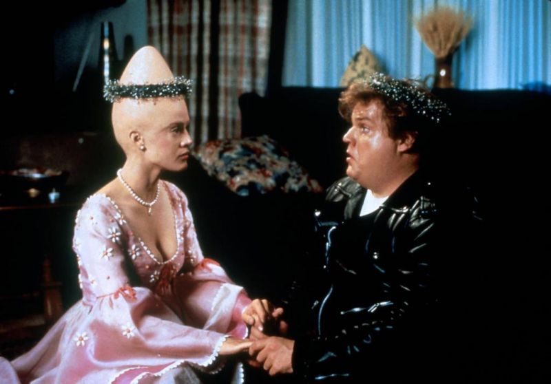
3277204.jpg


...and the text is unreadable again.
Look I'm trying ok.
and what text is unreadable again?
are you talking but the text at the top on the back?
Unless I find a much higher res pic, that is what I had to work with.
 
Back
Top Bottom