jswert123456
Well-known member
- Messages
- 2,379
- Reaction score
- 24
- Trophy Points
- 48
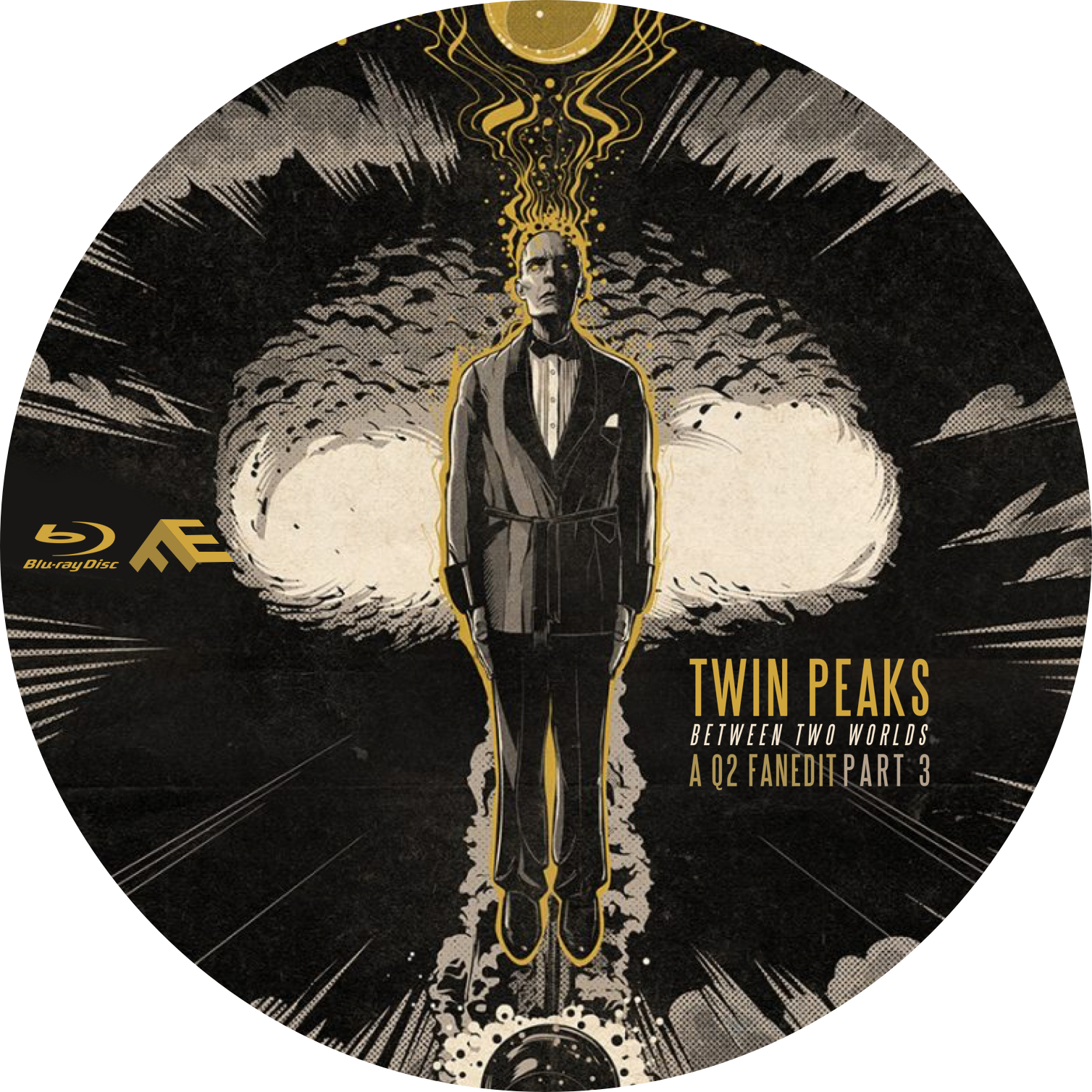
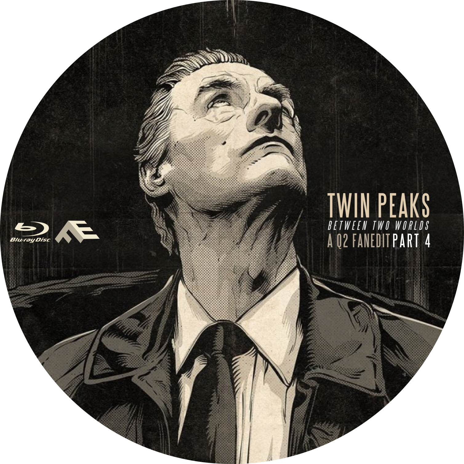
do you realize that it says "Part 4" on the spine of two different covers?
Read BEFORE posting Trades & Request
jswert123456 said:do you realize that it says "Part 4" on the spine of two different covers?
")


TM2YC said:^ Glorious!
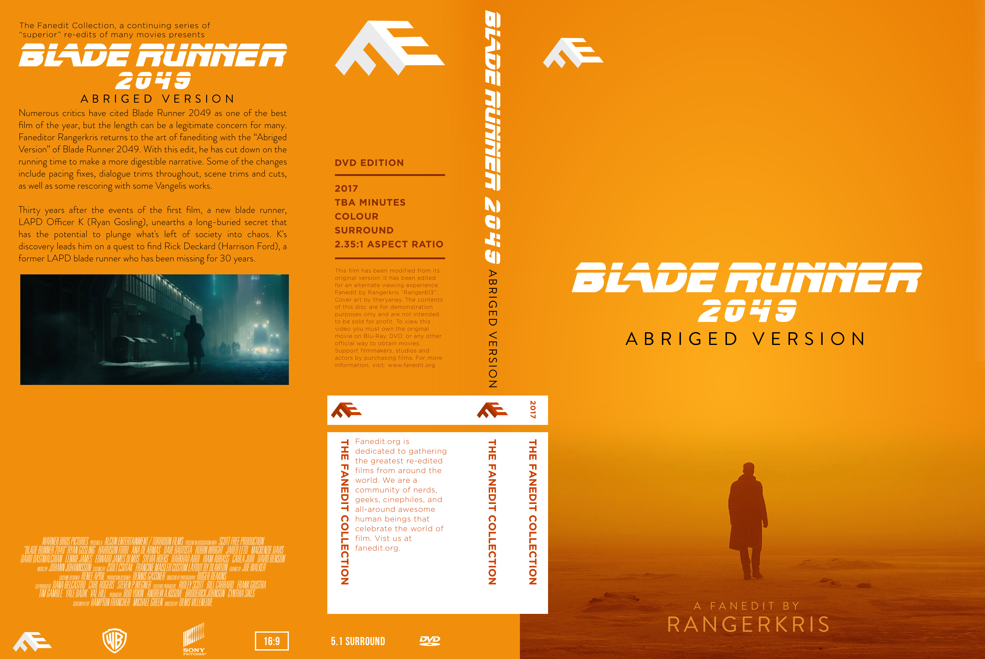
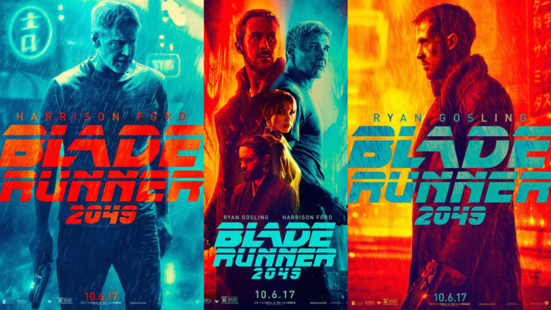
It might be even sexier if the teal colour from the back screenshot was integrated into the front-cover and spine text somehow... the way the dark orange text on the back cover links with the front. Also, shouldn't the letter spacing on "2049" be the same tight spacing as "Blade Runner"?
jswert123456 said:also felt the desert ground shouldve continued on the back
possibly as 1 long shot.
ThrowgnCpr said:Great work on all these covers. If I have one lingering comment, it is that they feel somewhat incomplete with that rather large open space on the bottom left of the back.
theryaney said:The line spacing was based on a cover I saw


The Scribbling Man said:Great work, @"theryaney" !
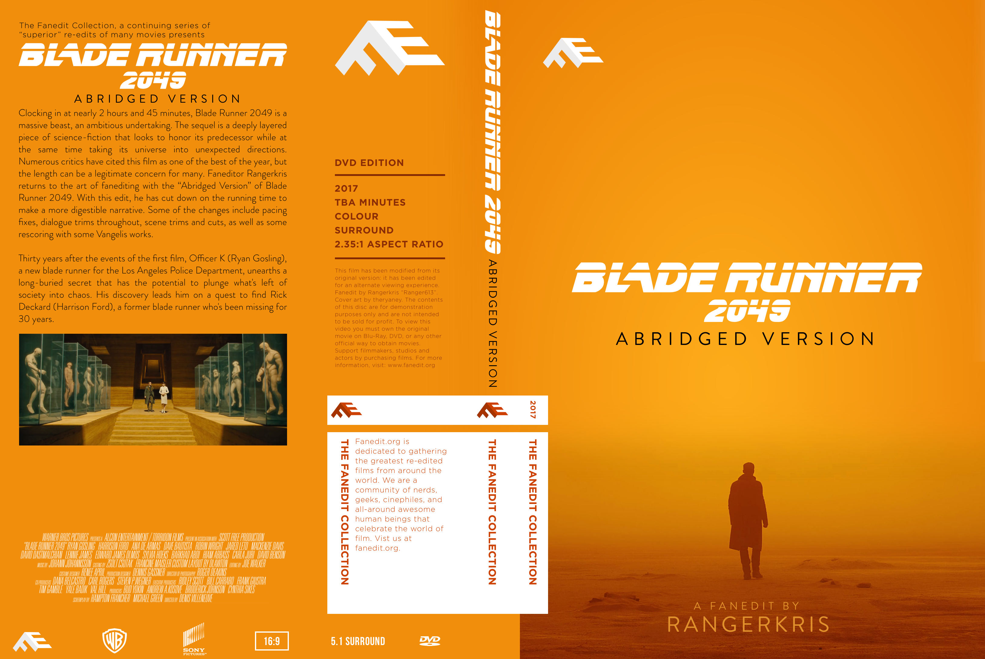
Hate to be a stickler, but "Abriged", should be "Abridged"

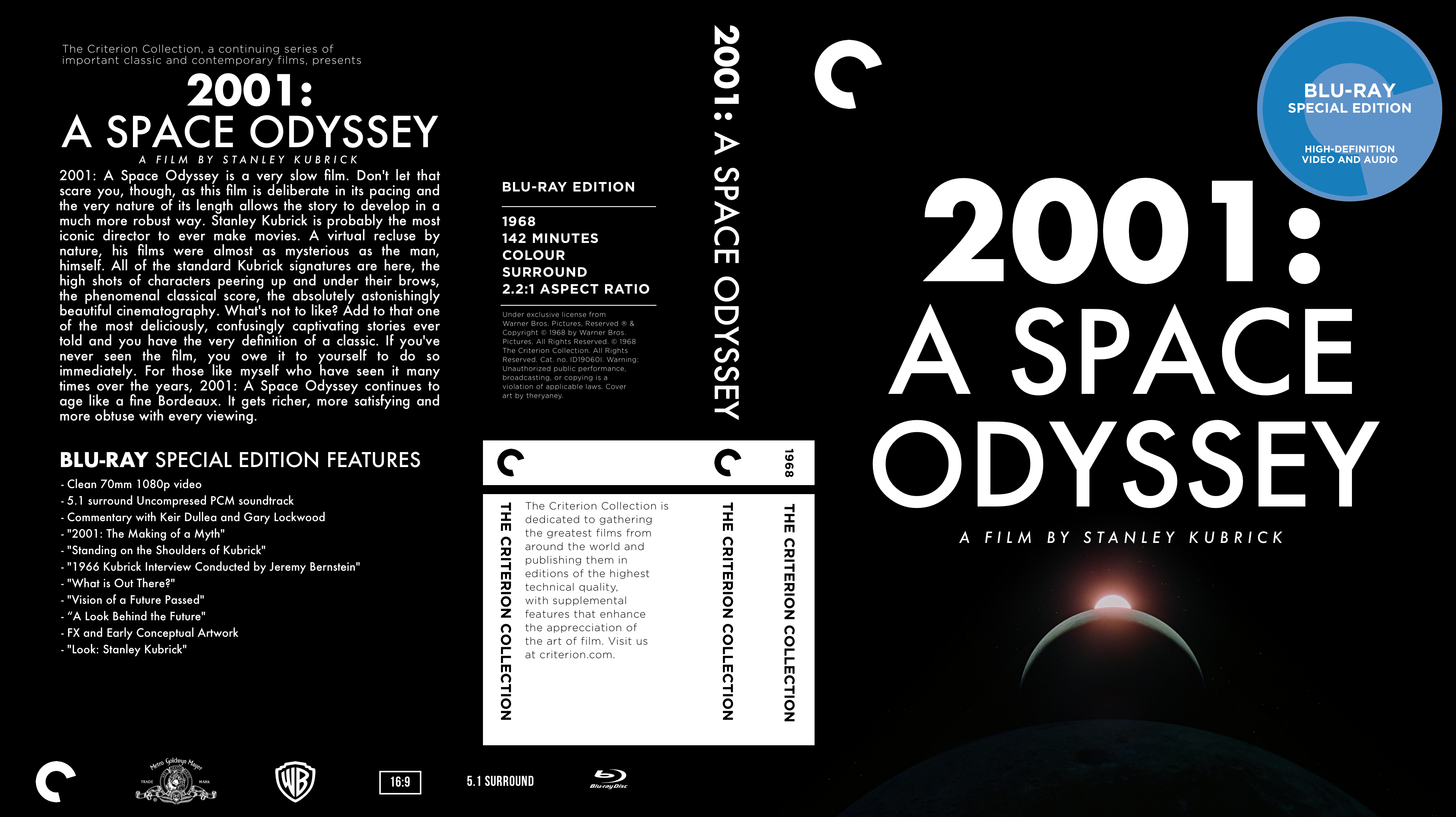
TM2YC said:I never much cared for:
200 1 :
A SP A CE
ODYSSEY
(My jokey way of saying the letter spacing needs finessed
Apart from that, very stylish.
TM2YC said:I never much cared for:
200 1 :
A SP A CE
ODYSSEY
(My jokey way of saying the letter spacing needs finessed
Apart from that, very stylish.